

This section describes how to configure the way your tool is presented to the user by the Redpoint Data Management client.
Defining a custom icon
You can define a custom icon for your tool. This icon will display in the tool palette and on the canvas.
The Data Management SDK supports icons in PNG, JPG and BMP formats. Icons should be 128x128 pixels for proper display on the palette and canvas.
When naming your icon, use the unqualified class name of your tool. For example, if your class is named MyInputTool, and your icon is in PNG format, your icon should be named MyInputTool.png.
Data Management expects to find your icon in the same directory as your tool class. You may elect to keep your Java sources and resources in separate directories during development (e.g. src/main/java and src/main/resources)—that's fine, as long as they end up in the same directory after compiling and packaging. See Build and install your tool for related packaging instructions.
Setting the tool name and description
By default, Data Management will set your tool's display name to the unqualified class name of your tool. So if your class is named MyInputTool, its display name in the Palette and in the Properties pane will be MyInputTool. If you wish to show your users something more descriptive, you can override the getDisplayName() and getDescription() methods in the Tool interface to better describe your tool:
|
Setting the palette category
In Data Management’s tool palette, related tools are grouped into Palette Categories. By default, any net.redpoint.dataflow.transform.Tool subclass belongs to the "Java plugin tools" category. If you wish to specify a custom category, override Tool.getPaletteCategory in your tool and specify the name of your category:
|
User-settable properties
Most tools require the user to perform some configuration. For example, you must specify an input file for the CSV Input tool. In the Data Management client, configuration is performed via controls in the Properties panel. Data Management will build a user interface for you by creating a user-settable property for each public data member of your class (or anything to which you've added one of the control annotations, even if the member is private). For this reason, you should only declare data members public if you want them to be user-settable properties.
The following Java types are supported by automatic user interface construction:
|
Java type |
Control |
Default annotation |
Required annotation |
|---|---|---|---|
|
java.lang.Boolean, boolean |
Checkbox |
@Checkbox |
|
|
java.lang.Byte, byte
|
Spin |
@Spin |
|
|
java.lang.Float, float
|
Textbox Spin |
@Textbox |
@Spin |
|
org.joda.time.LocalDateTime |
DateTime |
@DateTime |
|
|
org.joda.time.LocalDate
|
Date |
@Date |
|
|
org.joda.time.LocalTime |
Time |
@Time |
|
|
java.lang.Long, long |
Timespan picker |
|
@TimeSpan |
|
net.redpoint.dataflow.record.Schema |
Schema editor |
@SchemaEditor |
|
|
java.lang.String |
Single-line text edit
|
@Textbox |
|
|
java.lang.String |
Drop list |
|
@DropList |
|
java.lang.String |
Field selector |
|
@FieldSelect |
|
java.lang.String |
Display-only text |
@Text |
|
|
net.redpoint.dataflow.io.FilePath |
File browser |
@FileBrowse |
|
|
enum |
Drop list non-editable |
@DropList |
|
|
List<List<String>> |
Data view (sample) grid |
@DataView |
|
|
net.redpoint.dataflow.types.DataType |
Data type selector |
@DataTypeSelect |
|
Using other unsupported types will result in the display of an "error control" as a placeholder.
Each supported Java type has a implied "default" annotation. If you don't supply an annotation, the default annotation type will be assumed. However, if you want to alter the user interface (UI) to be something other than its simplest default behavior, or to use a different control type, you will need to supply an explicit annotation.
Some of these annotations support additional configuration elements (e.g. FileBrowse supports action, filter, and location). Review the Javadoc for details.
Using @TimeSpan
This feature is available starting in Data Management version 8.1.0.
The field annotated by @Timespan must be a long, and will contain the time span in milliseconds.
Using @DataTypeSelect
This feature is available starting in Data Management version 8.2.0.
Control annotation
The Data Management client will display a user interface control for each public data member defined in your tool, inferring the control based on the member's data type. You can customize the user interface via Java annotations defined in the net.redpoint.dataflow.annotations package. A data member can have one or more preceding annotations. By annotating a data member in this way, you can:
-
Fine-tune the behavior of specific controls (for example, setting the limits on a numeric spin control or specifying File Browse behavior).
-
Control the visibility of some controls based on the state of other controls via @Trigger and @MultiTrigger (e.g. "when I check this checkbox, show that text input").
-
Make some controls initiate actions in your code (for example, "connect to database" or "show data sample").
-
Derive the normally-static content of some controls from other data fields in your code (for example, "populate a droplist from a List<String> field").
The table above lists which annotations are applicable to each data type. The Javadoc in the net.redpoint.dataflow.annotations package provides details on each annotation's properties. You can also look at PropertiesSampleTool in the samples project, which demonstrates most of the SDK's annotation-driven user interface capabilities.
Pretty editors
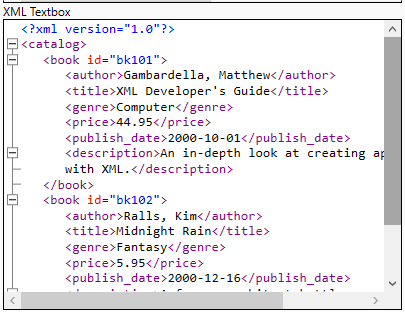
You can use the @Textbox annotation with multiline=true and a syntax-highlight specification to create a pretty-editor control (for example, for XML editing):
@Textbox(caption="XML Textbox", multiline=true, syntax=Textbox.Syntax.XML)
String xmlTextbox;
This results in syntax color highlighting of XML.
Password-setting dialogs
You can use the @Textbox annotation with passwordTitle="string" attribute to control the title of a password entry control:
{{@Textbox(caption="Password", password=true, passwordTitle="Enter the password")
String password;}}
Complex controls
While most controls described in the table above are fairly easy to understand, some require additional explanation.
@DropList
The @DropList annotation defines an editable (combo box) or non-editable (select list) control. This is perhaps best illustrated by example:
|
This will create a non-editable drop-list control with three items to choose from: gun, knife, or banana.
However, not all uses of this control are so simple. In many cases you want to separate the display string from the internal value string, showing one to the user while storing the other internally.
Starting with DM version 8.1, you can specify separate value and display by making each item in the list look like (display:value). For example:
|
In this case, the user will see and select from the set (gun, knife, banana), but the program will see the values (1,2,3).
Fields that are of enum type automatically become drop-lists.
Starting with version 8.2.1, you can specify a separate "display" string for enum values. The "value" part of the specification must exactly match the enum values.
@SchemaEditor
If you annotate a Schema field (Schema being the class representing the list of fields and their types contained in Data Management records) with the @SchemaEditor annotation (or even if you don't and the Schema field is public), Data Management will produce a schema editor control in the UI. A schema editor is a complex control—it is a grid that allows the user to specify a list of fields and their types.
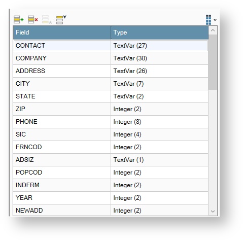
While this control does a lot for you, using it is incredibly simple. Just expect that the Schema field of your class will be populated with a valid Schema when configure() is called.
For an example of code that uses this control type, see the DelimitedInputSampleTool example tool code.
@Table
The @Table annotation tells Data Management to make a control that edits a list of objects. Not just any objects, but objects whose class is a POJO annotated using Data Management annotations. For example, this code from the TableControlSampleTool.
|
This creates a UI element that lets the end user insert, remove, and reorder a list of FieldOperation elements. This is expressed as a three-column grid, where each column corresponds to a field in the FieldOperation class.
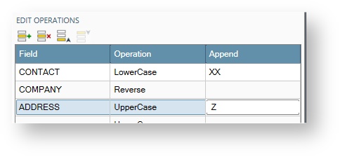
Your control can assume that the List<> is non-null and populated with non-null elements when configure() is called. However, you will probably need to skip over any "empty" rows, as it is very easy for users to accidentally enter these, as seen in the tool's example code.
|
Special consideration for table row class
Your table row class must have a default constructor! The class that represents the rows in your table control (the X in List<X>) cannot use the full complement of annotations, and there are some special cases.
The following annotations are not valid for fields of a table row class:
-
@DataView
-
@DynamicCaption
-
@GroupStart
-
@GroupEnd
-
@Menu
-
@NestedSettings
-
@OverridableSettings
-
@PushButton
-
@Schema
-
@SchemaEditor
-
@Tab
-
@Table
When using any of the following annotations:
-
@DynamicEnabled
-
@DynamicItems
-
@DynamicVisible
The referenced field always refers to a field in the outermost enclosing class (i.e. your tool class). The row items themselves cannot contain the dynamic values.
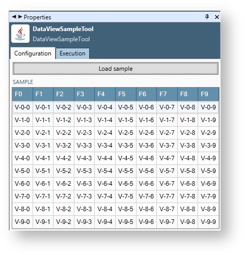
@DataView
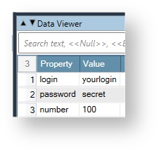
This annotation is used to create "sample data" grids in the UI. For example, if your tool reads from a file or database, you might want to show a sample of the records that will be read from that data source. To use this control annotation, you need a field of type List<List<String>>.
|
You can populate this sample data anywhere in your code, but a good place is in response to a UI Action (see later topic), especially one resulting from a PushButton control.
Populate the control such that the first List<> element contains the field names for your sample data. This will be used to populate the row header in the display grid. The remaining List<> elements contain the sample data. We recommend that you keep the size of the data reasonable, (no more than 100 columns or rows) to avoid excessive memory use and UI sluggishness. See the DataViewSampleTool for sample code.
|
The result looks like this.
Layout annotations
Data Management lets you control the layout of your user interface using the Label, GroupStart, GroupEnd, and Tab annotations.
@Label
Most control annotations include a caption element that you would normally use to label each control in your user interface. However, you might want to display more text than easily fits in a control's caption. In addition, @Label has some other useful aspects.
Think about using the @Label annotation when:
-
You want to display more text.
-
You want to change the label text dynamically.
Using the color, fontSize, and wrapping elements provided by the Label annotation, you have additional control over how your label is presented.
The following code snippet will result in a UI that looks like the following image.
|
@GroupStart, @GroupEnd
You can organize your controls into logical groupings by wrapping them in @GroupStart and @GroupEnd annotations. Data Management supports two group styles:
-
Collapsing, in which the group can be collapsed/expanded
-
Box, where the group is static and serves only to provide visual delineation
Group annotations can be useful when you need the contents of two or more groups to be visible at the same time. If you've got lots of controls, consider organizing them using Tab annotations.
Both of these annotations should be placed on a separate String field that contains the title text (while @GroupEnd never has any text, you have to put it on a String field anyway to give it something to be associated with).
For example, this code will place a collapsible group around the file browse controls (the indentation is subtle).
|
@Tab
You can also organize related controls using a familiar tab metaphor with the @Tab annotation. In the following example we create two tabs, "Input" and "Output", and add a few controls to each.
|
Data Management generates the following control layout.
If you do not specify any @Tab annotations, a tab will be created for you titled "Configuration".
Unless @Tab is the first UI annotation in your class, it will create a new tab.
Use static and final on caption fields!
You'll notice in the above example that the String fields annotated with @Tab, @GroupStart, and @Label are marked with the Java static and final keywords. This tells Data Management that the text cannot change, and makes the value available to the UI generator. This in turn lets Data Management create a more efficient UI (since it will not have to always tell the client what is in the label). You should always use static final if the label text doesn't change. On the other hand, if your label text can change, you should omit these keywords.
Dynamically hiding and showing controls
@Trigger
Triggers make the visibility or enabledness of a control (or group of controls) dependent on the value of some other control. For example, suppose that your tool has a "logging" option expressed with a checkbox control; when that box is checked, you want a file-browse control to appear so that the user can select the log file, and a spin control to appear so that the user can set the desired log detail level. You can accomplish this using the @Trigger annotation placed on the checkbox control, as in the following example.
|
In the above example, we attach the Trigger annotation to a source control (the enableLogging checkbox) and reference a target control (the logging group). This binds the display of the logging group to the enableLogging checkbox, such that the contents of the Logging group are shown only when enableLogging is checked.
The targetControl refers to the fieldname of the target control, not its caption.
This trigger functionality enables you to build smarter, cleaner interfaces that only reveal properties when they become relevant.
The @Trigger annotation can be used with controls other than checkbox, by setting its other attributes:
-
compareToValue: what value of source control should be compared?
-
compareToValues: a list of source control values to compare.
-
comparison: the comparison operation (defaults to =).
-
caseSensitive: is the comparison case-sensitive? (defaults to false).
-
targetAttribute: the target attribute, one of visible or enabled. Defaults to visible.
-
targetTrueValue, targetFalseValue: the target attribute values. Defaults to true and false, respectively. Use these to invert the sense of the trigger (e.g. show when checkbox is NOT checked).
Refer to the JavaDoc for a complete description of this annotation's attributes.
@MultiTrigger
The @Trigger annotation can only specify a single trigger action on a control. While this is usually sufficient, there are times when you want one control to have many trigger effects, especially for dropdown lists where you often want to enable or show different controls or groups based on the selection. To handle those situations, use the @MultiTrigger annotation, which attaches multiple triggers to one control. With @MultiTrigger, you specify an array of @Trigger annotations. For example, the following creates a dropdown control with six choices, enabling the visibility of other controls based on the selection.
|
This effectively attaches a list of @Trigger annotations to a single control.
We can use either one @Trigger with the compareToValues attribute and a comma-separated list of values, or multiple @Trigger annotations, each with a single compareToValue.
See the PropertiesSampleTool example for a demonstration of this in action.
@DynamicEnabled and @DynamicVisible
Generally, using triggers is the correct way to hide and show other controls in a dependent fashion. However, there are times when you want your code to control the enabledness or visibility of a control or a group of controls. In these cases, you can use the @DynamicEnabled and @DynamicVisible annotations to influence control state via the values of other fields.
Example:
|
The spin control will only be shown if your code sets the value of enableIt to true.
If your dynamic condition field is also a @Checkbox control, you should add the @Action annotation to make the UI respond immediately to changes in the condition as shown in the following snippet.
|
@DynamicEnabled and @DynamicVisible: using getter methods
The following is available starting with RPDM version 9.2.
Starting with RPDM version 9.2, you can use getter methods in addition to fields for @DynamicVisible and @DynamicEnabled. This follows the typical java naming convention for getters, so if the field name is xxx, the method is getXxx(). Using getter methods is more flexible when you have a class hierarchy of tools, because derived tools can override the getter methods.
|
Dynamic content
You have already seen above how the @Tab, @GroupStart and @Label annotations derive their text from the value of a following String field. Similarly, you can populate the contents of some controls by referencing the values of fields in your class. The content of these controls is dynamic, meaning that you can change the field value, and the UI will reflect that change. Changes made to dynamic fields will be reflected in the UI the next time it loads data “from the server,” specifically:
-
When the properties for the tool are loaded (the user selects the tool)
-
In response to a UI action event (the user operates a UI control that was annotated with @Action)
@DynamicCaption
This annotation specifies that the caption for a control should be derived from a String field. You can see in the example below that the caption of the text control will be obtained from the caption field.
|
You should make the caption field itself private, to prevent Data Management from turning it into a UI control in its own right.
@DynamicItems
This annotation lets you populate the contents of a dropdown list (in a combo box control) from a list of strings stored in a field in your class. For example, it can be used to populate a dropdown control with a list of database table names. This is especially useful when combined with a @PushButton control that triggers an action in your code (see Dynamically hiding and showing controls). For example, the following code will populate the contents of a dropdown control from a list of Strings stored in a field named tableList.
|
Separating drop-list elements display and value
This feature is available in 8.1.0 and later.
Sometimes, the elements you want to put in a drop-down control have both a "human readable" display part and an internal "unique identifier" part. To use this technique, nominate a List<net.redpoint.dataflow.ui.DropListItem> as the field() of the @DynamicItems annotation. The user will then see and choose the "display" elements, but the target field will contain the chosen "value".
Example:
|
The tableId field will contain the selected element from tableIds, not from tableNames.
Invoking methods in your tool's code
@Action
The @Action annotation wires up a UI control to a method in your UI. This allows your code to do things like:
-
Connect to a database
-
Analyze a file format
-
Display a sample of the input data
-
Fire the rocket thruster
While any control can be annotated with @Action, we recommend that you limit its use to one of several control types:
-
checkbox
-
dropdown list
-
pushbutton
The reason for this limitation is that other control types can fire the action quite frequently, and we've found in practice that this leads to laggy UIs with odd behavior. In future versions of Data Management we plan to add governors to the action rates to avoid these issues.
To enable your class to handle actions, it must implement the HasDynamicUI interface, which contains two methods:
public void handleUIAction(String property, String action, UIActionState state);
This method is called when a control annotated with @Action is operated. The parameters to this method are:
-
property: the name of the control that was operated (the field name to which the annotation was bound).
-
action: the type of operation performed, so that for example you can tell the difference between typing and selecting in a combo box.
-
state: an object that you can update with a message and percentage completion during long-running operations, and indicates when the user has cancelled the operation.
public void refreshUI();
This method is called when Data Management wants to update the dynamic content of controls, and gives you a chance to fill in dynamic-content items based on the current state. Normally you can just implement this with an empty method.
For example, the @DataView example code shown above calls the loadSample() method. It is wired to the pushbutton control as follows.
|
The @Action annotation has three modes:
-
wait: the default mode, this causes the UI to pause until the action is complete. This is useful for short actions or places where you don't mind making the user wait.
-
modal: this will cause the UI to pop up a dialog that can display a message and completion status, and which also has a cancel button. Use this for long-running actions with progress feedback.
-
modeless: this will cause the UI to run the action silently in the background. When the action is complete, any fields that you have changed in your tool will be updated in the UI as well.
@Pushbutton
The @Pushbutton annotation exists solely to make a pushbutton control appear in the UI. It serves no purpose other than calling your handleUIAction() method when it is pressed. Use it anywhere you want your tool's code to "do something now."
You've seen it used in the DataViewSampleTool already, but you can also see it in the AnalyzeSchemaSample tool. In this sample, the pushbutton is wired up to fill in a Schema field with fake data when it is pressed.
|
After the button is clicked, the result looks like this.
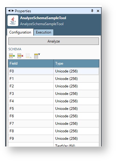
Of course, this is fake data, but the idea is that your tool could reach into the input file (or database connection, etc.), analyze the schema of its input data, and display that schema to the user.
@Menu
The @Menu annotation makes a menu control appear in the UI. It can annotate any field—the type is ignored and the field value is not used. Its only purpose is calling your handleUIAction() method when an item is selected. Use it anywhere you want your tool's code to "do something now." A menu is more compact than a pushbutton for multiple action choices.
When activated, your handleUIAction() method will be called with property equal to the menu item (not its text, if also specified—see below).
Menu items
Set the items property of the Menu annotation to specify your menu items. Menu items are separated by commas, for example: items="item1,item2,item3".
Make the menus more readable by adding text in parentheses following each menu item: items="item1(Menu Item1),item2(Menu Item2)".
The menu will display the text (e.g. Menu Item 1) but the action will receive the label (e.g. item1). This helps your UI separate the human-readable strings from the programatically-processed strings.
Add submenus by enclosing the sub-list in square brackets following the sub-menu item items="item1,Sub Items[subitem1,subitem2(Sub Item2)]".
There is no way to add any of these characters to a menu item: ( ) [ ] ,
Example
You can also see this annotation used in the MenuControlSampleTool example. In this sample, the menu is wired up to set a label when selected.
|
Your tool can perform more meaningful actions in handleUIAction, such as analyzing a file or connecting to a database.
Shared settings
During development of your SDK tools, you may find it convenient to store some settings globally, so that the user of your tools doesn't need to enter the same settings for every instance of the tool. For example, if your tool connects to a server using an URL, and the normal use case is for all instances of the tool to connect to the same server, you could make a shared setting for the server URL.
Shared settings are stored in the repository in the object path /Settings/Tools. All shared settings are in the same place. Your tool's settings will appear on a tab of their own to distinguish them from other settings.
See the SharedSettingsTool in the dataflow_examples project for a detailed example.
Defining shared settings
To define shared settings, you must do two things. Once you have done this and dropped your tool's jar file into the java_plugins folder, RPDM will automatically add a tab to /Settings/Tools in the repository and create a user interface for editing the properties.
Implement net.redpoint.dataflow.transform.Settings
In the SDK there is a simple abstract class named Settings.
|
You should implement a subclass of Settings, returning your settings category, and defining and annotating your settings fields, for example.
|
Add a resource to META-INF.services
In your tool's project, add a resource named META-INF.services/net.redpoint.dataflow.transform.Settings, as shown in Netbeans.
Add an entry for your settings class to this resource file.
|
Using shared settings
Given a built jar with your shared settings object copied into install/java_plugins, the RPDM user will be able to edit the shared settings in the repository. But your class must also fetch the settings at run-time, and use them. This is done by calling getSettings() in the ToolContext.
|
This call does several things for you:
-
Reads /Settings/Tools from the repository and parses the section for your settings.
-
Creates an object of the correct type.
-
Uses reflection to populate the settings object's fields in the same way the tool properties are set from the tool configuration.
Given your settings object, just access its fields directly.
Use @OverridableSettings to automatically incorporate shared settings
This feature is available in 8.0.1 and later.
The @OverridableSettings annotation, when used in conjunction with Shared settings, lets you manage complex properties and a generate a UI that automatically incorporates the system-wide settings while allowing the end user to override those settings for each tool. For example, let's start with the shared settings used in the samples pack ExampleSettings.java.
|
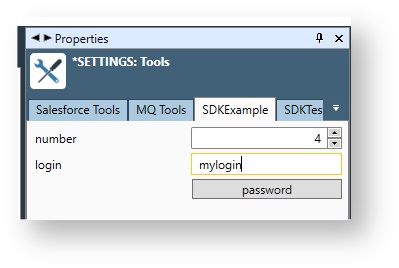
When you add a Settings subclass to your META-INF.services/net.redpoint.dataflow.transform.Settings resource file, it will cause a tab to be automatically created under /Settings/Tools (in this case, the SDKExample tab). If you have installed the examples jar, bring up this tab in Data Management and commit these settings.
Now that you have a defined a Settings object and its properties are folded into the /Settings/Tools UI, you are ready to use it in a tool. To do so, define a field of your Settings type and annotate it with @OverridableSettings. For example, consider the samples pack SharedSettingsTool.java.
|
If you have the samples jar installed, create a project, drag in the SharedSettingsTool, and you'll see these properties.
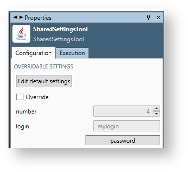
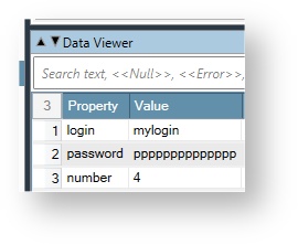
How the default properties that were set in /Settings/Tools->SDKExample in the repository automatically populate the properties of this tool when Override is unchecked. This serves as a visual cue to the user that these default settings will be in use. If you attach a Data Viewer tool and run the project, these defaults are shown in the data output.
When the user checks Override, she can enter values that are specific to this tool instance.
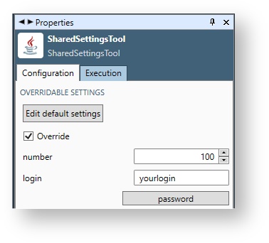
And when run, the project will show the overrides as output data.
Unchecking Override again restores the tool to its default settings.
Don't call ToolContext.getSettings(). Use @OverridableSettings and the correct settings will be automatically chosen and injected into your settings field.
You cannot use the following annotations in a Settings class, because the referenced fields will never be populated when the UI is shown under /Settings/Tools:
-
@DynamicItems
-
@DynamicCaption
-
@DynamicEnabled
-
@DynamicVisible
Use @NestedSettings to organize properties into another class
This feature is available in Redpoint Data Management 7.4.2 and later.
It is often convenient (especially when creating a set of tools with shared behavior) to declare a field that is a class instead of a primitive type. This class, in turn, contains annotated fields. If you annotate such a field with @NestedSettings, the SDK will automatically inject properties for the field's class type, for example.
|
This will result in the following UI.
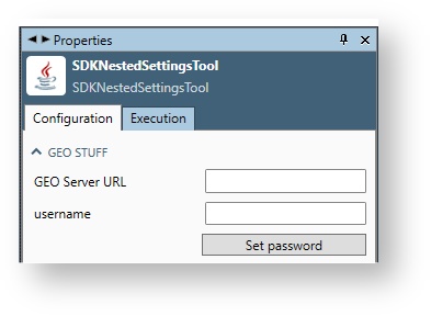
The SDK will automatically get and set the "geoStuff" field.
See the SharedSettingsTool example in the dataflow.samples project for a detailed sample.
Generated names of elements inside @NestedSettings
When you annotate a field with @NestedSettings, Data Management will generate a name for the referenced field of the form: outerFieldName + "." + innerFieldName.
This is the name that is used in all of the following annotations.
|
Annotation |
Property |
|---|---|
|
Trigger |
targetControl |
|
DynamicVisible |
field |
|
DynamicCaption |
field |
|
DynamicEnabled |
field |
|
DynamicItems |
field |
This implies that @Trigger annotations used outside of the nested field must reference the decorated name. However, @Trigger inside the nested class should still use the undecorated name.
For example, consider the following code.
|
In addition, nested settings can refer to elements in the containing Tool class in @Dynamic* annotations by prefixing the name of the field with "*.".
Example:
|
Without the "*.", such field references refer to fields inside the nested class, not the containing class. In practice the containing class is always a Tool. While you can put @NestedSettings inside other @NestedSettings, there is no way to refer to fields in the intermediate nesting levels.
Use @SuperSettings to inherit settings and behavior from a superclass
This feature is available in 7.4.2 and later.
We've seen above that @NestedSettings is useful for encapsulating sets of settings to another class, which also makes it easier to use and override "shared settings" from the repository. However, you may also find it useful to use inheritance in your SDK tools, allowing them to share both settings and processing logic. For example, suppose that you want to create a set of tools for connecting to a new database. You might create a base class tool that has a set of connection properties and handles such things as testing the connection and populating the database and table list, but implement the specific operations (load, query, execute) in subclasses.
If you do not add the base class to your META-INF.services/net.redpoint.dataflow.transform.Tool resource, the base class will not show on the palette or be usable as a tool in its own right. This is usually what you want—the derived classes are on the palette but the base class is not.
See the SuperSettingsToolBase and SuperSettingsToolDerived tools in the dataflow.samples project for an example of this pattern.
How do user interface properties get set into your class fields?
Data Management will automatically interpret the user-settable properties and set your object's public or annotated data members before calling your tool's configure() method. So when configure() is called, you can assume that the fields corresponding to UI elements have already been set to reflect the user settings.
Your configure method is also a logical place to validate your properties.
|
The configure method is called when:
-
A project containing your tool is opened
-
A new instance of your tool is dropped on the canvas
-
Changes to the Property panel are committed to your tool
-
Changes to "upstream" connected tools are made that result in different Schemas being presented to your tool
-
The user requests a refresh of file or database connections
For additional detail on the configure method, see Understanding the Tool lifecycle.
Discontinued use patterns and behavior changes
The following usage patterns and interface elements have been deprecated. New code development should discontinue their use.
Manual shared settings pattern using ToolContext.getSettings()
Long ago, the SDK supported a use pattern of "manually overriding shared settings". This was done first by defining properties like this.
|
Then processing those properties like:
This is no longer supported. ToolContext.getSettings() will not return the shared settings. You will get a NullPointerException.
Instead, use @OverrideableSettings.
Stacking @Label with other annotations
Prior to version 7.4, the only way to create a label control was to put the @Label annotation on something that was already going to be a control (like a String with @Textbox annotation). This would cause a label to appear above the intended control. For example, the following was supported.
|
However, this created problems (for example, you could not control label visibility with @Trigger). We now recommend that you use @Label to annotate a String that contains the label text, as in the following.
|
To reinforce this change, you will notice that the caption attribute of @Label has been deprecated. The caption should always be contained in the annotated String field instead.
Unless your label text can change dynamically, you should also add the static final keywords to your String field.
Stacking @GroupStart, @GroupEnd, and @Tab with other annotations
Prior to version 7.4, the only way to start a group or tab was to put the @GroupStart, @GroupEnd, or @Tab annotation on something that was already going to be a control (like a String with @Textbox annotation). This would cause a group to start above the targeted control. For example, the following was supported.
|
However, this created problems (for example, you could not control group visibility with @Trigger, and there were intractable ambiguities). We now recommend that you use @Tab or @GroupStart to annotate a String that contains the title text of the tab or group, as in the following.
|
To reinforce this change, you will notice that the caption attributes of @Tab and @GroupStart have been deprecated. The caption should always be contained in the annotated String field instead.
Unless your caption text can change dynamically, you should also add the static final keywords to your String field.
Tool.getInterfaceXml()
Prior to RPDM version 7.4, you could override getInterfaceXml() to generate custom user-interface XML. As of version 7.4 this is no longer supported, and the Tool.getInterfaceXml() method is final.
Generated names of elements inside @NestedSettings and @OverridableSettings
As of version 8.0, fields inside the type referenced by @NestedSettiings and @OverridableSettings will be assigned a name (used for trigger and dynamic content purposes) that contains the enclosing field name as a prefix. See the section on @NestedSettings for details.
Erroneous annotations
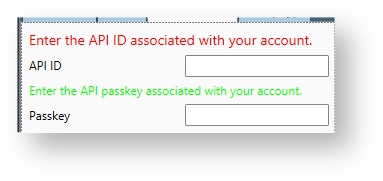
In Data Management version 7.4, incompatible annotations were largely ignored or sometimes processed incorrectly. For example, you could annotate the same field with @Spin and @Textbox. Either annotation might be applied. In Data Management version 8.0, extra incompatible annotations will result in an "error" label being generated in the UI to inform you that something is wrong. Error labels are large and red to make them hard to miss. For example, all of the following will result in error labels.
|
In addition, using any of the disallowed annotations from special table considerations will result in an "error label" for that column in the table.
Non-public fields
Prior to version 8.0, non-public fields with any SDK annotation would cause them to be treated as public. Now, only annotations that designate the field as a control will cause non-public fields to produce controls in the UI. For example, the following will no longer produce a checkbox.
|
Use of defaultValue in annotations
Prior to version 8.3.1, most control annotations had a defaultValue property, the intent of which was to set the default value of a field in the UI, as in.
|
However, this never really worked correctly – the default value would show in the UI, but it would not be used in the SDK tool unless you opened the UI and committed it.
Because of this all defaultValue have been deprecated. As of version 8.3.1, the supported way of setting default values is to simply set the field value, either in the constructor or inline in the class.
|