

Create Custom Color dialog
This dialog, which can be invoked in a number of contexts, allows you to define a custom color for use in the rich text editor.
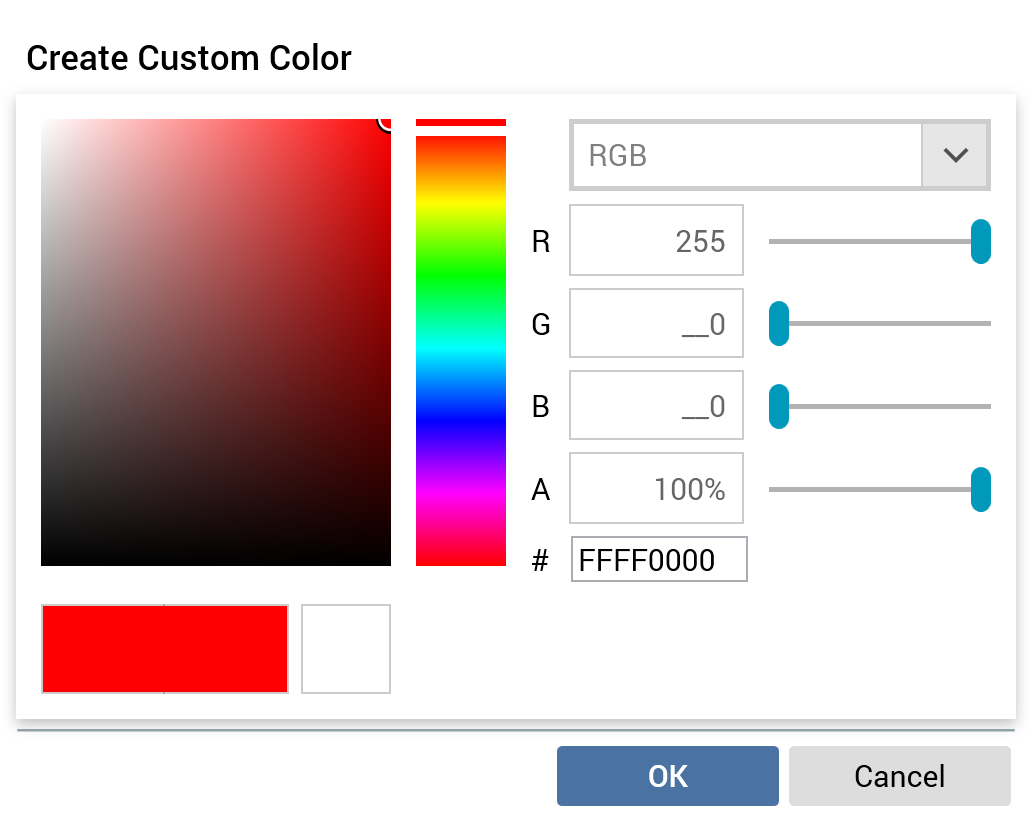
On the dialog’s invocation, if the current context has a color applied, the controls within the dialog reflect the same.
The dialog contains the following:
-
Color chart: the chart displays colors relevant to the hue selected at the right hand vertical slider and context of invocation. You can select on the chart to select the color value at the point in question.
-
Vertical slider: the vertical slider, shown to the right of the color chart, facilitates selection of the range of colors to be displayed in the chart.
The following properties are shown below the color chart:
-
Initial color
-
Selected color
-
Previous color
Note that you can select a color using these properties, by selecting one.
-
Color model type: this dropdown exposes how colors are to be modeled in the dialog. The following values are available:
-
CMYK
-
HLS
-
HSV
-
RGB (the default)
-
-
Color model units: the properties shown below the dropdown are contingent upon the value selected therein. Each is accompanied by a horizontal slider that facilitates its setting (and adjusts properties elsewhere in the dialog accordingly—moving a slider results in corresponding movement at the vertical slider and change in # value.
-
A: “Alpha”—this property controls the selected color’s opacity.
-
#: this property allows you to specify a color hex value.
Two buttons are displayed at the bottom of the dialog:
-
OK: selecting this button applies the selected color to the context of the dialog’s invocation.
-
Cancel: selecting this button closes the dialog without applying the selected color. Note that selecting off the dialog has the same effect.
Font dialog box
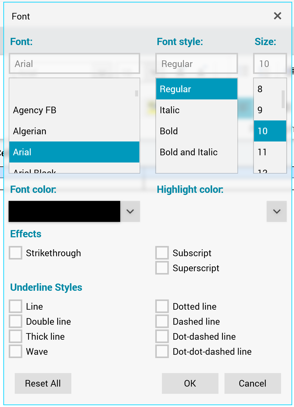
The Font dialog box provides control over the following font properties:
-
Font
-
Font style
-
Regular
-
Italic
-
Bold
-
Bold and Italic
-
Size
-
Font color
-
Highlight color
-
Effects
-
Strikethrough
-
Subscript
-
Superscript
-
-
Underline styles
The following buttons appear at the bottom of the dialog:
-
Reset
-
OK
-
Cancel
Paragraph Properties dialog box
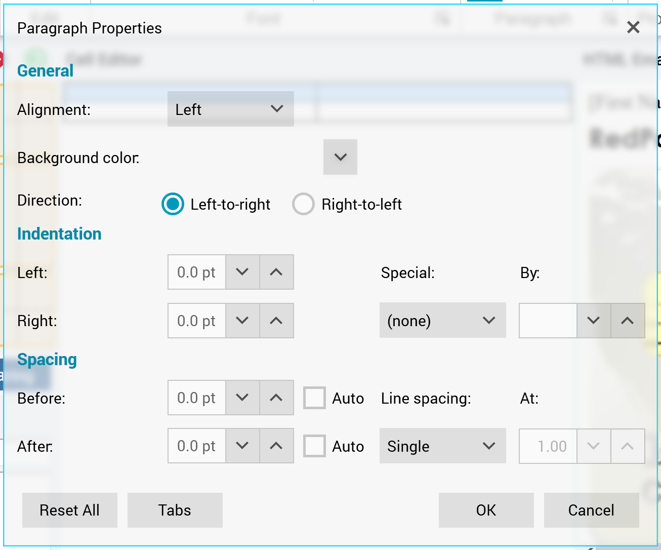
The Font dialog box provides control over the following paragraph properties:
-
General section:
-
Alignment
-
Left (selected by default)
-
Center
-
Right
-
Justify
-
-
Background color
-
Direction
-
Left-to-right: selected by default.
-
Right-to-left
-
-
-
Indentation section:
-
Left
-
Right
-
Special:
-
(none)
-
First Line
-
Hanging
-
-
By
-
This property is only relevant when Special is set to a value other than (none).
-
-
-
Spacing section:
-
Before
-
Auto
-
-
After
-
Auto
-
-
Line spacing
-
Single
-
1.5 lines
-
Double
-
At least
-
Exactly
-
Multiple (the default)
-
-
At
-
This property is only relevant when Line spacing is set to one of At least, Exactly, or Multiple.
-
-
The following buttons appear at the bottom of the dialog:
-
Reset All
-
Tabs: invocation of this option replaces Paragraph Properties with the Tabs dialog box:
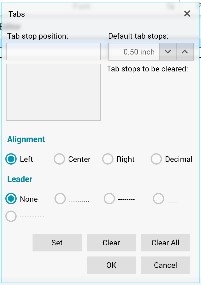
The dialog provides control over tab stop positions, alignment, and leader formatting.
-
OK
-
Cancel
Table Properties dialog box
The Table Properties dialog box contains four tabs: Table, Row, Column, and Cell.
Three buttons are displayed at the bottom of the dialog box:
-
Reset All
-
OK
-
Cancel
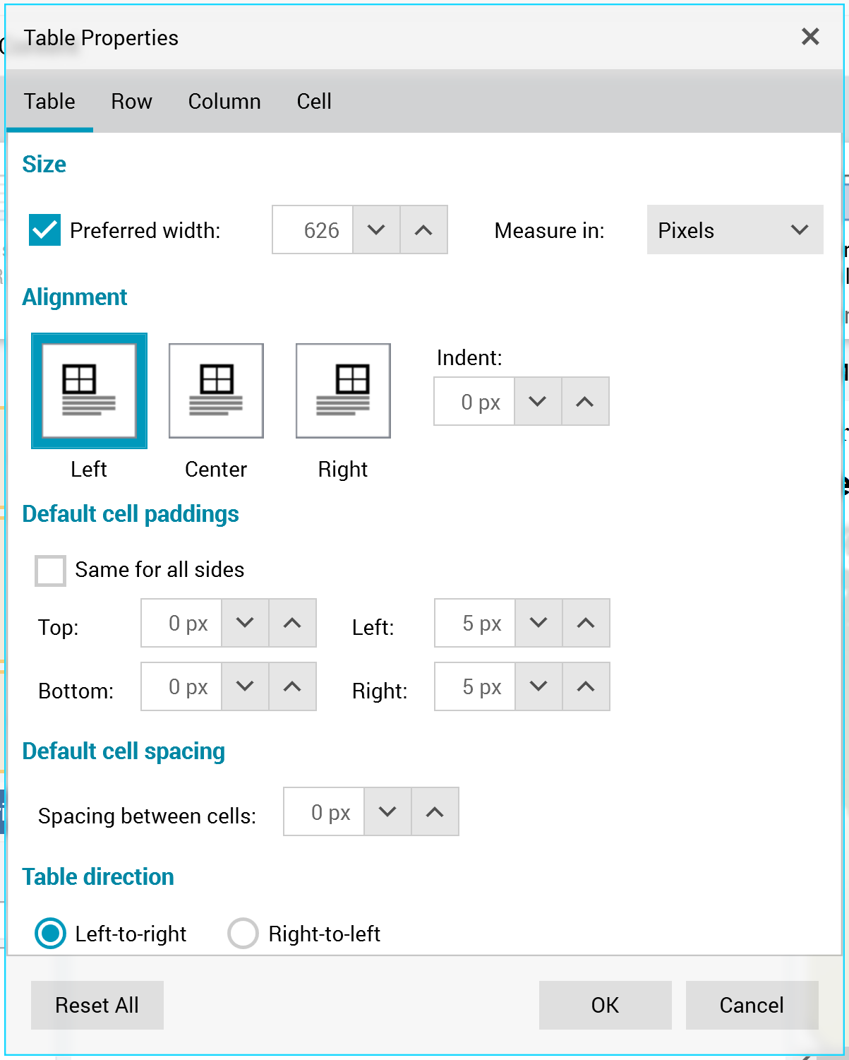
Table tab
The Table Properties dialog box’s Table tab exposes the following:

-
Size section:
-
Preferred width
-
Measure in
-
Percent (the default) or Pixels
-
-
-
Alignment section:
-
Left
-
Center
-
Right
-
Indent
-
-
Default cell paddings section:
-
Top
-
Left
-
Bottom
-
Right
-
Same for all sides
-
-
Default cell spacing section:
-
Spacing between cells
-
-
Table direction section:
-
Left-to-right
-
Right-to-left
-
Row tab
The Table Properties dialog box’s Row tab exposes the following:
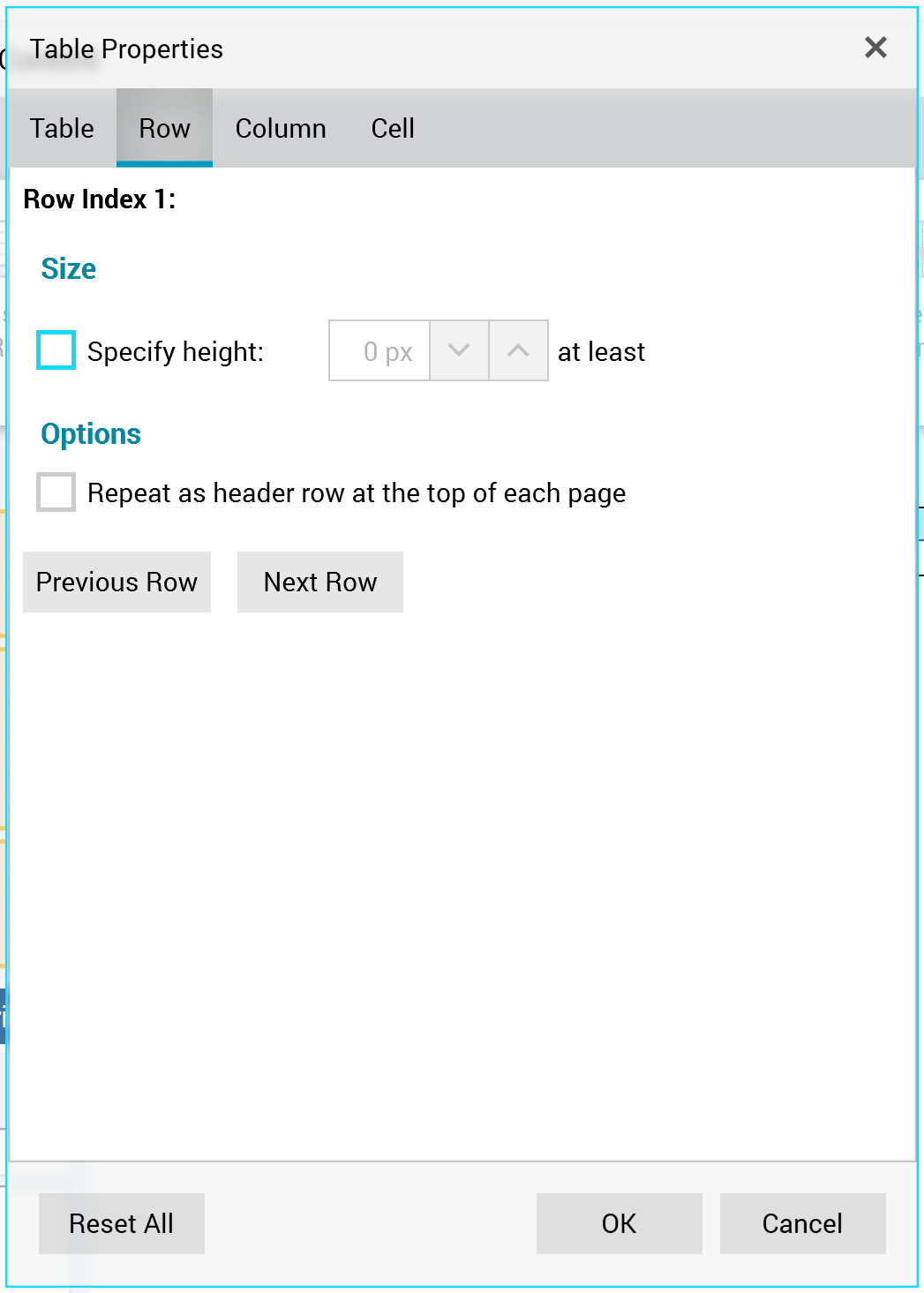
-
Row index: a read-only representation of the row in respect of which properties are currently being managed.
-
Size section:
-
Specify height: selecting this checkbox allows you to provide a specific minimum height for the row.
-
-
Options section:
-
Repeat as header row at the top of each page: checkbox.
-
Two buttons below the tab’s properties allow you to choose which row’s properties to set:
-
Previous Row
-
Next Row
Column tab
The Table Properties dialog box’s Column tab exposes the following:
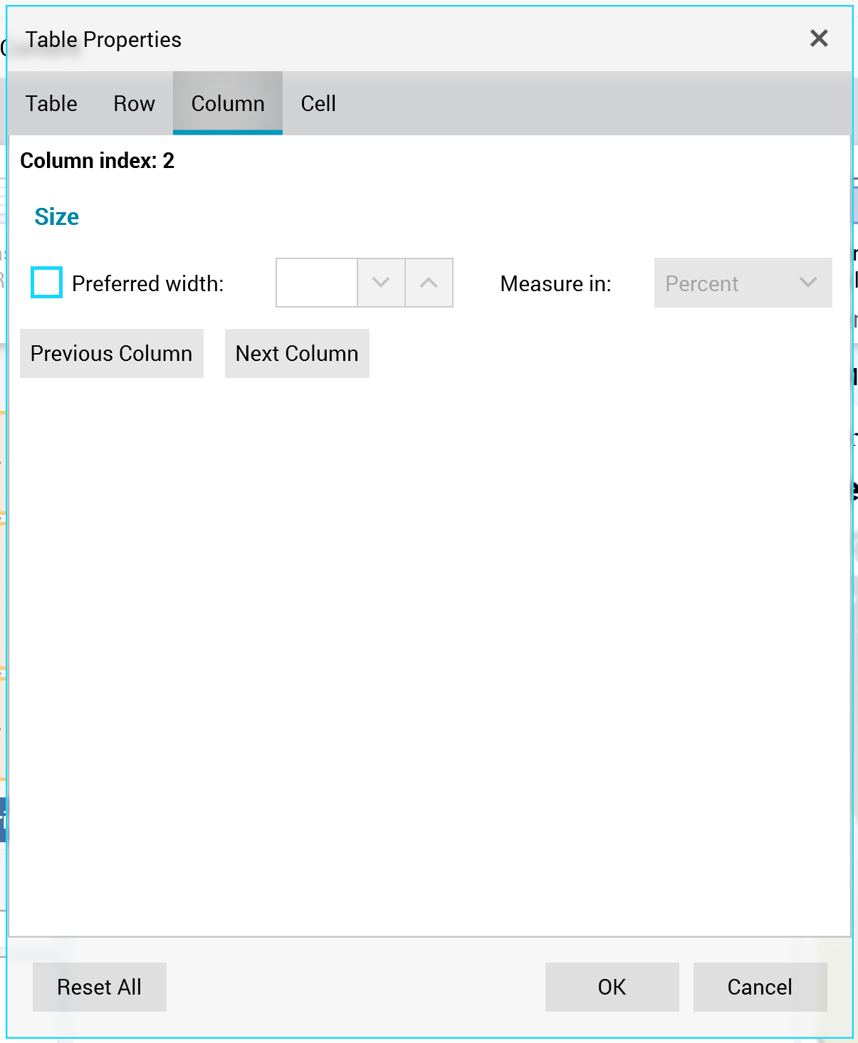
-
Column index: a read-only representation of the column in respect of which properties are currently being managed.
-
Size section:
-
Preferred width
-
Measure in
-
Two buttons below the tab’s properties allow you to choose which column’s properties to set:
-
Previous Column
-
Next Column
Cell tab
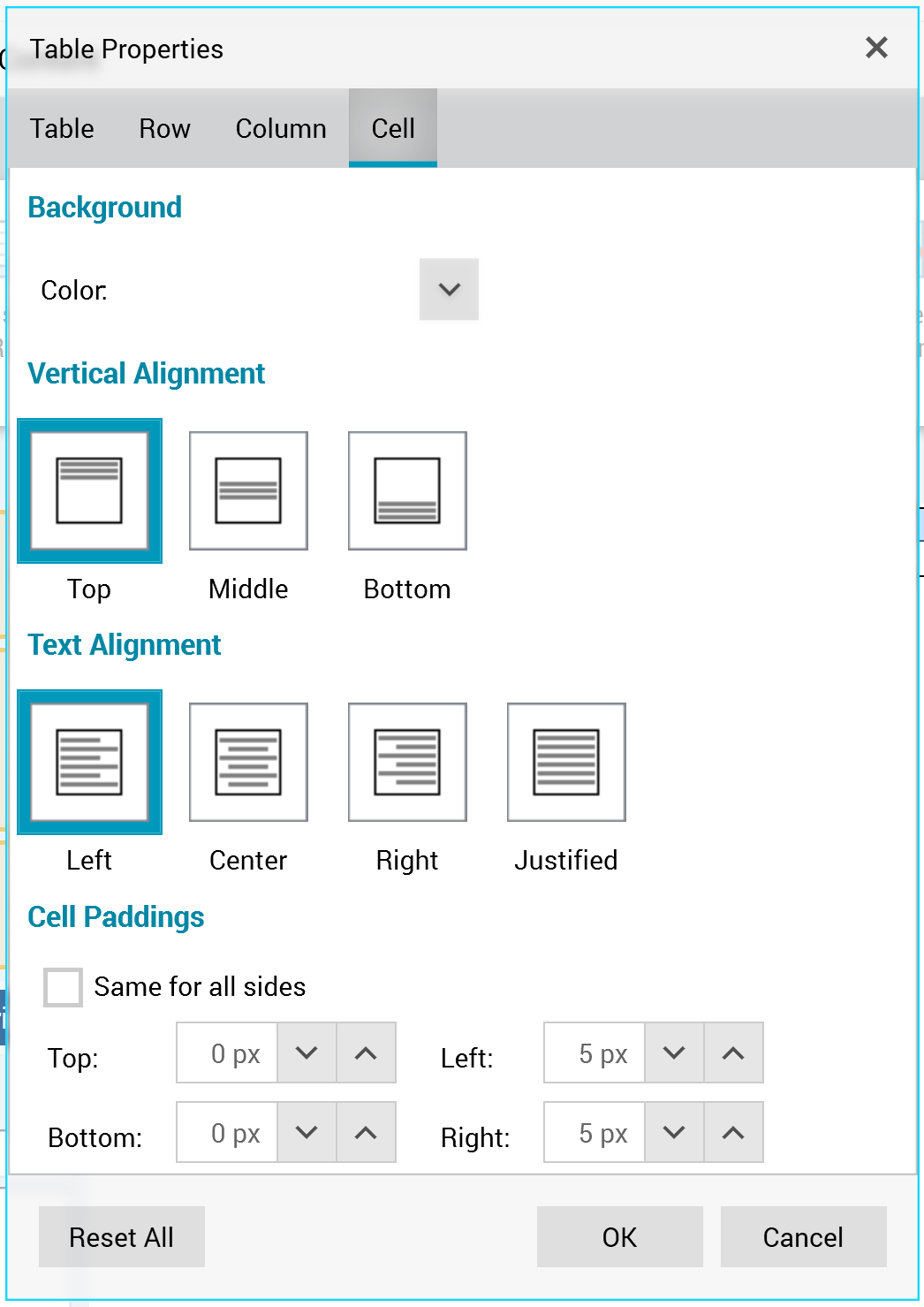
The Table Properties dialog box’s Cell tab exposes the following:
-
Background section:
-
Color
-
-
Vertical Alignment section:
-
Top
-
Middle
-
Bottom
-
-
Text Alignment section:
-
Left
-
Center
-
Right
-
Justified
-
-
Cell Paddings section:
-
Top
-
Left
-
Bottom
-
Right
-
Same for all sides
-
Table Borders dialog box
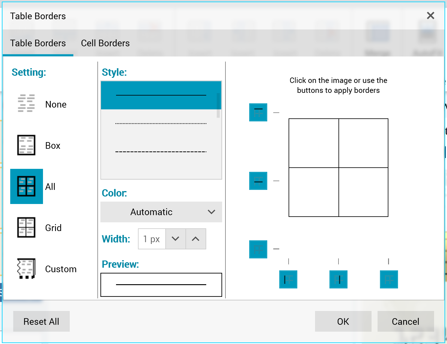
The Table Borders dialog box contains two tabs, Table Borders, and Cell Borders.
Three buttons are displayed at the bottom of the dialog box:
-
Reset All
-
OK
-
Cancel
Table Borders tab
The Table Borders dialog box’s Table Borders tab exposes the following:

-
Setting section:
-
None
-
Box
-
All (the default)
-
Grid
-
Custom
-
-
Style section:
-
Border style dropbox
-
Color
-
Width
-
Preview
-
The section to the right of the dialog box allows you to manually manipulate table borders.
Cell Borders tab
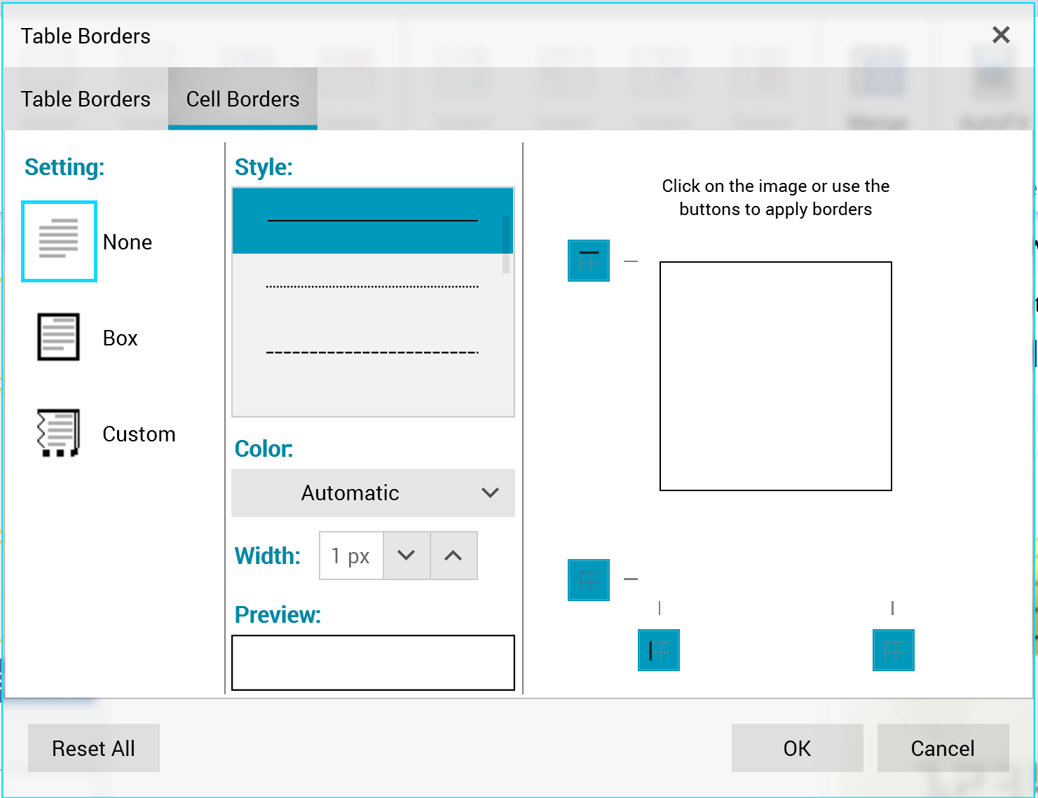
The contents of the Table Borders dialog box’s Cell Borders tab are the same as its Table Borders tab, other than the All and Grid options are missing at the Setting section.