

Overview
The layout tab allows you to drag form elements from the top section of the toolbox, and drop them into a form elements list to construct your web form.
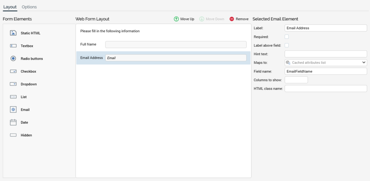
The section consists of Form Elements, Web Form Layout, and Selected Element sections.
Form Elements section
The web form’s Form Elements section exposes a series of elements that can be included in a web form.
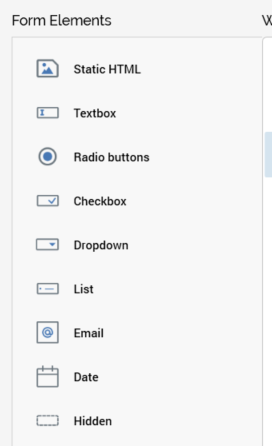
You can drag a form element from the list and drop it onto the Web Form Layout section to include it in a web form.
Web Form Layout section
The Web Form Layout section consists of a toolbar and form elements list.
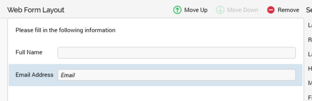
The toolbar is displayed at the top of the section. It exposes the following options:
-
Move Up: this button is available when an element other than the first in the list is selected. Invocation moves the element up one position in the list.
-
Move Down: this button is available when an element other than the last in the list is selected. Invocation moves the element down one position in the list.
-
Remove: invocation of this option removes the selected element without displaying an “Are You Sure?” dialog.
The form elements list occupies the majority of the Web Form Layout section.
It allows you to specify the form elements that will make up your web form.
When displayed initially, the form elements list contains a message:
You can drag the form elements you require from the top section of the toolbox and drop them onto the form elements list. You can then customize each element in turn by selecting it and changing its properties in the Selected Element section.
All form element types in the list, other than static HTML or hidden elements, display the label with which they have been configured. If the label property has been set to blank, “No label” is shown (other than at a right-aligned checkbox, where it is not shown at all).
Note that labels are displayed in accordance with elements’ Label above field settings.
In addition, and also at all elements other than static HTML or hidden elements, if a field has been defined as required, an asterisk (*) is shown next to its label.
All form elements in the list are read-only. The display of a form element within the list depends on its type:
-
Static HTML: static HTML as entered is displayed. No label is shown. The maximum height of a static HTML element within the list is 100 pixels.
-
Textbox: a single-line or multi-line textbox control is shown (as required). If Placeholder text has been defined, it is shown within the field.
-
Radio buttons: one radio button per row in the Values list is displayed, across a single or multiple lines, as required.
-
Checkbox: a checkbox is shown, with the label to the left or right as specified. The checkbox reflects the element’s Checked by default setting.
-
Dropdown: a non-functional dropdown control, reflecting the first row in the Values list, is displayed.
-
List: one checkbox per row in the Values list is displayed, across a single or multiple lines, as required.
-
Email: a textbox control, displaying the string “Email”, is displayed.
-
Date: a textbox control, displaying the string “Date”, is shown.
-
Hidden: displays the text “Hidden [Field name]”.
Selected Element section
This section, displayed to the right of the form elements list, displays details of the currently-selected form element.
If a form element is not selected, a message is displayed:
Its contents depend on the type of element selected:
Static HTML
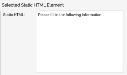
Static HTML: you can enter raw HTML in this field. Provision of a value is mandatory. The field defaults to the value “Static HTML”.
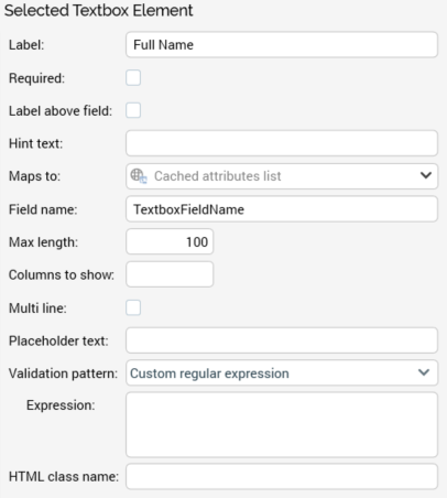
Textbox
-
Label: this property defaults to the name of the form element. Its provision is optional, and it can be a maximum length of 500 characters.
-
Required: this checkbox is unchecked by default. It allows you define whether the field is to be mandatory.
-
Label above field: this checkbox is unchecked by default. If checked, the form element's label is displayed above the field; if unchecked, to the left of the field.
-
Hint text: this optional property is blank by default. When set, it is shown as a tooltip at the form element when displayed in a browser; if not set, the element's label is displayed instead.
-
Maps to: this dropdown property allows you to define a web form element as serving as a lookup key to retrieve data, defined by a cached attribute list, into the Realtime cache. By doing so, you can then use the persisted attribute values, stored on a site visitor basis, to vary content using the RPI Realtime API.
By default, the property is set to the text “Cached attribute list”. Cached attribute lists are presented in alphabetical order. Having selected a list, you can Clear the property.
-
Field name: this mandatory property defaults to “TextboxFieldName”. Its maximum length is 50 characters, and it must be unique within the form.
-
Max length: this integer field, which defaults to value 100, is mandatory. It has a maximum value of 5000.
Note that this setting controls the maximum length of the element's Placeholder text (if decreased to below the length of existing Placeholder text, the existing text is not affected).
-
Columns to show: this optional integer property allows you to define the width of the field. It is blank and accepts a maximum value of 100.
-
Multi-line: this checkbox is unchecked by default. When checked, the Lines to show field is displayed.
-
Lines to show: when displayed, this integer property is mandatory. It provides control over the height of a multi-line textbox. It defaults to 2 and can be a maximum value of 100.
-
Placeholder text: this optional text field is blank by default. Its maximum length is defined by the element's Max length setting.
-
Validation pattern: a dropdown field, exposing the following values:
-
Custom regular expression (default)
-
Single alpha word
-
Single alphanumeric word
-
Single whole number
-
Zip code (5)
-
Zip code (5 or 5+4)
-
-
Expression: optional; used by Validation pattern. If a RegEx is supplied, it should be entered without enclosing forward slash characters.
-
HTML class name: this property is blank by default. When the form is used in a web page, styles/scripts are applied to the form element in accordance with the assigned HTML class value.
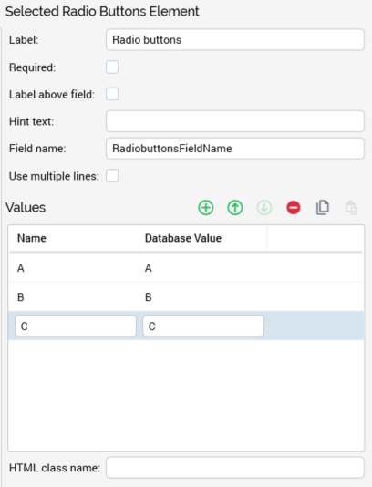
Radio buttons
-
Label: this property defaults to the name of the form element. Its provision is optional, and it can be a maximum length of 500 characters.
-
Required: this checkbox is unchecked by default. It allows you define whether the field is to be mandatory.
-
Label above field: this checkbox is unchecked by default. If checked, the form element's label is displayed above the field; if unchecked, to the left of the field.
-
Hint text: this optional property is blank by default. When set, it is shown as a tooltip at the form element when displayed in a browser; if not set, the element's label is displayed instead.
-
Field name: this mandatory property defaults to “RadiobuttonsFieldName”. Its maximum length is 50 characters, and it must be unique within the form.
-
Use multiple lines: this checkbox is unchecked by default. It allows you to define whether the radio buttons are to be displayed on a single, or across several, lines.
-
Values: you can define a series of Name and Database Value pairs for the radio buttons to be displayed within the form element by adding rows to the Values grid. One radio button is shown per row in the grid, which is accompanied by a toolbar. The Toolbar exposes the following options:
-
Add new Value: adds a new entry to the grid. Its default Name is “Name”, and its Database Value is blank.
-
Move selected Value up: this option is only available if the selected row is not the first in the list. Invocation moves the row up one position in the list.
-
Move selected Value down: this option is only available if the selected row is not the last in the list. Invocation moves the row down one position in the list.
-
Remove selected Value: invocation of this option removes the currently-selected value from the grid.
-
Copy Values to clipboard: this option is available when one or more values are present in the grid. Invocation copies the values to the clipboard.
-
Paste Values from clipboard: selecting this button displays two context menu options:
-
Replace existing Values: this option replaces all existing Values with the values copied to the clipboard.
-
Add to existing Values: this option appends any new values on the clipboard to the existing Values list. If a name already exists, it is not appended.
Provision of at least one row in the grid is mandatory. The following writeable columns are shown:
-
-
Name: mandatory, and unique within the element. Name can be a maximum of 100 characters in length. On update of Name when Database Value is blank or set to the same value as Name, Database Value is set to the same value as Name. Note that Name is case sensitive in this context.
-
Database Value: mandatory. Database value can be a maximum of 1000 characters in length.
-
-
HTML class name: this property is blank by default. When the form is used in a web page, styles/scripts are applied to the form element in accordance with the assigned HTML class value.
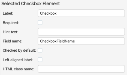
Checkbox
-
Label: this property defaults to the name of the form element. Its provision is optional, and it can be a maximum length of 500 characters.
-
Required: this checkbox is unchecked by default. It allows you define whether the field is to be mandatory.
-
Hint text: this optional property is blank by default. When set, it is shown as a tooltip at the form element when displayed in a browser; if not set, the element's label is displayed instead.
-
Field name: this mandatory property defaults to “CheckboxFieldName”. Its maximum length is 50 characters, and it must be unique within the form.
-
Checked by default: this checkbox is unchecked by default. If checked, the checkbox will be shown as checked when rendered in a browser.
-
Left-aligned label: this checkbox is unchecked by default. If checked, the element's label is shown to its left; if unchecked, to its right.
-
HTML class name: this property is blank by default. When the form is used in a web page, styles/scripts are applied to the form element in accordance with the assigned HTML class value.
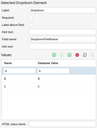
Dropdown
-
Label: this property defaults to the name of the form element. Its provision is optional, and it can be a maximum length of 500 characters.
-
Required: a checkbox, unchecked by default.
-
Label above field: this checkbox is unchecked by default. If checked, the form element's label is displayed above the field; if unchecked, to the left of the field.
-
Hint text: this optional property is blank by default. When set, it is shown as a tooltip at the form element when displayed in a browser; if not set, the element's label is displayed instead.
-
Field name: this mandatory property defaults to “DropdownFieldName”. Its maximum length is 50 characters, and it must be unique within the form.
-
Info text: this optional field is blank by default. It can be a maximum of 100 characters in length, and a space can be used to represent a blank value.
-
Values: you can define a series of Name and Database Value pairs for the dropdown by adding rows to the Values grid. One dropdown value is shown per row in the grid, which is accompanied by a toolbar. The Toolbar exposes the following options:
-
Add new Value: adds a new entry to the grid. Its default Name is “Name”, and its Database Value is blank.
-
Move selected Value up: this option is only available if the selected row is not the first in the list. Invocation moves the row up one position in the list.
-
Move selected Value down: this option is only available if the selected row is not the last in the list. Invocation moves the row down one position in the list.
-
Remove selected Value: invocation of this option removes the currently-selected value from the grid.
-
Copy Values to clipboard: this option is available when one or more values are present in the grid. Invocation copies the values to the clipboard.
-
Paste Values from clipboard: selecting this button displays two context menu options:
-
Replace existing Values: this option replaces all existing Values with the values copied to the clipboard.
-
Add to existing Values: this option appends any new values on the clipboard to the existing Values list. If a name already exists, it is not appended.
Provision of at least one row in the grid is mandatory. The following writeable columns are shown:
-
-
Name: mandatory, and unique within the element. Name can be a maximum of 100 characters in length. On update of Name when Database Value is blank or set to the same value as Name, Database Value is set to the same value as Name. Note that Name is case sensitive in this context.
-
Database Value: mandatory. At least two different values must be supplied. Database value can be a maximum of 1000 characters in length.
-
-
HTML class name: this property is blank by default. When the form is used in a web page, styles/scripts are applied to the form element in accordance with the assigned HTML class value.
When a dropdown field is displayed in a landing page, if an Info text value is not supplied, the field's initial value is displayed by default.
If an Info text value is supplied, it is displayed by default at the field, and is non-selectable. If the field is not Required, the form can be submitted without selecting a value. If the field is Required, it is necessary to select a value before submitting the web form.
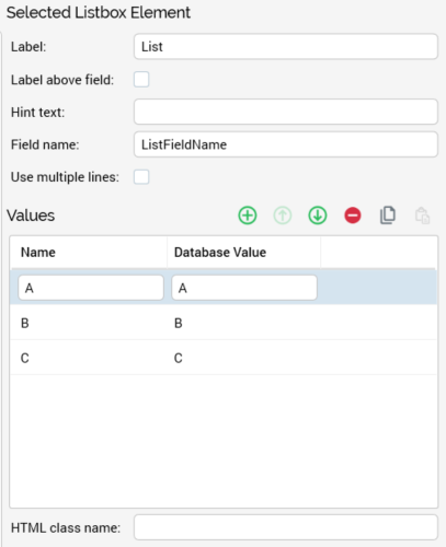
List
-
Label: this property defaults to the name of the form element. Its provision is optional, and it can be a maximum length of 500 characters.
-
Label above field: this checkbox is unchecked by default. If checked, the form element's label is displayed above the field; if unchecked, to the left of the field.
-
Hint text: this optional property is blank by default. When set, it is shown as a tooltip at the form element when displayed in a browser; if not set, the element's label is displayed instead.
-
Field name: this mandatory property defaults to “ListFieldName”. Its maximum length is 50 characters, and it must be unique within the form.
-
Use multiple lines: this checkbox is unchecked by default. It allows you to define whether the list is to be displayed on a single, or across several, lines.
-
Values: you can define a series of Name and Database Value pairs for the checkboxes to be displayed within the list by adding rows to the Values grid. One checkbox is shown per row in the grid, which is accompanied by a toolbar. The Toolbar exposes the following options:
-
Add new Value: adds a new entry to the grid. Its default Name is “Name”, and its Database Value is blank.
-
Move selected Value up: this option is only available if the selected row is not the first in the list. Invocation moves the row up one position in the list.
-
Move selected Value down: this option is only available if the selected row is not the last in the list. Invocation moves the row down one position in the list.
-
Remove selected Value: invocation of this option removes the currently-selected value from the grid.
-
Copy Values to clipboard: this option is available when one or more values are present in the grid. Invocation copies the values to the clipboard.
-
Paste Values from clipboard: selecting this button displays two context menu options:
-
Replace existing Values: this option replaces all existing Values with the values copied to the clipboard.
-
Add to existing Values: this option appends any new values on the clipboard to the existing Values list. If a name already exists, it is not appended.
Provision of at least one row in the grid is mandatory. The following writeable columns are shown:
-
-
Name: mandatory, and unique within the element. Name can be a maximum of 100 characters in length. On update of Name when Database Value is blank or set to the same value as Name, Database Value is set to the same value as Name. Note that Name is case sensitive in this context.
-
Database Value: mandatory. At least two different values must be supplied. Database value can be a maximum of 1000 characters in length.
-
-
HTML class name: this property is blank by default. When the form is used in a web page, styles/scripts are applied to the form element in accordance with the assigned HTML class value.
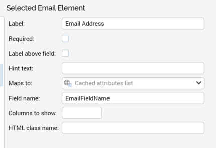
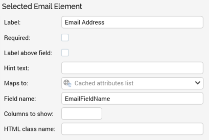
Email
-
Label: this property defaults to the name of the form element. Its provision is optional, and it can be a maximum length of 500 characters.
-
Required: this checkbox is unchecked by default. It allows you define whether the field is to be mandatory.
-
Label above field: this checkbox is unchecked by default. If checked, the form element's label is displayed above the field; if unchecked, to the left of the field.
-
Hint text: this optional property is blank by default. When set, it is shown as a tooltip at the form element when displayed in a browser; if not set, the element's label is displayed instead.
-
Maps to: this dropdown property allows you to define a web form element as serving as a lookup key to retrieve data, defined by a cached attribute list, into the Realtime cache. By doing so, you can then use the persisted attribute values, stored on a site visitor basis, to vary content using the RPI Realtime API.
By default, the property is set to the text “Cached attribute list”. Cached attribute lists are presented in alphabetical order. Having selected a list, you can Clear the property.
-
Field name: this mandatory property defaults to “EmailFieldName”. Its maximum length is 50 characters, and it must be unique within the form.
-
Columns to show: this optional integer property allows you to define the width of the field. It is blank and accepts a maximum value of 100.
-
HTML class name: this property is blank by default. When the form is used in a web page, styles/scripts are applied to the form element in accordance with the assigned HTML class value.
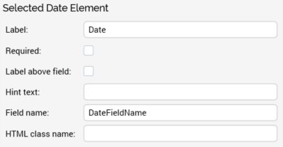
Date
-
Label: this property defaults to the name of the form element. Its provision is optional, and it can be a maximum length of 500 characters.
-
Required: this checkbox is unchecked by default. It allows you define whether the field is to be mandatory.
-
Label above field: this checkbox is unchecked by default. If checked, the form element's label is displayed above the field; if unchecked, to the left of the field.
-
Hint text: this optional property is blank by default. When set, it is shown as a tooltip at the form element when displayed in a browser; if not set, the element's label is displayed instead.
-
Field name: this mandatory property defaults to “DateFieldName”. Its maximum length is 50 characters, and it must be unique within the form.
-
HTML class name: this property is blank by default. When the form is used in a web page, styles/scripts are applied to the form element in accordance with the assigned HTML class value.
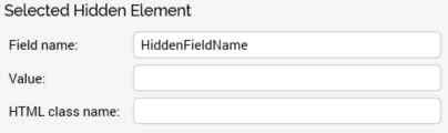
Hidden
This element is used to persist a piece of information that you wish to keep hidden from the site visitor, but which you wish to be stored alongside the rest of the submitted data in the database.
For example, you might want to store a code alongside the submitted web form data for internal use only. You can use a hidden form element for this purpose.
-
Field name: this mandatory property defaults to “HiddenFieldName”. Its maximum length is 50 characters, and it must be unique within the form.
-
Value: the field is blank by default. A value must be provided for the hidden field.
-
HTML class name: this property is blank by default. When the form is used in a web page, scripts can be applied to the form element in accordance with the assigned HTML class value.