

Overview
If displaying a text asset, the content panel contains a localization toolbar and tab set.
Localization toolbar
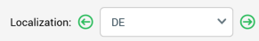
The localization toolbar is only displayed if system configuration setting RegionLanguageCodes has been set. It allows you to change the localized variant of the asset currently displayed in the Preview tab. This will change the content served by embedded localization assets in accordance with the selected region code.
It exposes the following options:
-
Previous Localized Content Variant: this button is available when a variant other than the Default is selected. Selecting it displays the previous variant as listed in the dropdown.
-
[Dropdown]: this property lists the variants defined at
RegionLanguageCodes. Variants are presented in alphabetical order, with “Default” being displayed first. You can use the dropdown to change the displayed variant. -
Next Localized Content Variant: this button is available when a variant other than the last alphabetically is selected. Selecting it displays the next variant as listed in the dropdown.
Tab set
The tab set exposes Text, Preview, and All Localized Variants tabs. Each are described below.
Text tab
The Text tab contains a content editor, which is described within the RPI Content Editor documentation.
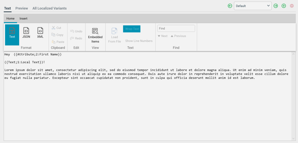
You can customize the content displayed within a text asset through the inclusion of attributes (including web form parameter attributes, if the asset is to be used e.g. in an email offer) and smart assets that contain text content.
You can drag a localization asset into text asset content. When you do so, an Add Localized Text Content inline dialog displayed.
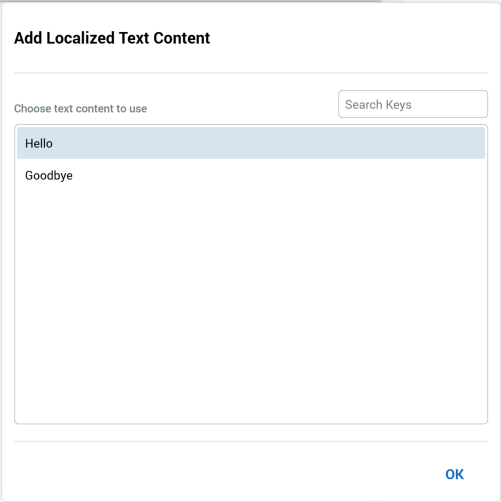
It allows you to choose which of the localized text elements defined at the asset you wish to add, and contains the following:
-
Search Keys: this textbox allows you to dynamically filter the list of keys displayed in the dialog by entering a search string.
-
List of keys
-
OK button
You can select a key and click OK to include the text string within the content. If you click off the dialog, it is removed from display and the first string in the list is added to the content.
Note that placeholder attributes can be used in text asset content only if exposing system variable values. For information on system variables, please see the Framework documentation.
Preview tab
The Preview tab allows you to visualize how the text asset will be rendered. It consists of preview and parameters panels.
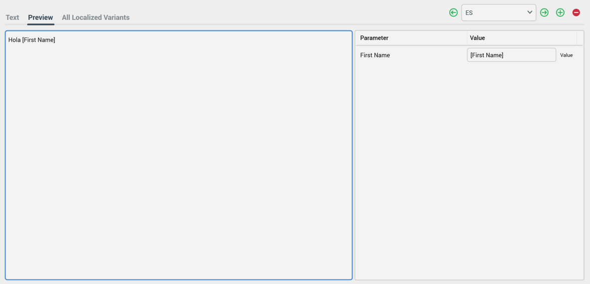
-
Preview panel: the contents of the text tab are shown, with any parameter values supplied included therein.
-
Parameters panel: You can specify parameter values for the attributes you have included in order to give an illustration of the asset’s final appearance. Provision of preview values is constrained by data type (string, integer, decimal or date/time).
By default, an attribute’s value is shown as [attribute name]. The preview is updated with a new parameter value immediately as you type.
By default, parameter values are specified using raw database values, rather than translated values (where they exist). You can toggle between ‘Value’ and ‘Trans’ (translation) using the button shown to the right of the parameter. If you elect to specify the parameter’s value using a translation, a dropdown, listing translated and raw values, is shown. Note, however, that when you choose a translated value, the raw value is shown in the preview; RPI only supports the output of raw database values, and not translated values.
All Localized Variants tab
This tab lists read-only representations of all localized content variants in alphabetical order.
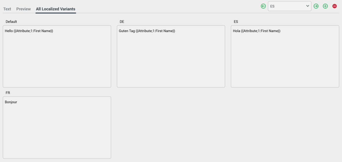
Up to three asset variants are shown per line.