

Overview
A dashboard is made up of a series of widgets.
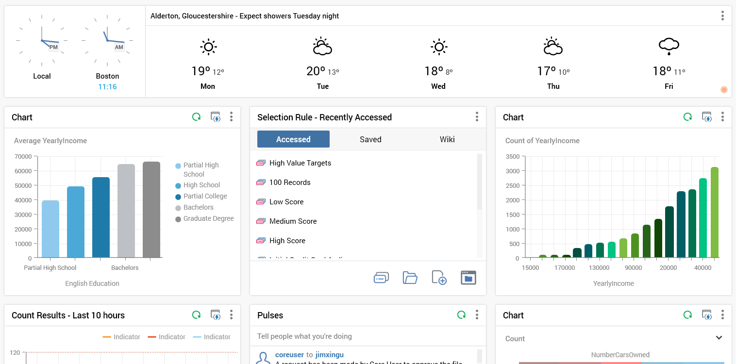
The following types of widget are available:
-
Channel Overview: this widget allows you to select a channel, and then view its results over time using chart types of your choosing.
-
Chart: allows you to select an attribute and view a visual representation of the breakdown of its values. You can optionally select a function attribute, and view aggregated counts based on the same.
-
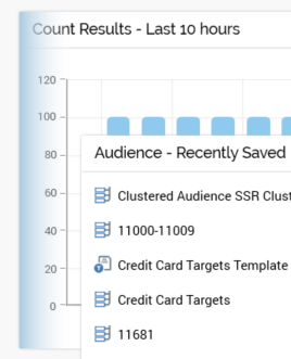
Count Results: this widget allows you to choose one or more selection rules, and the view counts and aggregated counts across time using chart types of your choosing.
-
File Approval: displays lists of files in respect of which a user’s attention is required, either as an approver, or as an approval requester.
-
File Type: allows you to choose a file type in respect of which to gain easy access to tasks, recent examples thereof, linked widget pages, etc., all from the context of a dashboard.
-
News Reader: this widget allows you display entries from an RSS feed in a dashboard.
-
Pulses: facilitates communication between team members using RPI’s Pulses feature.
-
Tasks: this widget can be configured with a series of tasks (e.g. Open Audience) and/or files of your choosing, thereby providing easy access to the same from a dashboard.
-
Time and Weather: this widget allows you to display world clocks, and/or a weather forecast for a location of your choice.
-
Twitter Feed: allows you to select a Twitter channel, associated with a Twitter feed, and then view the tweets made by that channel. Also allows you to specify a keyword, search for Twitter posts containing the same, and display them in the widget.
Adding widgets
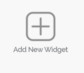
A dashboard consists of a number of widgets, each configured as required. No widgets are initially present within a new dashboard. You can select the Add New Widget button to initiate the process of adding a new widget to a dashboard.
When you do, the Add New Widget overlay is shown.
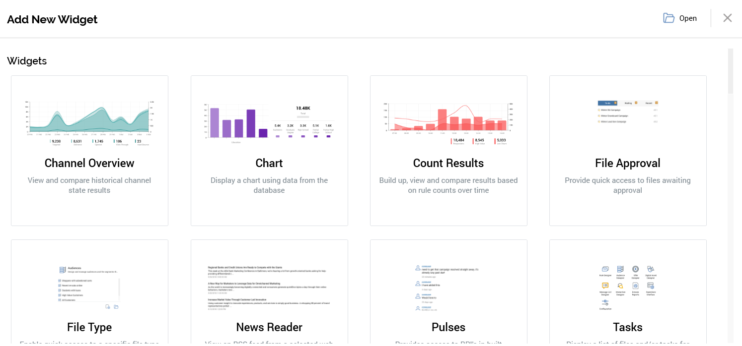
The overlay allows you to add a new or saved unconfigured or pre-built widget to the dashboard. It contains the following:
-
Open: this button allows you to add a widget to the dashboard from a file saved to the RPI file system. Selecting the button presents an Add Widget File System Dialog. Only Widget files are displayed therein. You can select a saved widget and select OK to add it to the current dashboard. Note that any changes made to a widget sourced from the file system are not saved back to the persisted file.
-
Cancel: removes the overlay from display without adding a widget.
-
The initial Widgets section allows you to add the following types of widget:
-
Channel Overview
-
Chart
-
Count Results
-
File Approval
-
File Type
-
News Reader
-
Pulses
-
Tasks
-
Time and Weather
-
Twitter Feed
-
You can also add a Header.
Having elected to build your own widget, a configuration overlay is displayed. Each widget type’s configuration is documented separately.
The subsequent sections allow you to add pre-configured widgets to the dashboard:
-
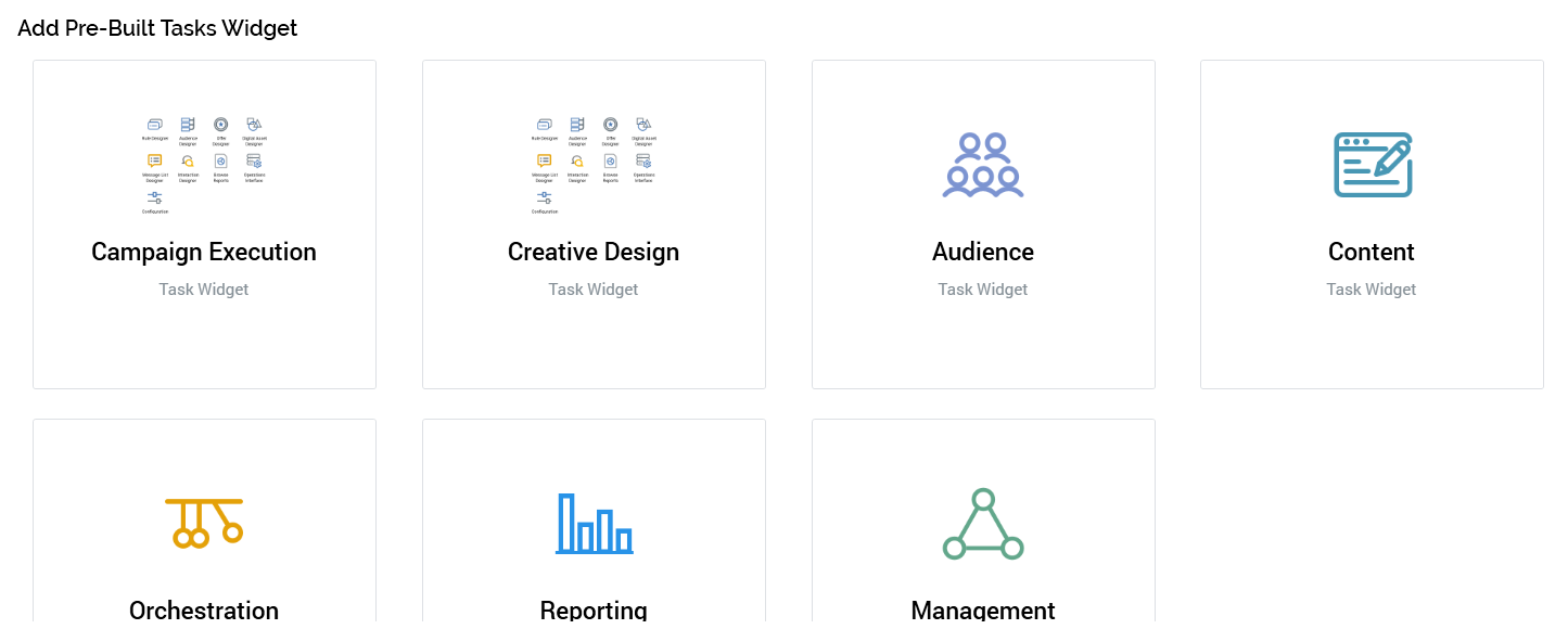
Add Pre-Built Tasks Widget: a series of options are displayed:
-
Campaign Execution
-
Creative Design
-
Audience
-
Content
-
Orchestration
-
Reporting
-
Management
-
-
Add Pre-Built File Type Widget
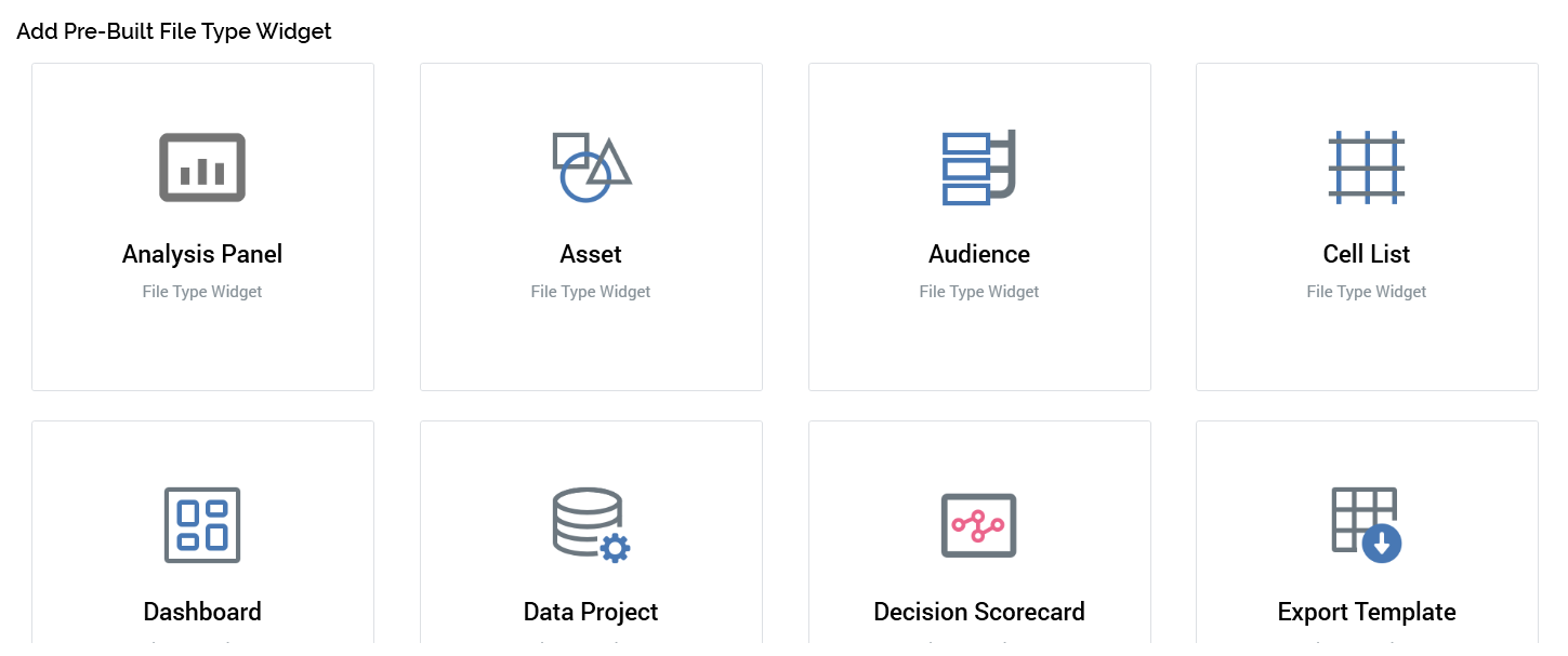
One option per file type (to which the user has access) is displayed. Choosing an option adds a file type widget to the dashboard, which is pre-configured with the selected file type.
-
Add Pre-Built Channel Overview Widget
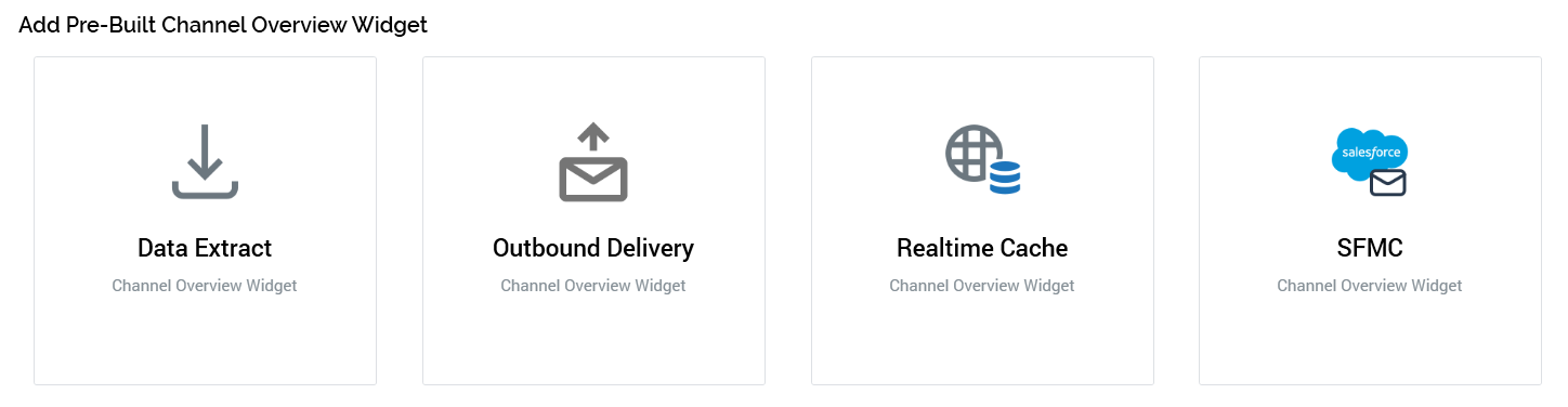
One option per existing channel is selected. Choosing an option adds a channel overview widget to the dashboard, which is pre-configured with the selected channel.
If you elect to add a pre-built widget, it is added immediately to the dashboard without display of its configuration overlay.
The maximum number of widgets and headers that can be added to a dashboard is controlled by system configuration setting MaxDashboardWidgets.
You can re-order the widgets and headers shown within a dashboard using drag and drop. When you do so, shading indicates where the object being moved can be dropped.
A No drop cursor is shown where dropping would be inappropriate.
Configuration overlay
All widgets are configured using a configuration overlay, which is displayed:
-
On electing to build your own widget. The new widget is added to the bottom of all existing widgets with the configuration overlay visible.
-
On selecting Configure at an existing widget displayed within a dashboard. The configuration overlay is displayed over the widget at its original position
The widget configuration overlay consists of a header, left-hand properties toolbox and right-hand preview panel.
A side-arrow button facilitates the hiding and showing of the properties toolbox at some widgets:
The header is shared by all widget configuration overlays; properties and preview panels are unique to each widget type, and are described on a widget-by-widget basis.
Having added a new widget, or having made changes to its configuration, you can select the Done button to the top right to save your changes and show the widget in display mode.
Configuration Overlay Header
The configuration overlay’s header contains the following:
-
Widget type: read-only
-
Title is hidden/visible: this dropdown allows you to specify whether a title should be displayed at the widget. The title is visible at a new widget unless stated otherwise within this documentation. The widget's title is shown or hidden in both display and configure mode in accordance with this setting.
-
Set manually/Generated automatically: this dropdown is displayed if the widget's title is visible. It is set to “Generated automatically” unless stated otherwise within this documentation. If set manually, the Title property is writeable. If generated automatically, the widget's title is set by default to the name of the widget type unless stated otherwise in this documentation.
-
Title: if writeable, this property is optional, and accepts a maximum of 100 characters.
-
Validation errors: this indicator is only displayed if one or more errors are present in the widget's configuration. You can select the indicator to view details of the validation issues in a dialog.
-
Refresh: selecting this button refreshes the widget with its latest available data.
-
Share as Pulse: this button is shown at the Chart, Count Results and Channel Overview widgets. It allows you to share an image of the current state of a widget as a Pulse message. Sharing of widget content as a Pulse is discussed in its own section within this documentation.
-
Actions: this context menu exposes the following options:
-
Display Size: allows the widget's size to be defined as one of:
-
Normal
-
Wide
-
Entire Width
-
-
Copy Image to Clipboard: invocation copies an image of the widget to the clipboard and displays an informational message.
-
Save As: selecting this button displays the Save Widget As File System Dialog, facilitating the saving of the widget as an autonomous file in the RPI file system. When saved, the file has a type of Widget, and a sub-type as per the type of widget in question. Note that you cannot open a widget file directly.
-
Clone: selecting this button creates an exact copy of the current widget, and places it in the next ordinal position in the current dashboard. Clone is not available when the maximum number of widgets are already present in the dashboard.
-
Remove: selecting this button removes the widget (and all of its associated configuration) from the dashboard. Remove is protected by an “Are You Sure?” dialog.
-
-
Done: selecting this button removes the configuration panel from display, and presents the widget in display mode.
Display mode
When in display mode, the widget is shown in accordance with its current configuration, and any functionality it affords is available to the user.
The following are available at a widget’s toolbar when displayed in a Dashboard (permissions notwithstanding):
-
Refresh: available at relevant widgets. Selecting this button refreshes the widget with its latest available data.
-
Share as Pulse: this button is shown at the Chart, Count Results and Channel Overview widgets. It allows you to share an image of the current state of a widget as a Pulse message. Sharing of widget content as a Pulse is discussed in its own section within this documentation.
-
Options: selecting this button displays a context menu.
-
Configure: displays the widget's configuration overlay.
-
Size: allowing the widget’s size to be defined as Normal, Wide, or Entire Width.
-
Copy Data to Clipboard (where applicable): invocation copies the current data to the clipboard and displays an informational message. Data is copied in a tab-delimited format.
-
Copy Image to Clipboard: invocation copies an image of the widget to the clipboard and displays an informational message.
-
Save As: selecting this button displays the Save Widget As File System Dialog, facilitating the saving of the widget as an autonomous file in the RPI file system. When saved, the file has a type of Widget, and a sub-type as per the type of widget in question. Note that you cannot open a widget file directly.
-
Clone: selecting this button creates an exact copy of the current widget, and places it in the next ordinal position in the current dashboard. Clone is not available when the maximum number of widgets are already present in the dashboard.
-
Remove: selecting this button removes the widget (and all of its associated configuration) from the dashboard. Remove is protected by an “Are You Sure?” dialog.
-