

Overview
The page layout section is shown to the left of the HTML content workspace:
It contains the following elements:
-
Toolbar
-
Cells (Pre-built or HTML template)
-
Tab set
Toolbar
A toolbar is shown at the top of the Page Layout section.
It exposes the following options:
-
Add a new cell: this button is only available when a Pre-built page layout is selected. Selecting it adds a new cell to the page layout panel, at the first available empty position as defined by the rows/columns grid. The new cell occupies one grid cell only. The option is available when one or more available empty positions exist. Available positions are populated from the top left, then across the row.
-
Remove the selected cell: this button is only available when a Pre-built page layout is selected. It is available when a cell is selected in the page layout panel. Invocation removes the selected cell from the panel. Any content therein is lost.
-
Choose page layout: this button allows you to choose a page layout for the offer. Selecting it displays the Choose Page Layout dialog, which is covered separately.
-
Hide/Show: selecting this button when the Page Layout section is shown causes it to be hidden.
-
Page Layout: A vertical "Page Layout" button is displayed to the left of the cell editor, at which you can select Show to redisplay the Page Layout section.
Choose Page Layout dialog
The Choose Page Layout dialog allows you to select a page layout upon which to base your email offer.
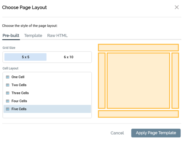
The dialog contains the following:
-
Choose the style of the page layout: you can select from a Pre-built, HTML template or Raw HTML based layout (the most-recently used grid layout is selected by default).
When specifying a Pre-built layout, the following are shown:
-
Grid size: two grid sizes—5x5 (the default) and 6x10—are available for your selection.
-
Cell layout: you can specify a one- to five-cell layout for your offer.
-
Grid preview: when you select a Cell layout, a preview representation thereof is shown to the right of the dialog.
HTML template
When specifying an HTML template-based layout, the following are shown:
-
Toolbar: exposing the following options:
-
Previous Page: this button is available when a page other than the first is displayed. Selecting it displays the previous page's worth of HTML templates. The page size controlled by system configuration setting
MaxFileSearchPageSize. -
Next Page: this button is available when a page other than the last is displayed. Selecting it displays the next page's worth of HTML templates. The page size controlled by system configuration setting
MaxFileSearchPageSize. -
Browse: selecting this button displays the Choose HTML Template File System Dialog, which is limited to the display of asset files only. You can select an HTML template to use. If you select a non-template HTML asset, a warning is displayed. If you select a non-HTML asset, a warning is also displayed.
-
-
Choose the template to use: a list of all HTML assets defined for use as HTML templates across all accessible folders in file system is displayed. A thumbnail is shown for each. Templates are listed in alphabetical order, and an informational tooltip is displayed on hover. The following context menu options are available when you right-click an HTML template:
-
View File Information…
-
Open File Location…
-
Open Latest Version
-
You can select the HTML template you wish to use by selecting it. Doing so turns on the Apply Page Template button.
Raw HTML
When specifying a Raw HTML-based layout, the following are shown:
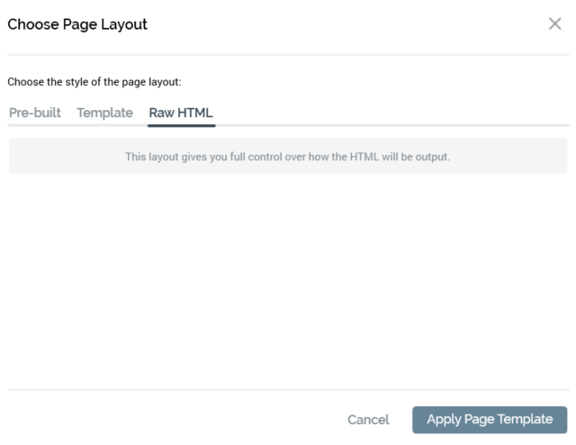
Having chosen to use Raw HTML, you have full control over the structure of the HTML email’s <body> tag.
Two buttons are shown at the bottom of the dialog:
-
Apply Page Template: having specified a grid layout or chosen an HTML template, selecting this button applies your selection to the email offer. When you do so, all previous content that you entered will be lost; an "Are You Sure?" dialog asks you to confirm that you wish to proceed.
-
Cancel: invocation of this option removes the dialog from display without applying the layout change (selecting off the dialog has the same effect).
Note that, on creation of an email offer, following clearing of the Email Properties dialog, the Choose Page Layout dialog is displayed. This applies only if the last layout used was Pre-built or HTML Template; the dialog is not shown if the last layout used was Raw. Within the dialog, the most recently-used option is selected automatically.
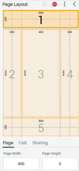
Grid
When a grid-based cell layout is selected, the Page Layout section appears as follows:
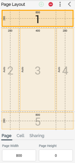
The following are shown:
-
Toolbar: exposing three options and covered separately.
-
Cells list: cells are shown below the Page Layout toolbar. Each cell is automatically assigned an ordinal number, which is incremented or decremented as cells are added and removed. You can populate a cell directly with an asset (other than a web form asset) or smart asset by dragging the required file from the toolbox and dropping it onto a cell. When you do so, any existing content in the cell is lost, and the file's name is displayed below the cell number. You can also select a cell within the cells grid. When you do so, the Cell Editor section is populated with the contents of the selected cell. A context menu is shown when you right-click a cell in a grid-based layout, exposing a single option:
-
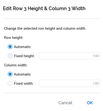
Edit row/column size: selecting this button displays the Edit Row [y] Height & Column [x] Width dialog.
The dialog allows you to set the following cell properties:-
Row height: two buttons allow you to specify that the row’s height should be set automatically (in accordance with the overall page height), or to a fixed value. If the latter is selected, you must specify a value, which defaults to 100, and which must be greater than or equal to 50.
-
Column width: as row height.
-
-
-
Tab set: covered separately.
HTML template
When an HTML template-based cell layout is selected, the Page Layout section appears as follows:
The following are shown:
-
Toolbar: exposing a single option (Choose page layout). Covered separately.
-
Message: advising you to "Select a cell to edit its contents".
-
Cells list: each cell within the HTML template is listed, in the order in which it appears therein. The currently-selected cell is selected. The following properties are shown for each:
-
Thumbnail: a thumbnail image provides an impression of the position of the cell (shown in yellow) within the HTML template relative to the other cells therein (displayed in gray).
-
Name
-
Description
-
You can select a cell, and then enter content manually therein using the Cell Editor. You can also assign an asset or smart asset directly to an HTML template cell. Note that, if you wish to edit the properties of a directly-assigned image asset, you should access it via the Embedded Items dialog.
A validation error is raised if you configure a cell with an HTML asset that is defined as for use as an HTML template.
-
Tab set: covered separately.
Page Layout: Tab set
The tab set is displayed below the Cells list. It contains the following tabs:
-
Page
-
Cell
-
Sharing
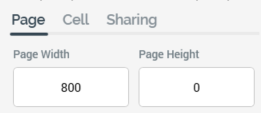
Page tab
This tab allows you to control the dimensions of the email page itself.
If a grid-based page layout is selected, the tab contains the following:
Size
Displayed as [Width] x [Height].
[Width] is a mandatory numeric property with a maximum value of 5000, a minimum value of 400 and a default value of 800. If the page's width is defined as less than or equal to the sum of the widths of columns 1, 2, 4 and 5, an asterisk is appended to widths as shown in page layout cells.
If the width is less than the sum of the widths of columns 1, 2, 4 and 5, the total of widths shown in page layout cells are set to the sum of the widths of the aforementioned columns.
[Height] is a mandatory numeric property with a maximum value of 5000 and a default value of 0. When the page's height is less than or equal to sum of the heights of rows 1, 2, 4 and 5, row 3's height is shown as “Auto”. When it exceeds that value, row 3's actual height is displayed, and is calculated as the sum of the heights of rows 1, 2, 4 and 5.
HTML template-based page layout
If an HTML template-based page layout is selected, the tab contains the following:
-
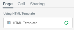
Using HTML template: the name of the currently-selected HTML template is shown. You can open the latest version of the template in the Asset Designer. You can also view information about the template in the File Information Dialog.
-
Refresh template: applies the latest version of the template to the current email offer.
Cell tab
This tab allows you to control the size and position of the cells that make up the email’s layout, using two sets of arrow controls. Cell sizes and positions are based on the underlying dashed grid.
If a grid-based page layout is selected, the tab contains the following:
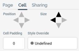
-
Position: set using up, down, left and right arrow controls. The controls are only available if the cell size is less than the available area within the page layout. Individual arrow controls are available in accordance with the current cell position. You can move the cell within the available area. Arrows are available or unavailable when the cell is moved to its new position.
-
Size: set using up, down, left and right arrow controls. The controls are available in accordance with cell's size compared to its current position. You can increase or decrease a cell’s size one column or row at a time. Cell size is increased or decreased from its right or bottom boundary. Note that you cannot change a cell's height when set to 'Auto'. The minimum cell width is one column, and the minimum cell height is one row.
-
Cell padding: you can specify an integer cell padding value on a cell-by-cell basis. Cell padding can be used to surround a cell with an empty border of a given number of pixels.
-
Style override: if you wish, you can optionally apply a CSS (Cascading Style Sheets) style directly to the cell.
HTML template-based page layout
If an HTML template-based page layout is selected, the tab contains the following:
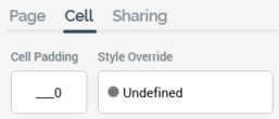
-
Cell padding: as per grid-based page layout.
-
Style override: as per grid-based page layout.
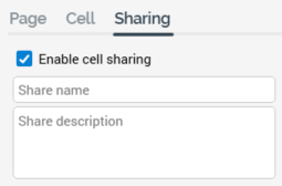
Sharing tab
The third tab allows you define cells as shareable. Shared cells are used when including a Share (to Facebook or Twitter) Content button in email content. A cell that is marked as shareable can be specified in the button’s configuration. On receipt of an email containing such a button, and on selecting the same, the user is able to share the content of the cell in question to his or her Facebook page or Twitter account.
The tab’s contents are identical, irrespective of whether a grid- or HTML template layout is currently selected:
-
Enable cell sharing: this checkbox, which is unchecked by default, allows you to define that the cell is shareable.
-
Share name: this field allows you to provide a name for the share, to be used when configuring a Share Content to Facebook or Twitter button, and also when viewing the cell’s contents in the View Embedded Items dialog. It is available when Enable cell sharing is checked, and, when so, is mandatory. The field accepts a maximum value length of 100 characters.
-
Share description: this field allows you to provide an optional description to accompany the Share name. The field is available when Enable cell sharing is checked, and its maximum length is 1000 characters.