Overview
The Preferences interface contains several tabs. The contents of each tab are detailed below.
Preferences
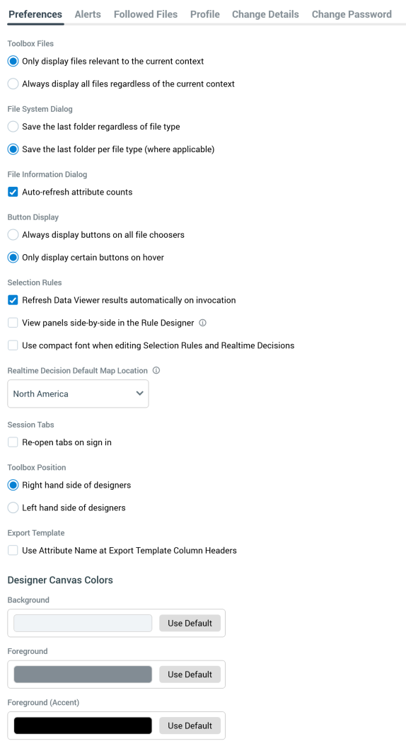
The Preferences tab allows you to manage the following settings for your RPI user account:
-
Toolbox Files: this option is accompanied by two mutually-exclusive radio buttons:
-
Only display files relevant to the current context: the default option. When selected, designers’ toolboxes only display files of types that are appropriate to designer in question; for example, attribute and selection rule files are shown in the Rule Designer, but interactions are not.
-
Always display all files regardless of the current context: when selected, designers’ toolboxes display all files, irrespective of their relevance to the designer in question; for example, interaction files are displayed in the Rule Designer, despite the fact that they cannot be used in that context.
-
-
File System Dialog: this property is accompanied by two mutually-exclusive radio buttons:
-
Save the last folder regardless of file type: selected by default. When this option is chosen, on invocation of the File System Dialog from the main RPI toolbar, an Open command within a designer, or at a file property, the folder displayed is accordant with the most recently-accessed folder within the most recent previous File System Dialog session.
-
Save the last folder per file type (where applicable): when this option is selected, the most recently-accessed folder is persisted on a file type-by-file type basis. This applies when opening a file in a designer, or when setting a file property.
For example, the most recently-accessed folder, as displayed on invocation of the File System Dialog, is persisted separately at the Offer Designer and at the Interaction Designer (meaning that different folders can be displayed on invocation of the File System Dialog in these two contexts).
-
-
File Information Dialog: this section contains a single property:
-
Auto-refresh attribute counts: this checkbox is checked by default. When checked, on first viewing an attribute’s Summary or Values tabs in the File Information Dialog within an RPI session, attribute values are displayed without need to refresh manually. When unchecked, a message explaining that a manual refresh is required is shown prior to values being displayed.
-
-
Button Display: this option is accompanied by two mutually-exclusive radio buttons:
-
Always display buttons on all file choosers.
-
Only display certain buttons on hover: selected by default.
-
There are certain property contexts within RPI where buttons are hidden unless hovered over (to maximize the user interface’s clean appearance). This setting provides control over whether to display buttons in this manner, or to show them at all times. The setting is applied immediately upon clicking Apply Changes – the RPI client does not need to be restarted. Any such properties already displayed within an open tab will not be affected by a change to this property.
-
Selection Rules: this section contains the following properties:
-
Refresh Data Viewer results automatically on invocation: this checkbox is checked by default. When checked, on Data Viewer invocation, the interface is populated with results automatically. If unchecked, results must be refreshed manually.
-
Note that this property is not shown if working in a NoSQL environment.
-
-
View panels side-by-side in the Rule Designer: this checkbox, which is unchecked by default, allows you to choose between whether to display a single panel horizontally at a time within the Rule Designer, or whether multiple rules can be shown side by side.
-
Hover over the information tooltip to view the following note: The side-by-side mode requires the application to run within an effective horizontal resolution of at least 1,500px.
-
When the property is checked, Use compact font... is checked and read-only.
-
-
Use compact font when editing Selection Rules and Realtime Decisions: this checkbox, which is unchecked by default, allows you to specify whether to use a larger or more compact font when viewing and editing rules and panels in the Rule Designer. The property is checked and read-only when View panels side-by-side... is checked.
-
-
Realtime Decision Default Map Location: this setting defines the default location that will be shown when creating a new Geolocation criterion in a Web Realtime Decision. A dropdown property, is exposes the following values:
-
Africa
-
Asia
-
Australia
-
Europe
-
North America (the default)
-
South America
-
United Kingdom
-
-
Session Tabs: this property is accompanied by a checkbox:
-
Re-open tabs on sign in: this checkbox is unchecked by default. When checked, at next sign in, any open tabs (at the point at which the RPI client was shut down) are re-opened automatically.
If a file was unsaved at the point of its being closed, if changes were saved, the file is displayed in the opened tab. If changes were abandoned, if the file had already been saved to the RPI file system, it is displayed without changes. If never saved, the file is not displayed (an empty designer instance is shown instead).
-
-
Toolbox Position: this property allows you to specify whether to display the designer toolbox to the right (the default) or to the left. Two accompanying radio buttons allow you to define your preference.
-
Export Template section: this section contains a single property:
-
Use Attribute Name at Export Template Column Headers: this checkbox is unchecked by default. When unchecked, when adding an attribute to an export template, RPI will use the attribute's database column name at the Header Row Value property. When checked, the attribute name's will be used instead. Any non-database field name compatible characters are replaced by underscores. If the attribute name is more than 50 characters in length, the first 50 characters are used.
-
-
Designer Canvas Colors section: this section contains three properties, which allow you to specify the following colors within the application:
-
Background: note that this is not applied at the Rule Designer.
-
Foreground
-
Foreground (accent)
-
Each is set using a Choose Designer Canvas Color dialog. Each property is accompanied by a Use Default button, which you can click to revert to the application’s original color selection.
Alerts
The Alerts tab allows you to subscribe to various types of alerts generated automatically upon the occurrence of certain events within RPI.
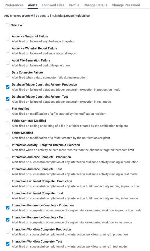
A checkbox is displayed alongside each alert type; by default, all are unchecked. You can choose the type of alerts to which you which to subscribe by checking the relevant boxes. A Select All checkbox allows for quick subscription to all alert types.
A label at the top of the interface states that ‘Any checked alerts will be sent to [your registered email address]’.
A list of available alert types is displayed:
-
Audience Snapshot Failure: alert fired on failure of any Audience Snapshot. This alert is not available when working in a NoSQL environment.
-
Audience Waterfall Report Failure: alert fired on failure of audience waterfall report
-
Audit File Generation Failure: Alert fired on failure of audit file generation
-
Channel Targeted Threshold Exceeded: alert fired when an activity targets more records than its channel's defined Targeted warning threshold. Separate Production and Test alerts are provided.
-
Data Connector Failure: alert fired when a data connector fails during execution.
-
Database Trigger Constraint Failure - [Production/Test]: alert fired on failure of database trigger constraint execution in [production/test] mode.
-
File Modified: alert fired on modification of a file created by the notification recipient.
-
Folder Contents Modified: alert fired on addition or deletion of a file in folder created by the notification recipient.
-
Folder Modified: alert fired on modification of a folder created by the notification recipient.
-
Interaction Activity Complete - Target Threshold Exceeded: Alert fired when an activity selects more records than the channels targeted threshold limit.
-
Interaction Audience Complete - Production: alert fired on successful completion of any interaction audience activity running in production.
-
Interaction Audience Complete - Test: alert fired on successful completion of any interaction audience activity running in test mode.
-
Interaction Fulfillment Complete - Production: alert fired on successful completion of any interaction fulfillment activity running in production.
-
Interaction Fulfillment Complete - Test: alert fired on successful completion of any interaction fulfillment activity running in test mode.
The following elements of the emails sent upon the triggering of the alerts above can be customized in the Interaction Designer’s triggers’ Alerts tabs:
-
Custom email subject text
-
Custom email content heading
For more information, please see the Interaction Designer documentation.
An Excel spreadsheet is attached at the alert emails above. It is named “[Interaction Name] - [Activity Name] - [GUID].xlsx”. If an audience alert, it contains Audience metadata and Audience counts tabs; if a fulfillment activity alert, a single Fulfillment counts tab.
In addition to standard alert email details, the alerts above also include log messages relating to the execution of the activity in question.
-
Interaction Recurrence Complete: alert fired on completion of recurrence of a single-instance recurring workflow. Alerts for the following modes are available:
-
Test
-
Production
-
-
Interaction Workflow Complete: alert fired on successful completion of an interaction workflow. Alerts for the following modes are available:
-
Test
-
Production
-
-
Interaction Workflow Failure: alert fired on any failure of an interaction workflow. Alerts for the following modes are available:
-
Test
-
Production
-
If system configuration setting InteractionFailureAlertsAttachZip is set to True, on receipt of an interaction failure alert email, the email includes a .zip attachment, named '[Interaction name]-[Trigger name]-[GUID]'. The zip file contains a folder, within which are presented the following files, which can be used to assist diagnosis of why the failure occurred:
-
AuditHistory.txt
-
ExecutionPlan.txt: used by the Execution Service to execute activity within the workflow.
-
ExecutionSchedule.txt: the state of activity execution at the Execution Service.
-
Interaction Workflow.json: a dump from the table of the same name.
-
QueryTrace.txt
-
ServerLog.txt
-
Summary.txt: high-level summary information.
-
SystemHealth.json
-
Telemetry.txt
-
For each audience/fulfillment activity:
-
Audience: dump from the DataWorkflow table.
-
Instance: serialized activity details.
-
Log: relating to the current activity's execution.
-
-
Files: the exported interaction files.
-
Interaction Workflow Pause: alert fired on pausing of any interaction workflow or activity. If the pause was initiated – manually or automatically – at an activity, the activity’s log details are appended to the email. Alerts for the following modes are available:
-
Test
-
Production
-
-
License expiry: this option provides for the firing of a daily alert email when the current RPI server is within 30 days of its license expiring. The email includes the license type, date of expiry and number of days to expiry.
-
Long Running Interaction Activity: alert fired when interaction activity execution duration exceeds a configured threshold. Alerts for the following modes are available:
-
Test
-
Production
-
When activity execution duration exceeds the value set at system configuration setting LongRunningActivityThreshold, an alert email is sent. This applies at interaction execution in both Test and Production mode, as well as at audience testing.
-
Long Running System Task: alert fired when system task execution duration exceeds a threshold defined by system configuration setting LongRunningTaskThreshold.
-
Pulse – Direct receipt: alert fired on receipt of any pulse that was sent directly to me (only displayed if system configuration setting EnablePulseMessages is set to True).
-
Pulse – Related object: alert fired on receipt of any pulse with an attached object created or modified by me (N.B. – only if modified by another user; only displayed if system configuration setting EnablePulseMessages is set to True).
-
System Health – Attention Required: alert fired when one of the System Health checks requires immediate attention.
-
System Health – Warning: alert fired when one of the System Health checks enters the warning state.
The following alerts can be published to a Google PubSub queue. More information on how to do this can be found in the RPI Admin Guide.
-
Audience Snapshot Failure
-
Data Connector Failure
-
Interaction Activity - Targeted Threshold Exceeded
-
Interaction Workflow Complete - Production
-
Interaction Workflow Complete - Test
-
Interaction Workflow Failure - Production
-
Interaction Workflow Failure - Test
-
Interaction Workflow Pause - Production
-
Interaction Workflow Pause - Test
-
Long Running Interaction Activity - Production
-
Long Running Interaction Activity - Test
-
Long Running System Task
-
System Health - Attention Required
-
System Health - Warning
Followed Files
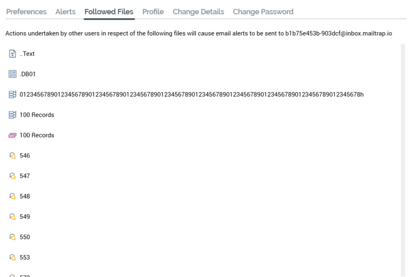
This tab displays all files you are currently following. Files are listed alphabetically. For each, the following are displayed:
-
Icon
-
Name
-
Unfollow File: this button is displayed on hover. Clicking it unfollows the file and removes it from the Followed Files list. A confirmatory message is displayed.
A context menu is available at files within the list, with the available options being dependent on the file's type.
Note that an alert will be sent when the duration of execution of an activity within a followed interaction exceeds the value defined at system configuration setting LongRunningActivityThreshold.
Profile
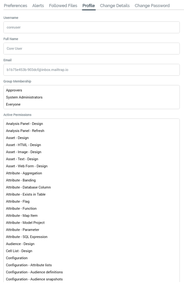
The Profile tab displays the following read-only information:
-
Username
-
Full Name
-
Email
-
Group Membership
-
Active Permissions
Change Details
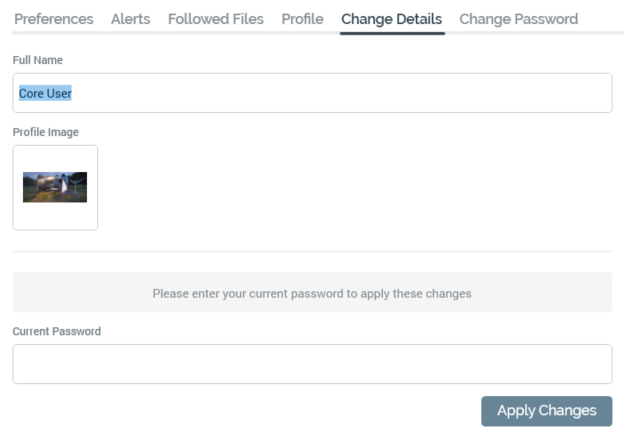
This tab allows you to update the following:
-
Full Name (display) (mandatory, maximum 256 characters).
-
Profile Image. Your image is used when you post a pulse within a pulses widget or the Pulses window (or when the system does so on your behalf).
-
A default image is provided for a newly-created user. You can click the image to change it. Doing so displays the Choose Profile Image Windows file system dialog. By default, the dialog is limited to the display of image files only. You can select an image in the dialog and confirm your selection by selecting Open (note that an attempt to select a non-image file results in the display of a warning message). Following selection of the image, it is resized to icon size and is displayed in the Change Details interface. You can also cancel the Choose Profile Image dialog, which retains your original image.
-
You must supply your Current password prior to the application of changes. A warning message is displayed when Caps Lock is on and focus is in the Current password field:
'Caps Lock is On. Having Caps Lock on may cause you to enter your password incorrectly. 'You should press Caps Lock to turn it off before entering your password.'
Clicking Apply Changes saves any changes you have made.
Change Password
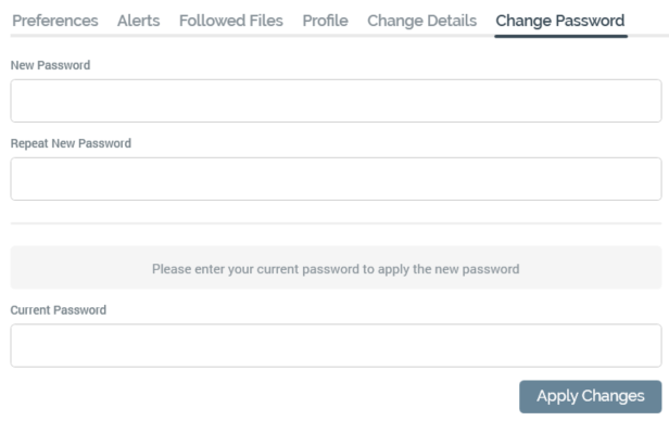
This tab allows you to change your password by inputting your current password, new password and repeat new password.
The password supplied must be accordant with the currently-defined password policy (please contact your system administrator for further information).
A warning message is displayed when Caps Lock is switched on and focus lies upon the password fields.
Selecting Apply Changes saves any changes you have made.

