

Overview
Each widget contains two views: the configuration overlay and display mode.
Configuration overlay
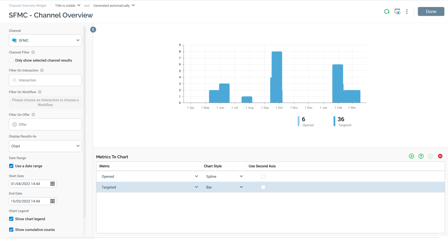
The Channel Overview widget configuration overlay contains the following elements.
Properties toolbox
-
Channel: this dropdown field lists all of the currently-configured channels. You can select a channel with which to configure the widget. When you do so, one or more Metrics to Chart, appropriate to the channel in question, are added to the grid of the same name. Any existing metrics in the same context are cleared automatically when you change Channel.
-
Channel Filter: a checkbox, which is unchecked by default. If the property is checked, the widget chart displays results for only the selected channel; if not, results for all channels of that type are shown.
-
Filter On Interaction: you can optionally browse for an interaction by which to filter the widget's results. Having selected an interaction, you can open its latest version in the Interaction Designer. You can also clear your selection.
-
Filter On Workflow: prior to selection of an interaction at the Filter on interaction property, the message "Please choose an Interaction" is displayed at this property. On selection of an interaction, the message is replaced by a dropdown, in which all workflows in the selected interaction are listed (along with a default blank value). Each is accompanied by a trigger-specific icon. You can optionally select a workflow by which to further filter the widget's results; having done so, you can clear your selection. Note that if the selected interaction contains no workflows, the message "No workflows available" is displayed.
-
Filter On Offer: you can also optionally browse for an offer by which to filter the widget's results. Having done so, you can open its latest version in the Offer Designer. You can also clear your selection.
-
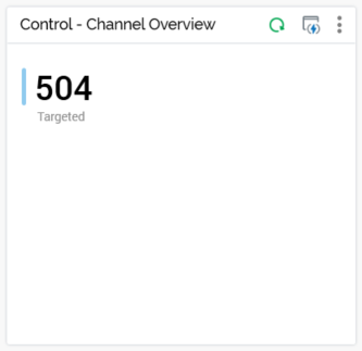
Display Results As: this dropdown field exposes values Chart (the default) and List of latest values.
-
When Chart is selected, the widget is rendered as a chart.
-
When List of latest values is selected, the Show last and Show chart legend properties are hidden at the widget configuration panel, and the Chart Style and Use Second Axis columns are disabled in the Rules to Chart grid.
-
-
Date Range: this property contains a Use a date range checkbox. It is unchecked by default. When unchecked, the Show Last property is displayed, and Start and End date are hidden. When checked, Show Last is hidden and Start and End date are displayed.
-
Start Date: this property is shown when Use a date range is checked. A date/time field, it allows you to specify a start date for the data to be displayed in the chart. It defaults to now - 4 weeks.
-
End Date: this property is shown when Use a date range is checked. A date/time field, it allows you to specify an end date for the data to be displayed in the chart. It defaults to now.
-
Show Last…day(s): this property is shown when Use a date range is unchecked. An integer property, it allows you to define the timespan over which channel results are to be displayed. It defaults to 14 days, and accepts values from 1 to 31.
-
Show chart legend: this checkbox, checked by default, controls display of the chart legend at the widget.
-
Show cumulative counts: this checkbox is unchecked by default. When checked, count values shown at the chart legend reflect totals of all displayed counts, rather than the most recently-available counts.
-
Chart Palette: this dropdown field allows you to choose the color scheme to be shown at the widget's chart. It defaults to the Arctic palette.
Preview
A preview of the widget is displayed to the top right.
Metrics to chart
This property allows you select the channel-specific metrics that are to be displayed in the widget's chart. It consists of a toolbar and a grid.
-
Toolbar: exposing to following options:
-
Add new Metric to chart: this button is enabled when a Channel has been selected. Selecting it adds a new row to the bottom of the grid. The new row's Metric property is set to a value appropriate to the selected channel, and its Chart Style is set to Spline.
-
Move selected Metric up: this button is enabled when a metric other than the first in the list is selected. Selecting it moves the selected metric up one position in the grid.
-
Move selected Metric down: this button is enabled when a metric other than the last in the list is selected. Selecting it moves the selected metric up one position in the grid.
-
Remove selected Metric: this button is enabled when a metric is selected in the grid. Selecting it removes the selected metric from the Metrics to Chart grid without display of an "Are You Sure" dialog.
-
-
Grid: containing the following columns:
-
Metric: a dropdown, which lists the states and metrics associated with the currently-selected channel, along with some channel-specific derived states, any states from associated custom state flows and web adapters attached to the channel.
-
Chart Style: another dropdown, exposing the following values:
-
Bar
-
Line
-
Area
-
Spline (the default)
-
Spline Area
-
Use Second Axis: this checkbox is unchecked by default. If checked, when the widget's chart is rendered, a second axis is shown to the right. This allows you to display values from a second series with a differing scale to that shown at the left.
-
-
-
A maximum of 6 metrics can be displayed at the same time in the widget’s chart.
Display mode
When a channel overview widget is shown in a dashboard, if no data to display is available, a message is shown.
The widget's header shows its title, a Refresh button (invocation of which displays the latest results data) and Options menu.
If Chart is selected at the widget's Display results as property, the widget is rendered as a chart, displaying Production results only.
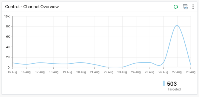
One series is displayed per configured metric, reflecting the current configuration settings (Channel, Filter on all/specific, Interaction, Workflow, Offer, Date Range/Show last [n] days, Show legend, and Chart palette).
A tooltip is shown when you hover over series values within the chart. It displays the date/time represented by the current chart position, and, for each metric with which the chart is configured, its name and count.
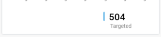
If List of latest values is selected at the widget's Display results as property, the following are displayed for each configured metric:
-
Color bar
-
Latest available count value
-
Metric name
If displayed as a chart, the widget’s footer contains the following:
-
If applicable, the Interaction and/or Offer filters with which the widget is configured are shown to the left of the footer. Context menus are available at each.
-
If the widget’s Show chart legend property is checked, the legend is shown to the right. Counts are shown for each series. If Show cumulative counts is checked, counts reflect the sums of each series’ values as shown in the chart. If unchecked, the latest available counts ae shown.
System configuration setting WidgetTimezoneOverride allows you to override the timezone to be used by the widget.