

Overview
When an HTML asset is shown in the Asset Designer, the following are displayed:
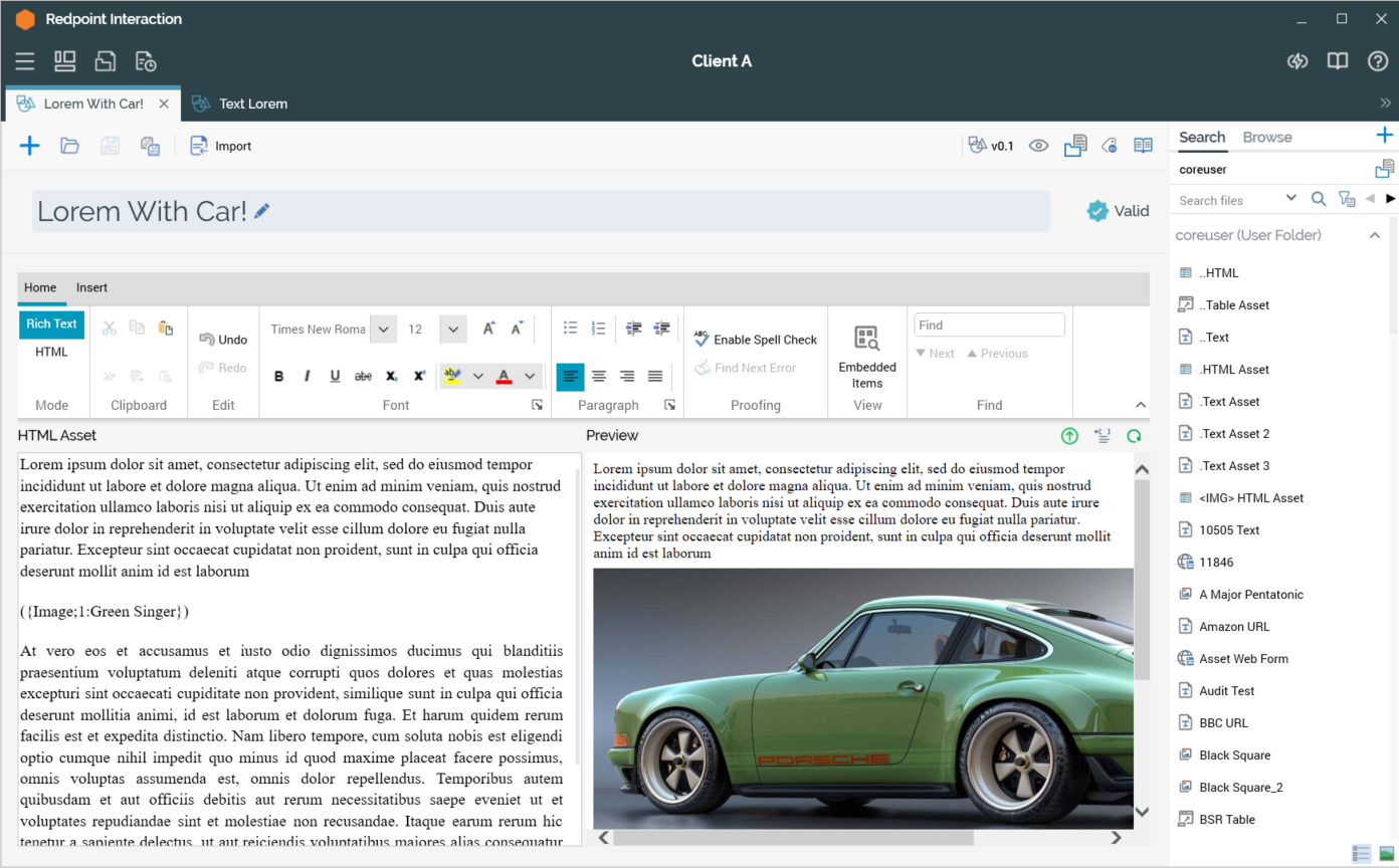
Content Editor
The HTML asset content editor allows you to edit an HTML asset’s contents.
Note that you can customize the content displayed within an HTML asset through the inclusion of attributes (including web form parameter attributes, if the asset is to be used e.g. in an email offer) and smart assets.
You can drag a localization asset into HTML asset content. When you do so, an Add Localized Text Content inline dialog displayed.
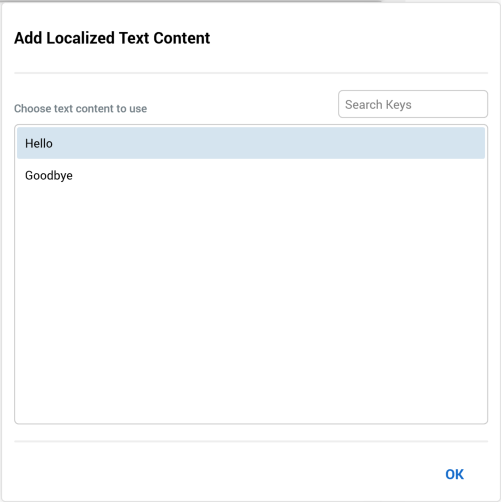
It allows you to choose which of the localized text elements defined at the asset you wish to add, and contains the following:
-
Search Keys: this textbox allows you to dynamically filter the list of keys displayed in the dialog by entering a search string.
-
List of keys
-
OK button
You can select a key and click OK to include the text string within the content. If you click off the dialog, it is removed from display and the first string in the list is added to the content.
Placeholder attributes can be used in HTML asset content only if exposing system variable values. For information on system variables, please see the Framework documentation.
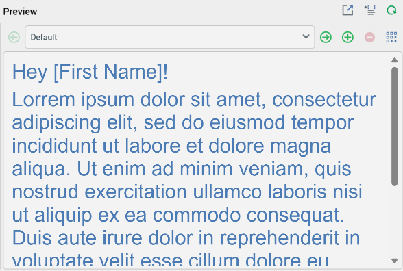
Preview section
The preview section is displayed to the right of the content panel and provides a visual indication of the HTML asset’s final appearance.
The following are displayed at the Preview toolbar:
Show the Preview Window as a Popout
Selecting this button removes the inline Preview from display, and displays it instead in a non-modal, floating Preview Window.
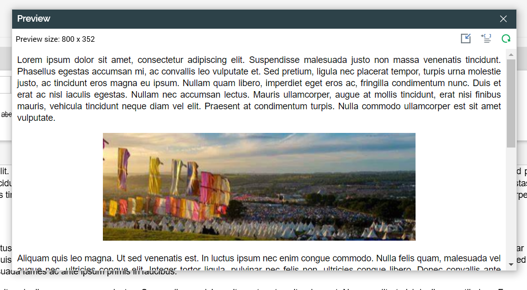
The floating Preview Window is displayed with a minimum width of 800px, and contains the following:
-
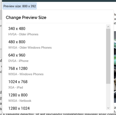
Preview size: the current size of the Preview Window is displayed. You can select it to change the size of the Preview Window. Doing so displays the Change Preview Size dialog.
-
You can select a size to select it, whereupon it is applied at the Preview Window.
-
By default, the Preview Window is displayed with a width of 800px. On re-invocation of Change Size, if the size was selected manually, the Preview Window is sized in accordance with your most recently-used selection.
-
-
Dock the Preview Window: selecting this button removes the floating Preview Window from display and redisplays the inline HTML Email Preview. Selecting the Window’s Close button has the same effect.
-
Show Preview Parameters: documented separately.
-
Refresh Content within the floating Preview Window is updated dynamically as it is changed within the Asset Designer. The Window is closed when the current RPI tab focus is changed.
View Preview Parameters
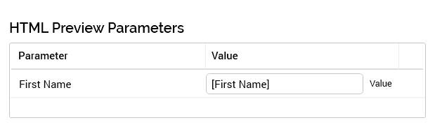
Invocation of this option displays the HTML Preview Parameters dialog:
-
You can specify parameter values for the attributes you have included in order to give an illustration of the asset’s final appearance. Provision of preview values is constrained by data type (string, integer, decimal or date/time).
-
By default, an attribute’s value is shown as [attribute name]. The preview is updated with a new parameter value immediately as you type.
-
By default, parameter values are specified using raw database values, rather than translated values (where they exist). You can toggle between “Value” and “Trans” (translation) using the button shown to the right of the parameter. If you elect to specify the parameter’s value using a translation, a dropdown, listing translated and raw values, is shown.
-
Note, however, that when you choose a translated value, the raw value is shown in the preview; RPI only supports the output of raw database values, and not translated values.
-
-
If the asset contains one or more regionalized text or HTML assets, a Region parameter is shown at the Preview Parameters dialog. By default, the Default asset content is displayed; entering a region code at this parameter displays that region's localized asset content.
-
Refresh Preview
The following toolbar options are shown when system configuration setting RegionLanguageCodes has been set. They allow you to change the localized variant of the asset currently displayed in the Preview tab. This will change the content served by embedded localization assets in accordance with the selected region code.
-
Previous Localized Content Variant: this button is available when a localized content variant other than the Default is selected. Selecting it displays the previous variant as listed in the dropdown.
-
[Dropdown]: this property lists the variants defined at
RegionLanguageCodes. Variants are presented in alphabetical order, with “Default” being displayed first. You can use the dropdown to change the displayed variant. -
Next Localized Content Variant: this button is available when a variant other than the last alphabetically is selected. Selecting it displays the next variant as listed in the dropdown.
-
Show All Localized Content Variants: selecting this button displays the All Localized Content Variants overlay.
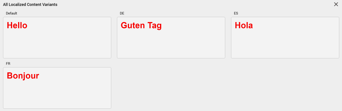
It lists read-only representation of all localized content variants in alphabetical order. A maximum of three variants are shown per line. A Close button is displayed at the overlay's top right.