

Overview
Each widget contains two views: the configuration overlay and display mode.
Configuration overlay
The Count Results Widget tab configuration overlay contains the following:
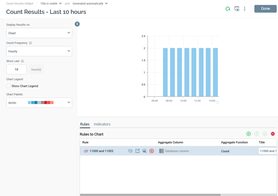
Properties Toolbox
-
Display Results As: this dropdown field exposes values Chart (the default) and List of latest values.
-
When Chart is selected, the widget is rendered as a chart.
-
When List of latest values is selected, the Show last and Show chart legend properties are hidden at the widget configuration panel, and the Chart Style and Use Second Axis columns are disabled in the Rules to Chart grid.
-
-
Count Frequency: this property allows you to define the frequency at which the counts or aggregates displayed within the widget are to be calculated. A dropdown field, it exposes the following values:
-
Hourly (the default)
-
Daily
-
Monthly
-
-
Show Last: an integer property, which allows you to define the timespan over which results are to be displayed. For example, by setting Count Frequency to Daily and Show... to 10 days, the last 10 days' counts or aggregates will be shown in the widget (once available). The property defaults to 10 and accepts a range of values from 1 to 31 (inclusive). It is accompanied by a note below, which advises that, as counts are generated over time, they will only be displayed when available.
-
Chart Legend: this checkbox, unchecked by default, controls the display of the chart legend at the widget.
-
Chart Palette: this dropdown field allows you to choose the color scheme to be shown at the widget's chart. It defaults to the Arctic palette.
Preview
A preview of the widget is displayed to the top right.
Tab set
Displayed to the bottom right of the configuration overlay, the tab set exposes Rules and Indicators tabs.
Rules tab
The tab contains a single property.
-
Rules to Chart: this property allows you to choose from one to six selection rules that are to serve as the basis for the counts to be displayed in the widget's chart. It consists of a toolbar and a grid.
-
Toolbar: exposing the following options:
-
Add new Rule: selecting this button adds a new rule to the bottom of the grid. Its Aggregate Function is set to Count, and its Chart style is set to Bar.
-
Move selected Rule up: this button is available when a rule other than the first in the list is selected. Invocation moves the rule up one position in the list.
-
Move selected Rule down: this button is available when a rule other than the last in the list is selected. Invocation moves the rule down one position in the list.
-
Remove selected Rule: this button is available when a rule is selected. Invocation removes the rule without display of an “Are You Sure?” dialog.
-
-
Grid: listing the rules to be charted. A maximum of 6 rules can be displayed in the widget. The grid contains the following columns:
-
Rule: the selection rule in respect of which counts or aggregated values across time are to be displayed in the widget's chart. You can browse for a selection rule file or initiate the creation of a new rule. Having chosen a rule, you can open its latest version in the Rule Designer. You can also clear the property.
-
Aggregate Column: prior to choosing a selection rule, the value ‘N/A’ is displayed in this column. Having chosen a selection rule, you can use the Choose Database Item dialog to select an aggregate column from the selection rule's resolution table’s database. Having done so, you can clear your selection. Note that provision of an Aggregate Column is optional. Aggregate Column is always set to “N/A” when a NoSQL selection rule is to be charted.
-
-
-
Aggregate Function: this property is initially set to the value Count. If you do not specify an Aggregate Column, it remains as Count. On choosing a non-numeric Aggregate Column, it is set to the value Count Distinct. On choosing a numeric Aggregate Column, a dropdown is made available, listing the following values. Aggregate Function is always set to Count in respect of NoSQL selection rules.
-
Average
-
Count (the default)
-
Maximum
-
Minimum
-
Sum
-
-
Title: the verbiage to be displayed at the series legend. Set by default to the rule’s name.
-
Chart Style: a dropdown field, exposing the following values:
-
Bar (the default)
-
Line
-
Area
-
Spline
-
Spline Area
-
-
Use Second Axis: this checkbox is unchecked by default. If checked, when the widget's chart is rendered, a second axis is shown to the right. This allows you to display values from a second series with a differing scale to that shown at the left.
Indicators tab
The tab contains a single property.
-
Indicators to Chart: this property allows you to add one or more horizontal indicator lines to the chart. It consists of a toolbar and a list.
-
Toolbar, exposing the following:
-
Add new Indicator: selecting this button adds a new indicator to the list. Its Label is set to "Indicator" (if this value exists, an incrementable integer is appended to ensure uniqueness), its Value to "0.00" and its Color to light blue.
-
Move selected Indicator up: this button is available when an indicator other than the first in the list is selected. Selecting it moves the selected indicator up one position in the list.
-
Move selected Indicator down: this button is available when an indicator other than the last in the list is selected. Selecting it moves the selected indicator down one position in the list.
-
Remove selected Indicator: this button is available when an indicator is selected in the list. Selecting it removes the selected indicator without displaying an "Are You Sure?" dialog.
-
-
List, exposing the following:
-
Label: a string property. If not set, "Use default label" text is shown (the default label is rendered as "Indicator" at the displayed widget). The maximum supported Label length is 100 characters.
-
Value: a mandatory, decimal property, with a maximum permissible value of "999,999,999.99".
-
Color: the color in which the indicator is to be rendered is shown at an inline button. Selecting it displays a color picker dialog, in which you can choose the color in which the indicator line is to be rendered.
-
-
Note that a maximum of 6 indicators can be defined.
Notes
-
Count results widget counts are calculated by the Calculate Count Results widget counts system task. At its execution, it snapshots counts or aggregate counts of the rules with which count results widgets are configured. The counts thus calculated are stored, so that they can be accessed as required by other users. They are also not deleted if their related widget is removed.
-
The ability to create a count results widget does not depend on the Selection Rule – Design functional permissions.
Display mode
When a count results widget is shown in a dashboard, if no data to display is available, a message is shown.
The widget's header shows its title, a Refresh button (invocation of which displays the latest results data) and Options menu.
Chart
If Chart is selected at the widget's Display results as property, the widget is rendered as a chart.
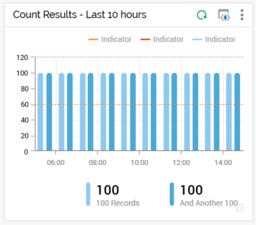
The widget's chart displays one series per configured rule, reflecting the current configuration settings (Frequency (note that only available results are displayed), Show last, Show chart legend, Chart palette and selection rule).
A tooltip is shown when you hover over series values within the chart. It displays the date/time represented by the current chart position, and, for each rule with which the chart is configured, its title and count.
If defined, indicators are displayed as colored dashed lines on the widget chart.
Their colors and values are as configured at the widget. A legend for each indicator is shown at the top of the chart.
A tooltip is shown on hovering over an indicator, displaying the indicator's label and value. Note that an indicator is only shown if its value falls within the displayed chart area.
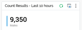
List of latest values
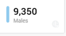
If List of latest values is selected at the widget's Display results as property, the following are displayed for each configured rule:
-
Color bar
-
Latest available count value
-
Rule Title
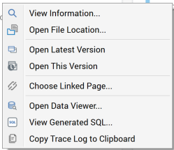
You can right-click a rule to view a selection rule context menu, from which you can invoke further functionality.
Footer
The widget's footer displays the following:
-
When the Calculate Count Results widget counts system task is running, a ’One or more counts are currently refreshing’ message is displayed. It is also displayed at initial chart display when configured with (a) rule(s) with no counts yet available.
-
If the widget’s Show chart legend property is checked, the legend is shown in the footer, and is right-aligned.
Right-clicking a rule within the legend displays a context menu:
An icon is shown at the bottom right of the widget; hovering over same displays a tooltip, which lists the timezone(s) being used to refresh data therein. Note that system configuration setting WidgetTimezoneOverride allows you to override the timezone to be used by the widget.
When a count results widget's Count frequency is set to Daily, results therein are updated at a cadence accordant with configuration setting WidgetCountDailyRefreshInterval (which defines the minimum number of minutes between refreshes of the widget`s daily total). Any change to the system configuration setting is picked up at the previous setting's expiration. Data displayed in the widget is refreshed every minute.
Persisted count results are removed on a regular basis by the Client housekeeper. Records are deleted from table Interaction_XXX.op_SelectionResultsCache when their IsActive flags is set to 0, which happens when no counts have been requested by a widget over a time period accordant with its Count frequency (e.g. hourly count set to Inactive after 7 days of no requests).