

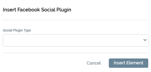
Content Section: Initial Display
When displayed initially, a single property is shown within the content section.
-
Social plugin type: initially blank, you must select a social plugin type to add to the landing page content. The following types are available:
-
Comments
-
Embedded Posts
-
Follow Button
-
Like Button
-
Page Plugin
-
Send Button
-
Share Button
-
When you select a value from the list, settings relevant to your selection are displayed within the dialog.
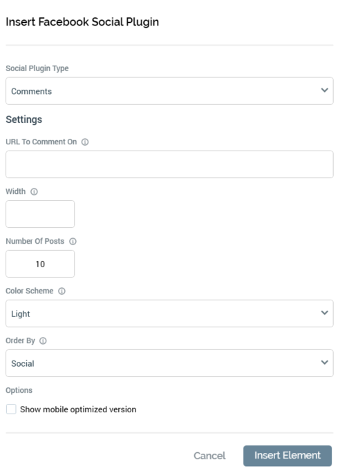
Content Section: Comments
The Comments plugin lets people comment on content on your site using their Facebook profile, and shows this activity to their friends in their news feeds. It also contains built-in moderation tools and special social relevance ranking.
The following properties are displayed for a Comments Facebook plugin:
-
URL to comment on: this mandatory textbox represents the absolute URL that comments posted in the plugin will be permanently associated with. It can be a maximum of 1000 characters in length and must be a valid URL.
-
Width: provision of a width for the plugin, in pixels, is optional. The property can be a maximum value of 9,999.
-
Number of posts: this mandatory property defaults to 10. It defines the number of comments to be shown by default.
-
Color scheme: this dropdown allows you to define the color scheme to be used by the plugin as one of Light (the default value) or Dark.
-
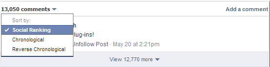
Order by: this dropdown allows you to specify the order in which comments will be presented. Available values are Social (the default), Reverse Time and Time.
-
Show mobile: this checkbox is unchecked by default. It allows you to define whether to display the mobile-optimized version of the plugin.
When viewed at preview, a placeholder image similar to the final layout will be displayed. The placeholder images are fixed and cannot be configured.
When viewed by a landing page visitor, the comments plugin will be displayed in accordance with the layout configured in RPI. The display may be different from the page preview, depending on the plugin’s settings.
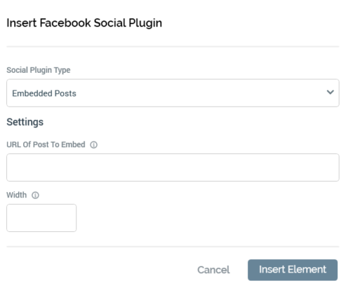
Content Section: Embedded Posts
Embedded Posts are a simple way to put public posts—by a page, or a person on Facebook—into web page content. Only public posts from Facebook pages and profiles can be embedded. The embedded post will show any media attached to it, as well as the number of likes, shares, and comments that the post has. Embedding posts will let people using your web site see the same information that is shown on Facebook.com, and they will allow people to follow or like content authors or pages directly from the embed.
The following properties are displayed for an Embedded Posts Facebook plugin:
-
URL of post to embed: this mandatory textbox represents the Facebook URL of the post to embed. It can be a maximum of 1000 characters in length and must be a valid URL.
-
Width: provision of a width for the plugin, in pixels, is optional. The property can accept values from 350 to 700.
When viewed at preview, a placeholder image similar to the final layout will be displayed. The placeholder images are fixed and cannot be configured.
When viewed by a landing page visitor, the embedded posts plugin will be displayed in accordance with the layout configured in RPI. The display may be different from the page preview, depending on the plugin’s settings.
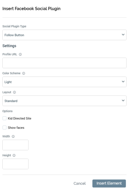
Content Section: Follow Button
The Follow button plugin lets people subscribe to the public updates of others on Facebook.
The following properties are displayed for a Follow Button Facebook plugin:
-
Profile URL: this mandatory text field can be a maximum of 1000 characters in length. It represents the Facebook.com profile URL of the user to follow. The value provided must be a valid URL.
-
Kid directed site: this checkbox, unchecked by default, identifies that the site to be followed is directed at children under the age of 13.
-
Width: provision of a width for the plugin, in pixels, is mandatory. The property can be a maximum of value 9,999.
-
Height: provision of a width for the plugin, in pixels, is mandatory. The property can be a maximum of value 9,999.
-
Color scheme: this dropdown allows you to define the color scheme to be used by the plugin as one of Light (the default value) or Dark.
-
Layout: this dropdown allows you to define the type of layout to be used by the plugin as one of Standard (the default value), Button, Button Count or Box Count.
-
Show faces: this checkbox is unchecked by default. It allows you to define whether to display profile photos below the button (available for Standard layout only).
When viewed at preview, a placeholder image similar to the final layout will be displayed. The placeholder images are fixed and cannot be configured.
When viewed by a landing page visitor, the follow button will be displayed in accordance with the layout configured in RPI. The display may be different from the page preview, depending on the plugin’s settings.
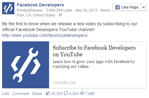
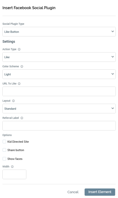
Content Section: Like Button
The Like button is the quickest way for Facebook users to share content with their friends. Selecting a Like button will “like” pieces of content on the web and share them on Facebook. You can also display a Share button next to the Like button to let people add a personal message and customize who they share the content with.
The following properties are displayed for a Like Button Facebook plugin:
-
Action Type: this dropdown allows you to specify the verb to be displayed at the button. It exposes values Like (the default value) and Recommend.
-
Color scheme: this dropdown allows you to define the color scheme to be used by the plugin as one of Light (the default value) or Dark.
-
URL to Like: this mandatory text field represents the absolute URL of the page to be liked. It can be a maximum length of 1000 characters and must be a valid URL.
-
Kid directed site: this checkbox is unchecked by default. It allows you to specify that the site being liked is intended for children under 13.
-
Layout: this dropdown allows you to specify the layout of the plugin. Available values are Standard (the default), Button Count, Button and Box Count.
-
Referral label: this optional text field allows you to specify a label for tracking referrals. It can be a maximum of 50 characters in length.
-
Share button: this checkbox is unchecked by default. When checked, a Share button is displayed alongside the Like button.
-
Show faces: this checkbox is unchecked by default. When checked, profile photos are displayed below the button. Show faces is only applicable when Standard layout is selected.
-
Width: provision of a width for the plugin, in pixels, is optional. The property can be a maximum value of 9,999.
When viewed at preview, a placeholder image similar to the final layout will be displayed. The placeholder images are fixed and cannot be configured.
When viewed by a landing page visitor, the like button will be displayed in accordance with the layout configured in RPI. The display may be different from the page preview, depending on the plugin’s settings.
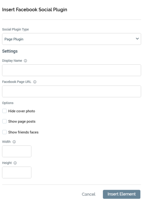
Content Section: Page Plugin
The page plugin allows you to include a summary of a Facebook page in landing page or HTML asset content.
The following properties are displayed for a Page Plugin Facebook plugin:
-
Display name: the name to be displayed at the page plugin.
-
Facebook page URL: the URL of the Facebook page to which the page plugin relates.
-
Width: provision of a width for the plugin, in pixels, is mandatory. The property can be a minimum value of 280, and a maximum value of 500.
-
Height: provision of a width for the plugin, in pixels, is mandatory. The property must be at least 130.
-
Hide cover photo: this checkbox, unchecked by default, allows you to specify whether the Facebook page’s cover photo is to be hidden.
-
Show page posts: this checkbox, unchecked by default, allows you to define whether a feed of the page’s posts is to be shown.
-
Show friends’ faces: this checkbox, unchecked by default, allows you to specify whether the faces of Facebook users who have already liked the page are to be shown.
When viewed at preview, a placeholder image similar to the final layout will be displayed. The placeholder images are fixed and cannot be configured.
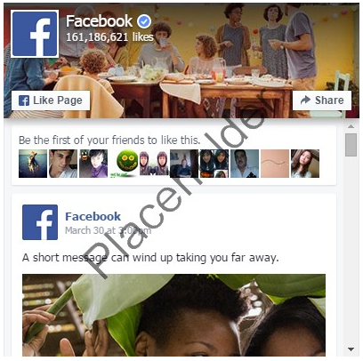
When viewed by a landing page visitor, the page plugin will be displayed in accordance with the layout configured in RPI. The display may be different from the page preview, depending on the plugin’s settings.
Content Section: Send Button
The Send button lets people privately send content on a site to one or more friends in a Facebook message, via an email address, or by sharing it with a Facebook group
The following properties are displayed for a Send Button Facebook plugin:

-
URL to send: this mandatory text field defines the absolute URL of the page to be sent. It can be a maximum of 1000 characters in length and must be a valid URL.
-
Kid directed site: this checkbox is unchecked by default. It defines that the page being sent is intended for children under 13
-
Color scheme: this dropdown allows you to define the color scheme to be used by the plugin as one of Light (the default value) or Dark.
-
Referral label: this optional property allows you to specify a label for tracking referrals. It can be a maximum of 50 characters in length.
-
Width: provision of a width for the plugin, in pixels, is mandatory. The property can be a maximum value of 9,999.
-
Height: provision of a width for the plugin, in pixels, is mandatory. The property can be a maximum value of 9,999.
When viewed at preview, a placeholder image similar to the final layout will be displayed. The placeholder images are fixed and cannot be configured.
When viewed by a landing page visitor, the send button will be displayed in accordance with the layout configured in RPI. The display may be different from the page preview, depending on the plugin’s settings.
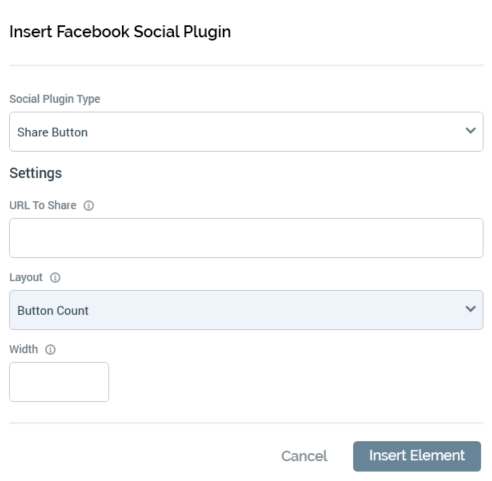
Content Section: Share Button
The Share button lets Facebook users add a personalized message to links before sharing on their timeline, in groups, or to their friends via a Facebook Message.
The following properties are displayed for a Share Button Facebook plugin:
-
URL to share: this mandatory text field defines the absolute URL of the page to be shared. It can be a maximum of 1000 characters in length and must be a valid URL.
-
Layout: this dropdown allows you to specify the plugin’s layout. Available values are Button Count (the default), Box Count, Button, Icon Link, Icon and Link.
-
Width: provision of a width for the plugin, in pixels, is mandatory. The property can be a maximum value of 9,999.
When viewed at preview, a placeholder image similar to the final layout will be displayed. The placeholder images are fixed and cannot be configured.
When viewed by a landing page visitor, the share button will be displayed in accordance with the layout configured in RPI. The display may be different from the page preview, depending on the plugin’s settings.
Footer
Two buttons are shown in the Insert Facebook Social Plugin footer:
-
Insert Social Plugin: this button is enabled when a Social plugin type has been selected. Invocation adds the plugin to landing page content. A plugin is represented by a tag, for example:({FacebookSocialPlugin;1:FacebookSocialPlugin}).
If selected when one or more validation issues are present, a warning, listing the issues, is displayed at the bottom of the content section.
-
Cancel: selecting this button removes the dialog from display without adding a social plugin. An “Are You Sure?” dialog is not displayed prior to closure.