

Overview
The Insert tab is displayed in the following contexts:
-
Email Offer Designer: Rich Text mode
-
Email Offer Designer: HTML mode
-
Email Offer Designer: Text content
-
SMS Offer Designer
-
Landing Page Designer: Rich Text mode
-
Landing Page Designer: HTML mode
-
Asset Designer: HTML Asset: Rich Text mode
-
Asset Designer: HTML Asset: HTML mode
-
Asset Designer: Text Asset
-
Wiki Page Designer: Rich Text mode
-
Wiki Page Designer: HTML mode
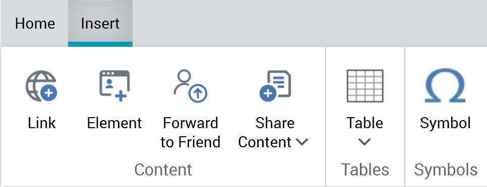
It can contain the following sections: Content, Tables, and Symbols.
Content section
The Insert tab’s Content section exposes the following sections:
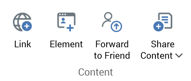
-
Link
-
Element
-
Forward to Friend
-
Share Content
Content: Link
This button is displayed in the following contexts:
-
Email Offer Designer: HTML Email Content: Rich Text mode
-
Email Offer Designer: HTML Email Content: HTML mode
-
Email Offer Designer: Text Email Content
-
SMS Offer Designer
-
Landing Page Designer: Rich Text mode
-
Landing Page Designer: HTML mode
-
Asset Designer: HTML Asset: Rich Text mode
-
Asset Designer: HTML Asset: HTML mode
-
Asset Designer: Text Asset
-
Wiki Page Designer: Rich Text mode
-
Wiki Page Designer: HTML mode
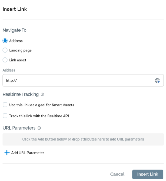
This button allows you to include a hyperlink within the current content editor. Selecting it displays the Insert Link dialog.
When invoked at the email Offer and HTML Asset Designers, the dialog appears as follows:
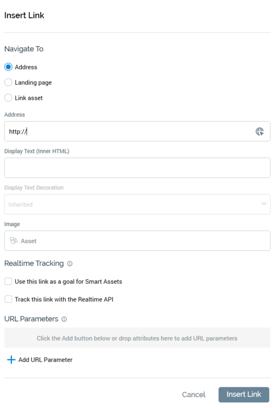
The dialog contains the following:
-
Navigate to: three radio buttons accompany properties, which allow you to define the type of link to be inserted
-
Address: selected by default. The property defaults to “http://”. It is mandatory if the radio button is selected. An Encode the address query string button is shown to the right; selecting it encodes the URL query string, if one exists.
-
Landing page: if the radio button is selected, you must choose a landing page to which the link will navigate. You can browse for a landing page, or you can populate the property using drag and drop. Once a landing page has been chosen, you can invoke Open Latest Version to display its latest version in the Landing Page Designer. You can also Clear the selected landing page.
-
Link asset: when selected, the option facilitates the configuration of the link with a URL provided dynamically by a smart asset. You must select a valid smart asset, at which Realtime in Outbound is supported. Each of the asset's content elements must be configured with a valid absolute URL, which can be provided via inline text or a text asset (including a nested text asset). Note that the link's Display text property must be provided when Link asset is used.
-
-
Display Text (Inner HTML): you can optionally provide Display text for the hyperlink. If you provide neither Display text nor an image, the link’s Address is shown. If an Image and Display text are provided, the latter is used as the image’s HTML Alt text.
-
Text decoration: this dropdown field is available when Display text has been provided. It exposes the following values:
-
Inherited (the default)
-
No underline
-
Underline
-
-
Image: you can optionally provide an Image for the hyperlink. If you provide neither Display text nor an image, the link’s Address is shown. If Image is to be used,
To configure the property, you must select a valid image asset or smart asset. If using a smart asset, all content elements at the same must be configured with image assets, or smart assets exposing nested images. In addition, Realtime in Outbound must be supported at the selected smart asset.
When an image is rendered in a delivered email, selecting it will navigate to the address supplied. If an Image and Display text are provided, the latter is used as the image’s HTML Alt text.
Realtime Tracking section
The section header is accompanied by an information icon, hovering over which displays a tooltip that says “Set these options when realtime tracking support is required at this link, to allow it to be used as a goal for Smart Assets and/or to communicate with the Realtime API”.
The section contains the following properties:
-
Use this link as a goal for Smart Assets: this checkbox is unchecked by default. When checked, clicks on the link can be used in goal smart asset assessment.
-
Track this link with the Realtime API: this checkbox is unchecked by default. If a Link asset is specified, it is checked automatically. Otherwise, you can check the property manually to use the RPI Realtime API to track link clicks.
Note that the Realtime Tracking section is not shown when inserting or editing a link in the Landing Page Designer.
-
URL parameters: you can optionally customize the URL to which the hyperlink will navigate through the use of parameters. These appear as a query string at runtime. A toolbar above the URL parameters list exposes the following options:
-
Add: invocation of this option adds a new URL parameter to the list. Its Attribute property is initially empty, and the parameter’s name is set to NewParameter.
-
Remove: selecting this button removes the selected URL parameter without display of an “Are You Sure?” dialog.
The following properties are shown for each URL parameter: -
Attribute: provision of an attribute is mandatory. You can choose an attribute by browsing the RPI file system, or you can provide one using drag and drop. Note that you cannot use exists in table or auxiliary database attributes in this context. Parameter attributes are supported. Once you have selected an attribute, you can view its details in the File Information Dialog. You can also Clear the attribute. Note that issues may occur if attempting to navigate to URLs containing date/time parameters.
-
Parameter name: it is also mandatory to provide a name for the URL parameter. The name provided must be unique within the link, can be a maximum of 100 characters in length and cannot contain the “?”, “&” or space characters.
-
Two buttons are shown at the bottom of the dialog:
-
Insert Link: selecting this button removes the dialog from display and adds a hyperlink to the content. If the link is configured incorrectly, any validation errors are displayed at the bottom “At least one URL parameter attribute is missing. A URL parameter is missing a name”.
-
Cancel: selecting this button removes the dialog from display without adding a hyperlink.
When invoked at the Landing Page Designer, the dialog appears as follows:
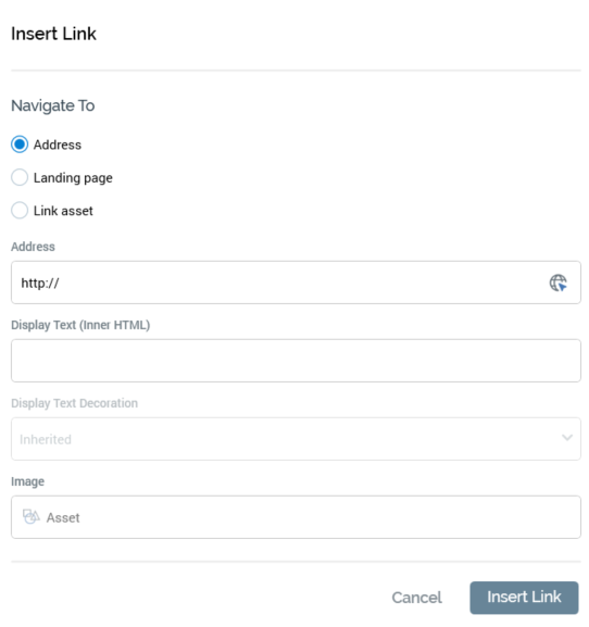
Note that the use of URL parameters is not supported in landing pages.
When invoked at the text Asset Designer, the dialog appears as follows:
When invoked at the Wiki Page Designer, the dialog appears as follows:
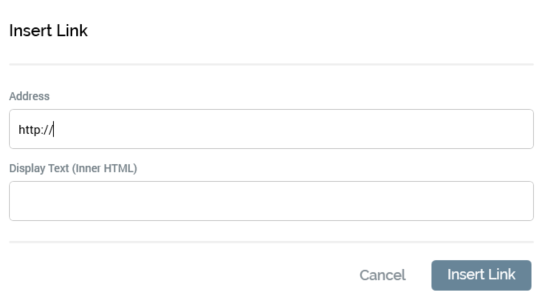
It contains the following:
-
Address: you must provide the Address to which the link will navigate when selected.
-
Display text: you must also provide the link’s Display text.
-
Insert Link: selecting this button adds the link to the Wiki page at the current cursor position.
-
Cancel: selecting this button removes the Insert Link dialog from display.
The same dialog—with name changed to Edit Link—is used to edit existing links.
Note:
-
Other toolbar buttons are unavailable when the Insert/Edit Link dialog is shown.
-
It is not currently possible to edit a link in the Wiki Page Designer.
Content: Element
This button is displayed in the following contexts:
-
Email Offer Designer - HTML Email Content - Rich Text mode
-
Email Offer Designer - HTML Email Content - HTML mode
-
Landing Page Designer - Rich Text mode
-
Landing Page Designer - HTML mode
-
Asset Designer - HTML Asset - Rich Text mode
-
Asset Designer - HTML Asset - HTML mode
Selecting this button displays a submenu, the contents of which are dependent on the context of invocation. Each option available therein is documented within its own separate section.
Element: Facebook Like
This option is available in the following contexts:
-
Email Offer Designer - HTML Email Content - Rich Text mode
-
Email Offer Designer - HTML Email Content - HTML mode
-
Asset Designer - HTML Asset - Rich Text mode
-
Asset Designer - HTML Asset - HTML mode
The button allows you to include a Facebook Like button in email content. On selecting it, the Insert Facebook Like Button dialog is displayed.
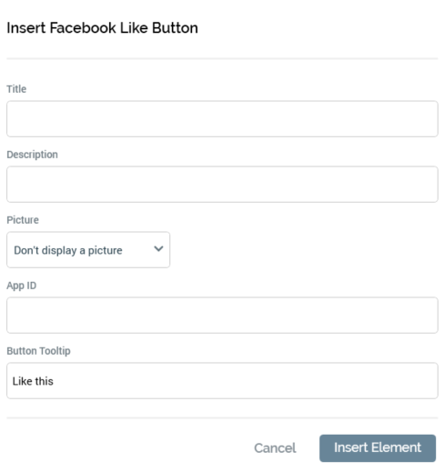
The dialog exposes the following properties:
-
Title: this value is displayed as the title and heading within the web page displayed when the Like button is selected by a recipient. Its provision is mandatory. Its maximum length is 1000 characters.
-
Description: an optional property, with a maximum length of 1000 characters. Description is shown above any shared content within the web page displayed when the Like button is selected by a recipient.
-
Picture: a dropdown field, with two values:
-
Don't display a picture: (the default)
-
Display picture from URL: when selected, the Picture URL field is displayed.
-
Picture URL: this field is only displayed when Picture is set to Display picture from URL. It is mandatory when shown and can be a maximum length of 1000 characters. If set, the Picture is displayed at the “liker’s” timeline/news feed.
-
App ID: this value represents the unique ID of a Facebook app to be used to track the number of Likes. Its provision is optional, and its maximum length 100 characters.
-
-
Button tooltip: an optional property that defaults to “Like this”. Its maximum length is 1000 characters.
-
Share: two radio buttons are displayed:
-
Entire content: this option is selected by default. When selected, if the recipient chooses to press the Like button, at the resultant preview page, all of the email’s content is shown.
-
Content in cell: selecting this option, which is not selected by default, allows the recipient to Like a specific shared cell within the email’s content. It is accompanied by a [Shared cells] dropdown, which is available when this radio button is selected. The dropdown lists all shared cells alphabetically, with the first cell selected by default.
-
-
Insert Element: selecting this button invocation adds a tag to the email content, e.g.: “({FacebookLikeButton;1:FacebookLikeButton})"
-
Cancel: invocation removes the dialog from display.
Element: Facebook Page
This option is available in the following contexts:
-
Email Offer Designer - Rich Text mode
-
Email Offer Designer - HTML mode
-
Landing Page Designer - Rich Text mode
-
Landing Page Designer - HTML mode
-
Asset Designer - HTML Asset - Rich Text mode
-
Asset Designer - HTML Asset - HTML mode
The button allows you to include a button in content which, when selected, opens the Facebook page with which it is configured in a browser.
On invocation, the Insert Facebook Page Button dialog is displayed:
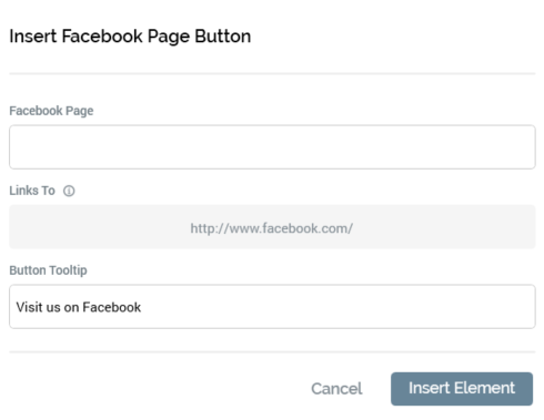
It contains the following properties:
-
Facebook page: provision of a Facebook page is mandatory (a warning icon is displayed at invocation of OK if not provided). The value can be a maximum length of 1000 characters, and is used at the button to link to a URL as per the following: “http://facebook.com/[Facebook page]"
-
Button tooltip: by default, this value is set to "Visit us on Facebook". It is optional and can be a maximum length of 1000 characters.
-
Insert Element: selecting OK adds a tag to the content, e.g.: “({FacebookPageButton;1:FacebookPageButton})”
-
Cancel: selecting Cancel removes the dialog from display.
At Preview, or when displayed in a landing page or on receipt of an email containing a Facebook button, the image shown is accordant with system configuration setting ButtonImageFacebookVisit. If no button image has been defined, a default image is used.
Selecting the button in a landing page or delivered email opens the Facebook page in the visitor’s or recipient’s default browser.
Element: Alchemer Page
This option is available in the following contexts:
-
Email Offer Designer - HTML Email Content - Rich Text mode
-
Email Offer Designer - HTML Email Content - HTML mode
-
Landing Page Designer - Rich Text mode
-
Landing Page Designer - HTML mode
-
Asset Designer - HTML Asset - Rich Text mode
-
Asset Designer - HTML Asset - HTML mode
The button allows you to insert a button that will facilitate navigation to a given Alchemer survey.
Selecting it displays the Insert Alchemer Button dialog.
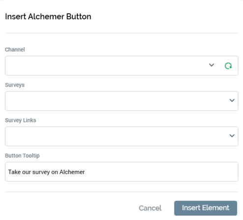
It contains the following:
-
Channel: mandatory. A dropdown listing all currently-configured Alchemer channels.
-
Sync surveys: this button is available when a Channel has been selected. Selecting it populates the Survey dropdown with details of all of the channel’s associated surveys.
-
Survey: mandatory. A dropdown listing all surveys associated with the currently-selected channel. Populated by invocation of Sync surveys.
-
Survey links: this dropdown allows you to select a survey link from the existing survey links configured at the selected survey.
-
Button tooltip: an optional property that defaults to “Take our survey on Alchemer”, and which can be a maximum of 1000 characters in length.
-
Insert Button: selecting this button adds an Alchemer Page button to the current content.
-
Cancel: selecting this button removes the dialog from display.
Element: Twitter Follow Page
This option is available in the following contexts:
-
Email Offer Designer - HTML Email Content - Rich Text mode
-
Email Offer Designer - HTML Email Content - HTML mode
-
Landing Page Designer - Rich Text mode
-
Landing Page Designer - HTML mode
-
Asset Designer - HTML Asset - Rich Text mode
-
Asset Designer - HTML Asset - HTML mode
The button allows you to include a button in content which, when selected, opens the Twitter feed with which it is configured in a browser, allowing a visitor or recipient to become a follower.
On invocation, the Insert Twitter Follow Page Button dialog is displayed:
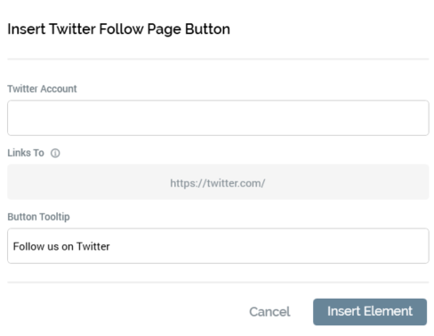
It contains the following properties:
-
Twitter account: provision of a Twitter account is mandatory (a warning icon is displayed at invocation of OK if not provided). The value can be a maximum length of 100 characters, and is used at the button to link to a URL as per the following: “http://twitter.com/#[Twitter Page]”
-
Button tooltip: by default, this value is set to "Follow us on Twitter". It is optional and can be a maximum length of 1000 characters.
-
OK: selecting OK adds a tag to the current content, e.g.: “({TwitterFollowPageButton;2:TwitterFollowPageButton})”
-
Cancel: selecting Cancel removes the dialog from display.
At Preview, display in a landing page, or on receipt of an email containing a Twitter Follow Page button, the image shown is accordant with system configuration setting ButtonImageTwitterFollow. If no button image has been defined, a default image is used.
Selecting the button opens the Twitter page in the recipient’s default browser.
Element: Twitter Tweet
This option is available in the following contexts:
-
Email Offer Designer - HTML Email Content - Rich Text mode
-
Email Offer Designer - HTML Email Content - HTML mode
-
Landing Page Designer - Rich Text mode
-
Landing Page Designer - HTML mode
-
Asset Designer - HTML Asset - Rich Text mode
-
Asset Designer - HTML Asset - HTML mode
The button allows you to embed a button in content which, when selected, opens a Twitter page (following login, if required), in which a pre-configured tweet has been prepared for the recipient to share with his or her followers.
On invocation, the Insert Twitter Tweet Button dialog is displayed:
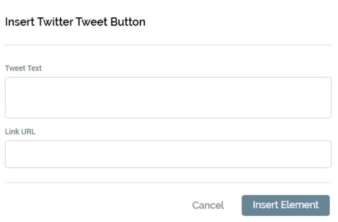
It contains the following properties:
-
Tweet text: this field is mandatory if a Link URL is not provided. If the combined message and Link URL length exceeds 140 characters, a warning message is displayed.
-
Link URL: this field is mandatory if a Twitter Tweet is not provided. The value entered must be a well-formed URL (a warning icon is displayed at invocation of OK if this is not the case). If the combined Tweet Text and Link URL exceeds 140 characters, a warning message is displayed.
-
OK: a warning icon is displayed at invocation if neither Tweet text nor Link URL is provided. Selecting OK adds a tag to the current content, e.g.: "({TwitterTweetButton;1:TwitterTweetButton})"
-
Cancel: selecting Cancel removes the dialog from display.
At Preview, display in a landing page, or on receipt of an email containing a Twitter Tweet button, the image shown is accordant with system configuration setting ButtonImageTwitterTweet. If no button image has been defined, a default image is used.
Selecting the button opens Twitter in the recipient’s default browser (if he or she is not logged in, a Sign in to Twitter page is displayed first). The Share a link on Twitter page is displayed and is pre-populated with the combined Twitter Tweet and Link URL (separated by a space character). The visitor or recipient is then able to tweet the predefined message to his or her followers.
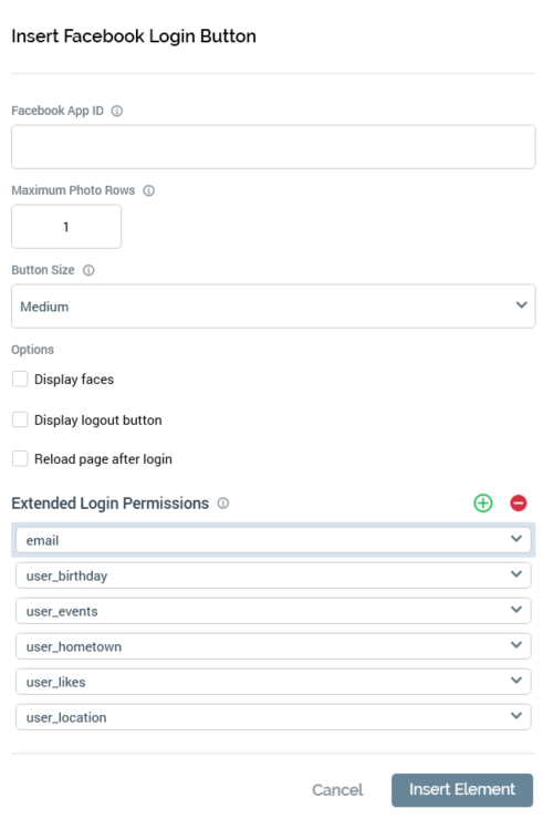
Element: Facebook Login
This option is available in the following contexts:
-
Landing Page Designer - Rich Text mode
-
Landing Page Designer - HTML mode
-
Landing Page Designer - Asset Assigned to cell
-
Asset Designer - HTML Asset - Rich Text mode
-
Asset Designer - HTML Asset - HTML mode
This social button allows you to insert a button into a landing page or asset, which a visitor can select in order to log into your Facebook app. During the login process, Facebook will confirm that the visitor is happy to divulge a range of data. After successful login, RPI can use this data in the context of Facebook Realtime decisions to determine personalized content to be served via RPI smart assets. For more information, please see the Realtime Decision and Smart Asset Designers’ documentation.
On invocation of the Facebook Login button, the Insert Facebook Login Button dialog is shown.
(The same dialog, entitled Edit Facebook Login Button, is used when editing a Facebook Login button.)
The dialog contains the following:
-
Facebook App ID: this mandatory field can be a maximum length 100 characters. It must match the unique ID of the Facebook app to which the button facilitates login.
-
Display faces: this checkbox is unchecked by default. It allows you to control whether profile photos replace the Login button when the user has logged in using the login button.
-
Maximum photo rows: this integer property defaults to 1 and can be a maximum of 10. It allows you to control the number of profile photo rows displayed.
-
Button size: this dropdown field allows you to specify the size of the Facebook login button as Small, Medium (the default), Large or Extra large.
-
Display logout button: this checkbox, unchecked by default, allows you to control whether, following a successful login, the Login button is replaced by a Logout button.
-
Reload page after login: this checkbox, unchecked by default, allows you to control whether the page should be reloaded automatically on logging into Facebook.
-
Extended Login Permissions: this list allows you to specify a series of additional pieces of data, above a default set, to be provided by the user after confirmation during a successful login. A toolbar above the list exposes two options:
-
Add new Permission: selecting this button adds a new login permission to the bottom of list. Its default name blank.
-
Remove selected Permission: invocation of this option removes the currently-selected list entry without display of an “Are You Sure?” dialog.
The following values are presented in the list by default. Each represents Facebook data to which RPI will be granted access on a user's successful login to a Facebook app using an RPI Facebook Login button. -
email
-
user_birthday
-
user_events
-
user_hometown
-
user_likes
-
user_location
-
For each list entry, a dropdown lists login permission values sourced from Facebook. Each value must be unique in the list, and specification of a value is mandatory.
Note that provision of Extended Login Permissions is optional; if none are provided, RPI is furnished with default set of data from Facebook
Two buttons are shown at the bottom of the dialog:
-
Insert Button: selecting this button adds a Facebook Login button to landing page content.
-
Cancel: selecting Cancel removes the dialog from display without inserting a Facebook Login button.
If editing a Facebook Login button, the Insert Button and Cancel buttons are replaced with a single OK button.
A Facebook Login button is represented in the Preview using a placeholder image, which does not reflect the selected button size.
You can only include a single Facebook Login button in a given landing page (a validation error is raised if more than one is present). This also applies if the button is hosted in an embedded HTML asset.
When an anonymous visitor navigates to a landing page containing Facebook login button and uses it to log in to a Facebook app, his or her Facebook data, as defined by the standard data supplied by Facebook and any extended login permissions, are written to the realtime cache. If the visitor already has a visitor profile, any changed Facebook data values are reflected in the cache.
Note that data is cached on domain basis, so the landing page in which the Facebook Login button is hosted and any landing pages utilizing Facebook decision-based smart assets must be hosted in the same context.
Element: Facebook Social Plugin
This option is available in the following contexts:
-
Landing Page Designer - Rich Text mode
-
Landing Page Designer - HTML mode
-
Landing Page Designer - Asset Assigned to cell
-
Asset Designer - HTML Asset - Rich Text mode
-
Asset Designer - HTML Asset - HTML mode
Facebook social plugins are tools that can used in a landing page (or HTML asset in a landing page) to provide people with personalized social experiences. When you interact with social plugins, you share your experiences of Facebook with your friends and other Facebook users.
On invocation of the Facebook Social Plugin option, the Insert Facebook Social Plugin dialog is displayed. The dialog consists of a content section and a footer.
On addition of a Facebook plugin, a sample plugin layout is shown at preview.
When displayed to a visitor within a landing page, a Facebook plugin’s behavior is determined by its type, and is documented separately.
Content: Forward to Friend
This button is available in the following contexts:
-
Email Offer Designer - HTML Email Content - Rich Text mode
-
Email Offer Designer - HTML Email Content - HTML mode
-
Asset Designer - HTML Asset - Rich Text mode
-
Asset Designer - HTML Asset - HTML mode
Selecting the button inserts a tag representing a “Forward to a Friend” link at the current cursor position.
When viewed at Preview or in a delivered email, the button shown is accordant with system configuration setting ButtonImageForwardToFriend.
Selecting the button in a delivered mail facilitates the forwarding of the email in its entirety to one or more recipients of the sender’s choosing.
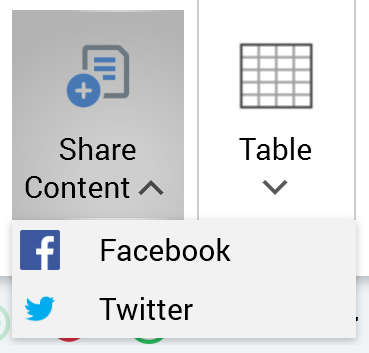
Content: Share Content
This button is available in the following contexts:
-
Email Offer Designer - HTML Email Content - Rich Text mode
-
Email Offer Designer - HTML Email Content - HTML mode
This option allows you to embed a button in an email which, when selected, facilitates the sharing of content via Facebook or Twitter. Invocation displays a submenu exposing the following options:
Selection of an option displays the Share Content to Facebook/Twitter dialog (the dialog is the same, other than the title, for both):
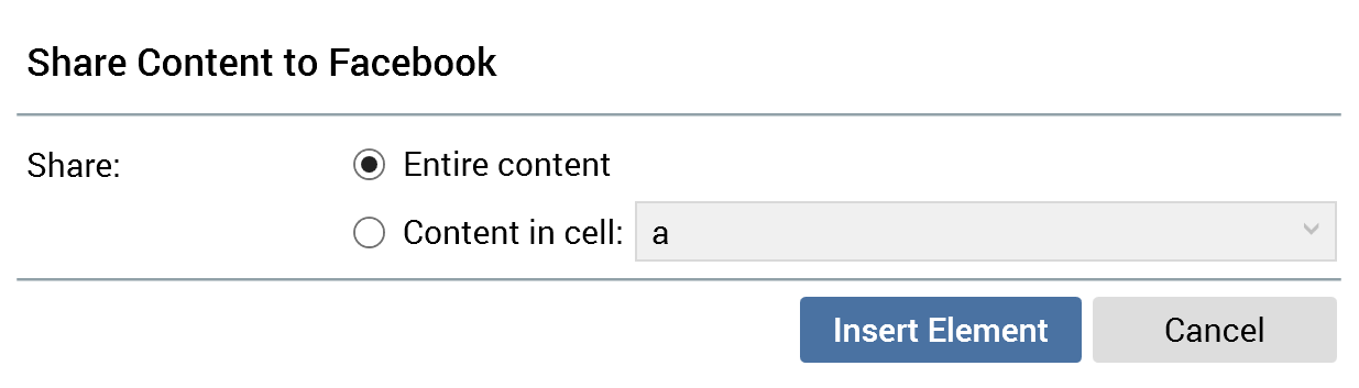
It contains the following:
-
Share: two mutually-exclusive radio buttons are displayed:
-
Entire content: this radio button is selected by default. When configured with this option, the entire contents of the email will be shared.
-
Content in cell: this radio button is not selected by default. It is accompanied by a dropdown field that lists all cells within email content that have been defined as shareable. If no cells are available for sharing, the radio button and dropdown are unavailable.
-
When Content in cell is selected, only content within the selected cell will be shared.
-
OK: invocation of this option adds a tag to email content, e.g.: “({ForwardToFacebook;1:ShareToSocial})”.
-
Cancel: invocation of this option removes the dialog without inserting a tag.
On receipt of an email containing a Share button, a button of the appropriate type is included in its content.
Tables section
This section is available in the following contexts:
-
Email Offer Designer - HTML Email Content - Rich Text mode
-
Landing Page Designer - Rich Text mode
-
Asset Designer - HTML Asset - Rich Text mode
-
Wiki Page Designer - Rich Text mode
The Insert tab’s Tables section exposes a single command:
-
Table: invocation of this option displays the Insert Table grid:
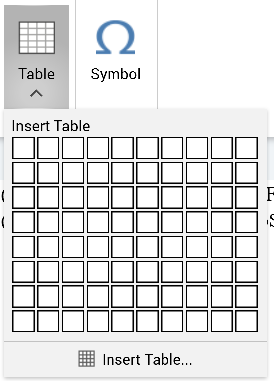
You can hover the mouse over the grid to select your required table size:
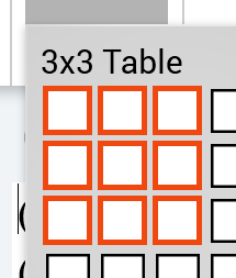
Selecting the bottom right cell within the grid inserts a table of the required size at the cursor position.
-
Insert table button: invocation of this option displays the Insert Table dialog box:
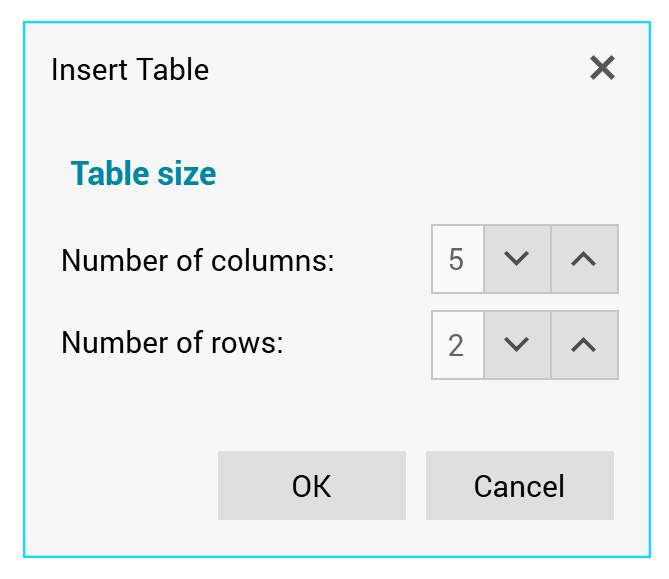
The dialog allows you define the numbers of columns and rows in the table. Selecting OK adds the table to the rich text content and selecting Cancel removes the dialog box from display.
Inserting a table into rich text content displays the Layout tab.
Symbols section
This section is available in the following contexts:
-
Email Offer Designer - HTML Email Content - Rich Text mode
-
Landing Page Designer - Rich Text mode
-
Asset Designer - HTML Asset - Rich Text mode
-
Wiki Page Designer - Rich Text mode
The Insert tab’s Symbols section exposes a single command:
-
Symbol: invocation of this option displays the Insert Symbol dialog box:
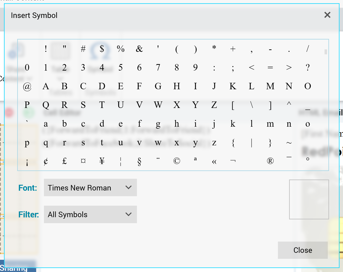
The dialog contains the following:
-
Symbols list: you can select a symbol to insert it at the current cursor position.
-
Font
-
Filter: a dropdown field that allows the contents of the symbols list to be restricted to display e.g. currency symbols.
-
Selected symbol
-
Close: selecting this button removes the dialog from display.