Overview
Each widget contains two views: the configuration overlay and display mode.
Configuration overlay

The File Type Widget configuration overlay contains the following:
Properties toolbox
-
File Type: this dropdown lists the file types to which the user has access. The following values can be shown:
-
Analysis Panel
-
Asset
-
Audience
-
Cell List
-
Dashboard
-
Data Project
-
Decision Scorecard
-
Export Template
-
Interaction
-
Landing Page
-
Model Project
-
Offer
-
Realtime Decision
-
Report
-
Selection Rule (selected by default)
-
Smart Asset
-
Subscription Group
-
Wiki Page
-
Workspace
-
-
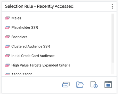
Show large primary option: this checkbox is unchecked by default. It controls display of whether a large primary option will be displayed at the widget, as per these examples.
If checked:

If unchecked:
-
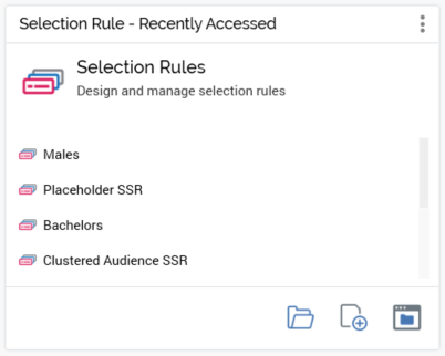
Display: this dropdown allows you to control whether additional details are to be displayed at the widget. You can select from the display of the following, as illustrated by these examples:
Nothing:
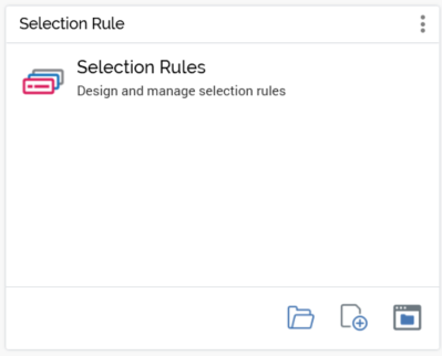
Recently Accessed files (selected by default):
-
Show extra details tabs: this checkbox is shown when Display extra details is set to a value other than “Nothing”. If checked, Accessed, Saved, and Wiki tabs are all shown at the widget.
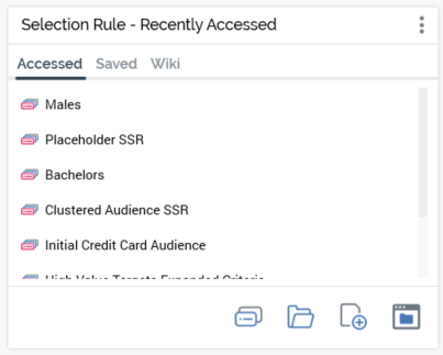
Initial tab selection at the widget is accordant with its Display extra details setting.
-
Show shortcut buttons: this checkbox is checked by default. It controls display of a shortcut footer at bottom of the widget, as per the following examples.
If checked:

If unchecked:
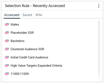
Preview
A preview of the widget is displayed to the top right.
Display mode
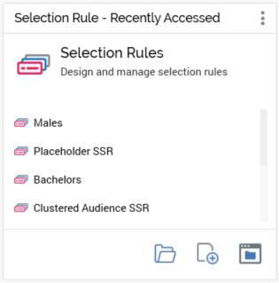
When a File Type widget is shown in a dashboard, you can access options therein in accordance with its configuration, including:
-
Primary option
-
Recently accessed files
-
Recently saved Wiki Pages
-
Recently saved files
-
Shortcuts
A context menu at any listed files exposes the following options:
-
View File Information
-
Open Latest Version
-
View Insights (selection rules and audiences only)
-
Open File Location

