

Overview
A grid is displayed, listing all existing value lists:
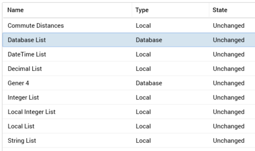
Within the grid, the following read-only columns are displayed:
-
Name: the unique name that identifies a value list.
-
Type: one of Database or Local.
-
State: one of Added, Edited, Deleted, or Unchanged.
When no value lists have been configured, an advisory message is displayed.
Selected Value List Details
This section displays the details of the value list selected currently in the list. If no value lists have been configured, an advisory message is displayed.
The section contains the following properties:
-
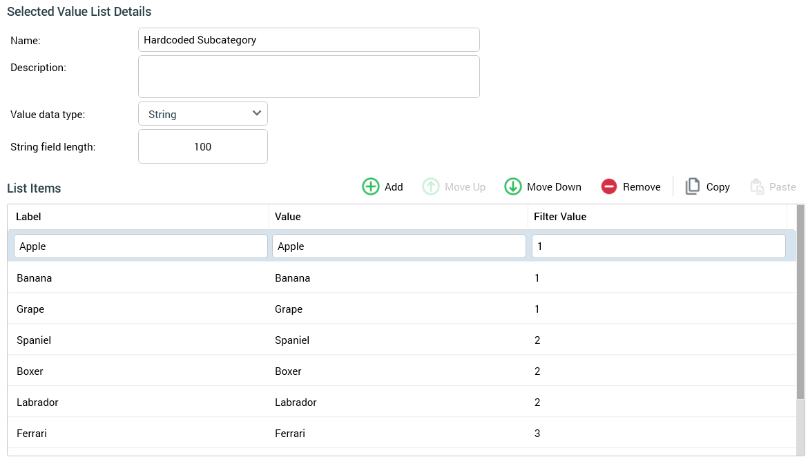
Name: the unique name used to identify the value list. Name is mandatory, can be a maximum of 100 characters in length, and must be unique across all value lists.
-
Description: an optional property that can be a maximum of 1000 characters in length.
The following properties are shown if a local value list is selected:
-
Value data type: this dropdown field exposes the following values:
-
DateTime
-
Decimal
-
Integer
-
String (the default)
-
-
String field length: this property is only displayed when Value data type is set to String. An integer field, it defaults to 100, and accepts a minimum value of 1 and a maximum value of 1000.
-
List items: this property consists of a toolbar and a list.
-
Toolbar: exposing the following:
-
Add new List Item: invocation of this option adds a new list item to the list. Its default Label is “Label” (this value can be incremented to ensure uniqueness), and its default Value blank.
-
Move selected List Item up: this button is available when a single list item other than the first in the list is selected. Selecting it moves the list item up one position in the list.
-
Move selected List Item down: this button is available when a single list item other than the last in the list is selected. Selecting it moves the list item down position in the list.
-
Remove selected List Items: selecting this button removes the currently-selected list items from the list. An “Are You Sure?” dialog is not shown.
-
Copy List Items to clipboard: this button is available when one or more list items is present in the list. Invocation copies the list items to the clipboard. Names and values are tab-delimited.
-
Paste List Items from clipboard: this button is available when the clipboard is populated with text. Selecting it displays a submenu:
-
Replace existing values
-
Append to existing values
If the clipboard values are of the correct tab-delimited structure, names and values are pasted into the list in accordance with the selected option. If the clipboard contents are not of the correct tab-delimited structure, a warning message is displayed.
-
-
-
List: containing updateable Label and Value columns. On creating a new local list, a single list item is present therein. Its Label property is set to “Label” (this can be incremented to ensure uniqueness). Its Value is blank. At least one list item must be defined.
-
Label: this column is optional. All supplied labels must be unique within a list. If blank, the text Blank label is displayed.
-
Value: this column is also optional. If a String list, Value is set automatically to the same string as its corresponding Label, and the length of the Value provided must not exceed the list's String field length.
-
Filter Value: this optional text column allows you to specify values that group together list items within a value list (say called List One). The values specified can be used to reference values from another value list (say List Two). When both value lists are exposed as metadata attributes in an audience definition, the value selected in List Two will cause the values available at List One to be filtered to only show those that share the same, selected, Filter Value.
-
-
When using a value list at an audience definition metadata attribute, Value will be displayed if a Label is not provided.
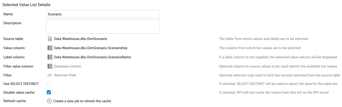
The following properties are shown if a database value list is selected:
-
Source table: this property represents the table from which values and labels are to be selected. A database table must be selected using the Choose Database Item dialog. Selection of a table makes the the Value and Label column properties available. Changing Source table clears any existing column properties.
-
Value column: this property represents the column from which list values are to be selected. It is unavailable until a Source table is selected. The property must be set to a database column from the Source table, using the Choose Database Item dialog. You can Clear the property once selected.
-
Label column: this optional property represents a label to be shown instead of the corresponding value. If a label column is not supplied, the selected value column is displayed instead. It is unavailable until a Source table has been selected. The property can set to a database column from the Source table, using the Choose Database Item dialog. You can Clear the property once selected. A Validation error is raised when saving value lists if the Value and Label columns are set to the same column.
-
Filter value column: this optional property allows you to specify a data warehouse column. By selecting a foreign key, you can specify that, when the value list is used at a metadata attribute, and a value is selected at another metadata attribute populated using values from the table referenced by the foreign key, the values available from the current database value list are constrained to only those with matching foreign keys. For example, assume we have database value lists exposing values from Product Category and Product Sub-Category tables. Filter value column at Product Sub-Category is set to Product Category key. Both value lists are exposed as metadata attributes at an audience definition. When setting audience metadata, on choosing a value for Product Category, the available values at Product Sub-Category are constrained to only those records with a Product Category (foreign) Key matching the selected Product Category value.
-
Filter: this property represents an optional selection rule used to limit the records selected from the source table. You can browse for a selection rule, or populate the property using drag and drop. Having populated the Filter, you can open its latest version in the Rule Designer. You can also Clear your selection. Note that the selection rule you choose must be compatible with the selected Source table; if not, a Failed to load values message will be displayed at a metadata attribute based on the list (hovering over the same displays the error details in a tooltip).
-
Use SELECT DISTINCT: this checkbox is unchecked by default. When checked, the SQL used to populate the current database value list uses SELECT DISTINCT rather than SELECT.
-
Disable database value cache: when this checkbox is checked, RPI won’t cache the values from the database value list on the RPI server. It's unchecked by default.
-
Refresh Cache: selecting this button creates a “Refresh '[DVL name] Value List'“ job and displays it in the My Jobs dialog.