

Overview
The Manage Realtime Layout overlay allows you to view and make changes to a previously-saved Realtime layout.
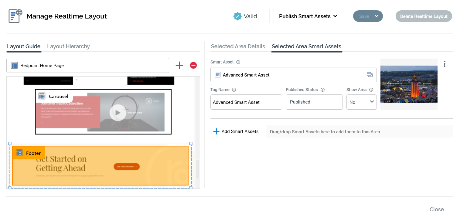
It contains the following: Toolbar, left-hand tab set, right-hand tab set, and Footer.
Toolbar
The following are displayed at the Manage Realtime Layout overlay's toolbar:
-
Validation status indicator: an icon that indicates the validation status.
-
Manage Metadata for this file: selecting this button displays the File Metadata Editor, which is covered in the RPI Framework documentation.
-
Publish Smart Assets: allows you to publish smart assets within the current layout. The dropdown, which exposes two context menu options, is available when you have the Realtime Layouts - Publish Smart Assets functional permission.
-
Publish All Smart Assets: this option allows you to publish all Smart Assets associated with the current Realtime layout for use with the RPI Realtime API.
-
Publish Smart Assets at Selected [Layout/Area]: this option allows you to publish all Smart Assets within the selected area or layout, and its child areas/layouts, for use with the RPI Realtime API. An information message is displayed when you select this option and no smart assets have been associated with the currently-selected layout or area or its children.
-
Both of the options above are unavailable when the current Realtime layout is invalid or contains unsaved changes.
-
Save: selecting this button saves any unsaved changes within the current Realtime layout, and publishes all Realtime layouts at the current client to the RPI Realtime API. Note that this does not publish their associated smart assets. A Publish job is created, but the My Jobs Dialog is not shown. The following save options are available at a context menu:
-
Save: as per selecting the main Save button.
-
Clone and Save: selecting this option creates a new Realtime layout based on the current one. The new layout is saved, and displayed in the Manage... overlay. An incrementable integer is appended to the layout's name to ensure its uniqueness.
-
Export: this option is available when the Realtime layout contains no unsaved changes. Selecting it displays a Browse for Folder Windows file system dialog. Selection of a folder and selecting OK creates an Export job, and displays it in the My Jobs dialog. Having exported a Realtime layout, you can import it in the usual manner from the RPI File System Dialog.
-
-
Delete Realtime Layout: this button is displayed in gray and changes to red when hovered over. Its invocation is protected by an "Are You Sure?" dialog. When a Realtime layout is deleted, the Manage... overlay is removed from display, the layout is removed from the list and the list is refreshed. An information message confirms the deletion.
Left-hand tab set
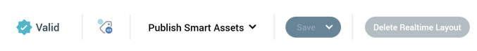
Layout Guide tab
The Layout Guide tab allows you allows you to visually represent a layout. A background image (typically of a web page) can be uploaded, and areas can be located within the layout.
It consists of a toolbar and a Layout control.
Toolbar
The toolbar exposes the following:
-
Layout chooser: this control, displayed at the top of the tab, allows you to choose a layout, and the areas contained therein, to view in the Layout Guide. If more than one layout has been configured within the current Realtime layout, a treeview is displayed on selecting the layout chooser. You can select a layout to display in the Layout Guide. The treeview is not shown if only a single layout has been configured.
-
Add new Area to this Layout: this button, shown to the right of the layout chooser, allows you to add a visual representation of a new area to the Layout Guide. The new area is positioned below all existing areas within the current layout, is selected automatically and is named "New Area" (an incrementable integer can be appended to ensure that the area's name is unique within the layout).
-
Remove selected Area from this Layout: this button, displayed to the right of Add new Area..., is enabled when an area is selected in the Layout Guide. Selecting it removes the area without display of an "Are You Sure?" dialog.
Layout control
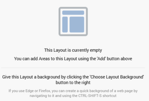
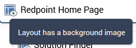
The Layout control appears below the toolbar. A representation of the current layout, optionally displaying an image selected at the layout's Choose Layout Background property, is displayed below the toolbar. When an image has not been associated with the layout, and no areas have been added, the following is displayed:
When a layout background has been set, it is displayed as expected:
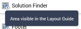
When an area is selected within a layout, the area's Realtime API Context Path is shown in a tooltip when hovering over the same:
When an area is unselected, it is displayed with a black border and no fill:
On hovering over an area, it is displayed with an orange border and fill:

When an area is selected, it is displayed with a selected item dotted border:
You cannot select more than one area simultaneously. No constraints upon areas' placement are enforced.
If an area represents a smart asset with its Show Area property set to "Yes", it is differentiated from other areas through use of a smart assets icon. The smart asset name is also included in the Realtime API Context Path tooltip shown on hover. The Z-order of areas displayed within a layout is as per the placement in the current Layout Hierarchy, with areas later in the hierarchy displayed over earlier areas.
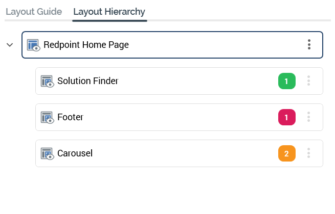
Layout Hierarchy tab
The Layout Hierarchy contains a treeview representation of the current Realtime layout's hierarchy of layouts and areas. If the Layout Guide is used, it reflects the structure of layouts displayed therein.
The Layout Guide is read-only. An initial layout is always present.
A tooltip is shown when hovering over a layout or node in the hierarchy, displaying its name and description.
The following appear at a layout or area displayed within the Layout Hierarchy:
-
Icon: representing a layout or area. The icon is adorned with a mini icon in the following cases:
-
Name: name of the layout.
-
"Traffic light": displaying the current status of smart asset publishing at the layout or node. A tooltip is shown when hovering over the traffic light stating “This Area contains [#] Smart Asset(s). All Smart Assets within this Area are [Publish status]”. The traffic light's color represents the following:
-
Green: All Smart Assets within this Area are published.
-
Amber: There are both published and unpublished Smart Assets within this Area.
-
Red: No Smart Assets within this Area have been published.
-
-
Actions: this button is displayed at the right of a layout or area. Selecting it displays a context menu, exposing the following options:
-
Add New Child Area: selecting this option creates a new area as a child of the current layout or area. It is added after all other children. Its default name is "New Area" (an incrementable integer can be added to ensure the name's uniqueness within its parent).
-
Add New Child Layout: selecting this option creates a new layout as a child of the current layout or area. It is added after all other children. Its default name is "New Layout" (an incrementable integer can be added to ensure the name's uniqueness within its parent).
-
Remove: this option is unavailable at the root layout. Invocation removes the selected layout or area without display of an "Are You Sure?" dialog.
-
The maximum depth to which layouts and areas can be nested is 10 deep.
The Layout Hierarchy treeview's collapsed or expanded status is saved along when the current Realtime layout is saved.
You can drag and drop layouts and areas within the treeview to re-order them. You cannot drag the root layout, and you can only drop layouts and areas in a legitimate position.
Right-hand tab set
Selected Layout/Area Details tab
This tab is displayed in the right-hand tab set, and displays the properties of the layout or area selected currently in the Layout Guide or Hierarchy.
Layout
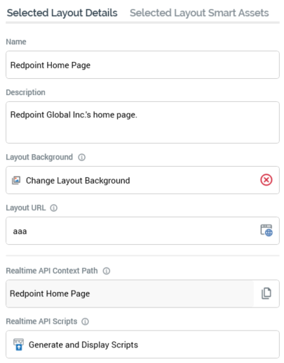
If a layout is selected, the following are shown:
-
Name: this mandatory, updateable text field can be a maximum of 100 characters in length. If the root layout, the value supplied must be unique across all Realtime contexts at the current client. If a non-root layout, the value supplied must be unique within the parent layout or area. No case restrictions apply, but you may not use the "/" or "." characters.
-
Description: this optional, multi-line text field can be a maximum of 1000 characters in length.
-
Layout Background: this property allows you to select an optional layout background to use at the Layout Guide. A button is shown; when a background has yet to be selected, it appears with no “x” icon. When a background has been selected, there is a red “x” icon displayed.
Selecting the button displays the Choose Layout Image Windows file system dialog, which is display image Files only. On selection of an image, it is displayed at the currently-selected layout in the Layout Guide.
-
Layout URL: you can optionally provide a URL representing the layout in this text field. When a URL has been specified an Open URL in Web Browser button is displayed to the right of the property. Selecting it opens the URL provided in your default browser.
-
Realtime API Context Path: this read-only property represents the full path to the layout, which can be used when accessing it via the Realtime API. It is accompanied by a Copy Realtime API Path to Clipboard button, displayed to the right of the property.
-
Realtime API Scripts: this button ("Generate and Display Scripts") allows you to generate scripts to access the layout using the Realtime API. Selecting the button generates the scripts and displays them below the button. You can copy the JSON body to be used to evaluate smart assets at the current layout.
Area
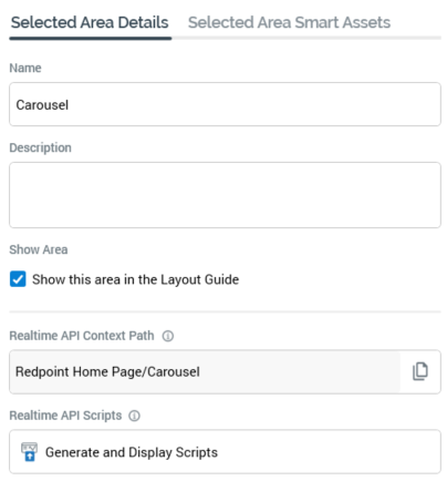
If an area is selected, the following are shown:
-
Name: must be unique within the parent layout or area.
-
Description: optional description of the layout or area.
-
Show Area: this checkbox is checked by default. When checked, the area is shown at the Layout Guide. When unchecked, the area is not shown.
-
Realtime API Context Path
-
Realtime API Scripts
Selected Layout/Area Smart Assets tab
This tab is used to manage the smart assets associated with a layout or area.
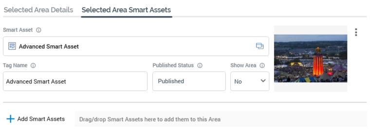
When no smart assets are associated with the layout or area, a message is shown that states “No Smart Assets associated with this Layout”. A list of the associated smart assets is displayed in alphabetical order.
-
Smart Asset: a read-only representation of the smart asset file associated with the selected layout or area. An inline Open Latest Version button is provided, and standard file operations can be accessed from a context menu.
-
Preview: if the smart asset's default content is an image asset, a preview is displayed inline. Otherwise, it can be accessed by selecting this property to view a preview in the File Information Dialog.
-
Actions: this button, represented as a three-dot action menu, provides access to the following context menu options:
-
View Results: selecting this option displays the smart asset's details in the Realtime Details Report.
-
Publish Smart Asset: selecting this option publishes the smart asset. It is unavailable when the Realtime layout is invalid or contain unsaved changes.
-
Remove: removes the smart asset from the layout or area. Not protected by "Are You Sure?".
-
-
Tag Name: an optional property used to identify the Smart Asset when using the Realtime API. Tag Name can be a maximum of 100 characters in length, and defaults to the name of the smart asset.
-
Published Status: a read-only representation of the current published status of the smart asset (one of Published, Unpublished, or Not published). An information tooltip is shown on hovering over the property that covers the following information:
-
Published or Unpublished:
-
Published version
-
Publish method
-
Latest published date/time
-
Published by
-
-
Never been published: text that states “This Smart Asset has never been published”.
-
-
Show Area: this Yes/No dropdown field allows you to specify that the smart asset be shown as a separate area in the Layout Guide. If set to "Yes", a separate area, named after the smart asset and with a smart asset icon, is displayed.
-
Add Smart Assets: this button allows you to associate smart assets with the layout or area. Selecting it displays the Add Smart Assets File System Dialog, within which you can select one or more smart assets to add to the list.
-
Drag/drop Smart Assets here to add them to this [Layout/Area]: dragging a smart asset from the toolbox and dropping it onto this label adds it to the list. If the smart asset is already present in the list it is not added.
-
Rule, Model, Goal, Tag, Table, and Advanced smart assets can be added to the list. Attribute and Audience Segment smart assets cannot.
-
The presence of an invalid smart asset within a Realtime layout does not make the layout itself invalid.
Finally, a new Realtime API Context Paths section is now available in the Smart Asset Designer’s Publish Options dialog.
Footer
The following buttons are displayed at the Manage Realtime Layout overlay's footer:

-
Cancel: displayed if outstanding changes are present within the Realtime layout. Invocation is protected by an "Are You Sure?" dialog, abandons any changes made to the Realtime layout and closes the Manage... overlay.
-
Save & Close: displayed if outstanding changes are present within the Realtime layout. Invocation saves any changes made to the Realtime layout and closes the Manage... overlay.
-
Close: displayed if no outstanding changes are present within the Realtime layout. Invocation closes the Manage... overlay.