

Overview
Table smart assets facilitate the output of series of repeated data entities in RPI inbound or outbound content.
Three types of table smart asset are available in RPI:
-
The Predefined table smart asset is used to display two-dimensional tabular data. Typically, a table smart asset might be rendered in email content—e.g. to display transactional information in a customer statement.
-
The Custom HTML table smart asset provides complete control over an HTML-based table smart asset’s:
-
Header
-
Content
-
Including the number of columns across which transactional entities will be displayed.
-
-
Footer
-
-
The Custom Text table smart asset provides for additional control over a text table’s header, content and footer.
Table smart assets can be used in the following Batch Outbound contexts:
-
Text asset
-
HTML asset
-
Email offer
-
HTML content
-
Text content
-
-
SMS offer
Table smart assets can also be used in Inbound Realtime.
All table smart asset types’ content panels contain a Configure Table Smart Asset Settings section, within which the following are always shown:

-
Display Mode: this dropdown field controls the type of table content that will be served by the smart asset. Three options (as described above) are available:
-
Predefined (supported at HTML and Text)
-
Custom HTML
-
Custom Text
-
Each Display Mode is described separately.
-
Filter: optional provision of a standard or basic selection rule at this property allows you to limit the data to be displayed within the table smart asset. For example, if displaying a list of product recommendations within an email offer, you could apply a filter to limit the list to only products with a list price of more than $100.00.
Note that NoSQL selection rules are not supported. Filter is not shown when running in NoSQL mode.
You can populate the property using drag and drop, or by browsing for an existing selection rule. You can also initiate the creation of a new selection rule. Once populated, you can open the latest version of the rule in the Rule Designer; you can also invoke Clear to remove the Filter.
-
Show Preview: selecting this button displays a preview of the table smart asset in the Table Smart Asset Preview dialog (covered separately).
Predefined
When the table smart asset’s Display mode is set to Predefined, the table smart asset content panel contains the following:
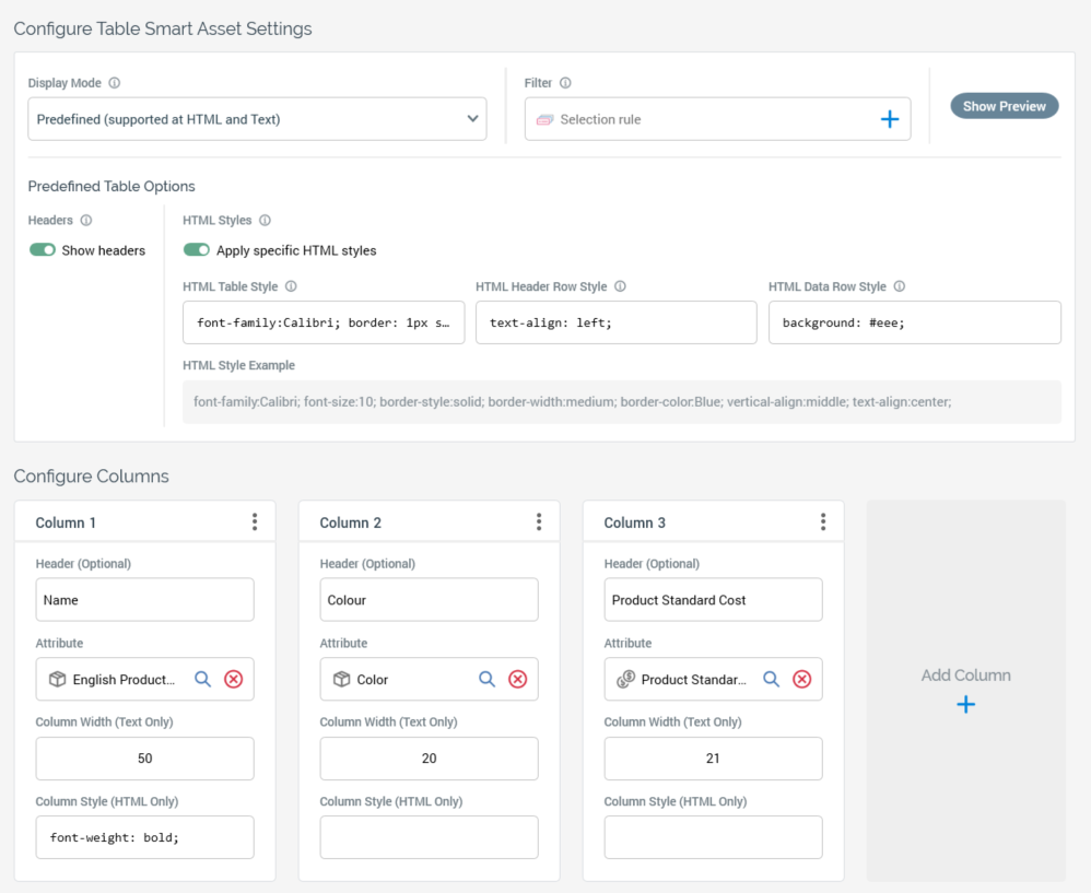
Predefined Table Options section, containing the following:
-
Headers: this toggle control determines whether headers defined for each column will be shown. Its default setting is On.
-
HTML Styles: this section allows you to apply specific HTML styles to the table when it is used in HTML content. It contains the following:
-
Apply specific HTML styles: this toggle control determines whether HTML styles will be applied. Its default setting is Off.
The following properties are shown when Apply specific HTML styles is switched on: -
HTML Table Style: defines the style to be applied to the <table> HTML element.
-
HTML Header Row Style: defines the style to be applied to the <th> HTML element.
-
HTML Data Row Style: defines the style to be applied to the <td> HTML element.
-
HTML Style Example: an example style is provided
-
Configure Columns section, which allows you to specify the columns that will be output within the table. It contains the following:
-
Add Column: this button is shown to the right of any existing columns. Invocation adds a new column to the right of the same.
The following are displayed at a column:
-
Column [n]: columns are numbered automatically from left to right
-
Actions: this button provides access to the following options:
-
Move left
-
Move right
-
Remove
-
-
Header (Optional): you can optionally provide a header value to be displayed at the top of the column.
-
Attribute: this mandatory property defines the data that will be output within a column. You can select an attribute using drag and drop or Browse. Once populated, you can view the attribute’s information in the File Information Dialog. You can also clear the attribute. Note that you cannot populate Attribute with an Exists in table or an anonymous auxiliary database attribute.
-
Column Width (Text Only): the number of characters displayed for a fixed-width column when used in text content. An integer, Column Width is set in accordance with the length of attribute with which configured (only when a column is added using drag and drop).
-
Column Style (HTML Only): an optional text field, in which you can apply an HTML style to the column.
Note that it is mandatory to supply at least one column within a table smart asset.
Custom HTML
When the table smart asset’s Display mode is set to Custom HTML, the table smart asset content panel contains the following:
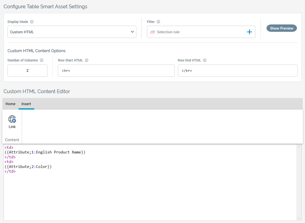
Custom HTML content options
This section contains the following:
-
Number of Columns: this property defines the number of columns across which transactional entities are to be shown before a new row is started. Each “Content” element, as defined using the content editor, represents a single transactional entity. For example, a table smart asset is intended to list the products a customer has purchased. The asset contains three columns. Customer A has purchased five products. When the custom table smart asset is rendered in an email received by Customer A, the first row therein displays three products across the page. The next row shows two products. A mandatory integer field, Number of columns can be a minimum value of 1 and a maximum value of 999.
-
Row start HTML: this optional property can be used to apply a style at table row level. It is set by default to the value “<tr>”.
-
Row end HTML: this optional property can be used in conjunction with Row start HTML to apply a style at table row level. It is set by default to the value “</tr>”.
Custom HTML content editor
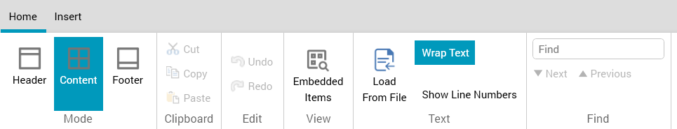
An RPI content editor is shown at the bottom of the content panel. Its toolbar exposes the following:
-
Home tab: containing Mode, Clipboard, Edit, View, Text, and Find sections.
-
Mode section: containing the following toggle buttons, which facilitate the selection of the context within which content may be entered:
-
Header: this section allows you to define the table's header row. It is set by default to “<br>Header<br><table>”. Provision of a Header is optional.
-
Content: this section is selected by default. It allows you to define the content used to represent a transactional entity (e.g. a customer's purchased products). It is set by default to “<td>Cell Content</td>”. Provision of Content is mandatory.
-
Footer: this section allows you to define the table's footer row. It is set by default to “</table><br>Footer”. Provision of a Footer is optional.
-
-
Clipboard section: exposing the following:
-
Cut
-
Copy
-
Paste
-
-
Edit section: exposing the following:
-
Undo
-
Redo
-
-
View section: exposing the following:
-
Embedded Items
-
-
Text section: exposing the following:
-
Load From File
-
Wrap Text
-
Show Line Numbers
-
-
Find section: exposing the following:
-
Find
-
Next
-
Previous
-
-
-
Insert tab: containing a single Content section.
-
Content section: exposing a single option:
-
Link
-
For more information on the options listed above, please see the RPI Content Editor documentation.
You can enter content as required in the editor shown below the toolbar. The context in which content is added is defined by the selected Mode toggle button.
You can include the following in custom HTML table smart asset content:
-
Attribute (other than or an anonymous auxiliary database attributes)
-
HTML asset
-
Image asset
-
Smart assets in which Batch Outbound supported (including nested)
Custom Text
When the table smart asset’s Display mode is set to Custom Text, the table smart asset content panel contains the following:
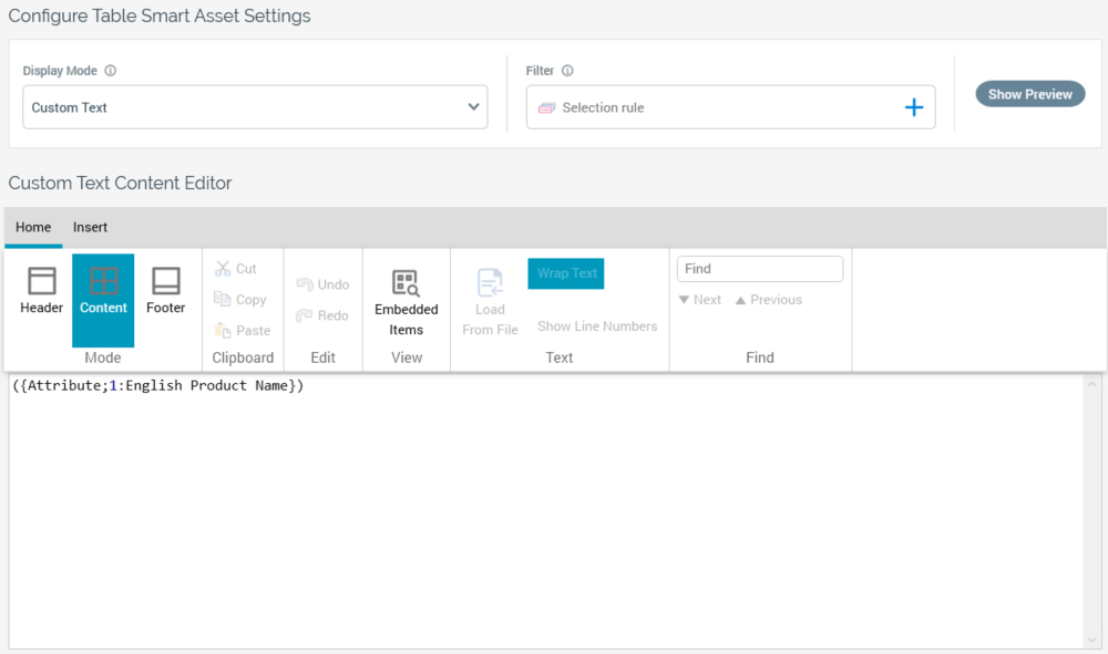
In addition to the list documented in the Custom (HTML Based) Content Editor section, you cannot include the following asset types in custom text table smart asset content:
-
HTML
-
Image
-
Smart assets with non-text content
Table smart asset preview dialog
When displayed for a Predefined table smart asset, the modeless Table Smart Asset Preview dialog contains HTML and Text Preview tabs:
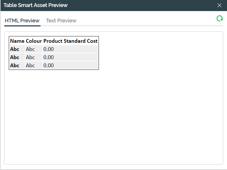
Three rows are displayed. A Refresh button is provided.
The HTML Preview and Text Preview tab only are provided when previewing a Custom HTML and Custom Text table smart asset, respectively.
Miscellaneous
The following apply at table smart assets:
-
You can include collection parameter attributes in table smart asset content. When you do so, the number of elements must be the same across all attributes.
-
The use of Recommender model project attributes in a table smart asset is supported. When included, all ranked attribute values are returned in the table.
-
When used in an Inbound Realtime context, you can include attributes sourced from a cached attribute list within a table smart asset.