Overview
Each widget contains two views: the configuration overlay and display mode.
Configuration overlay
The Configure Tasks widget configuration overlay contains the following:
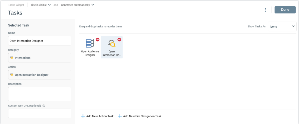
The widget contains the following:
-
Properties toolbox: displayed to the left, this section allows you to set the properties of the task selected currently in the tasks list.
-
Tasks list: displayed to the right. This section lists the tasks with which the widget is currently configured.
-
Add.. buttons: displayed to the bottom right, two buttons allow you to add new Action or File Navigation tasks to the widget, using tailored overlays.
Properties toolbox
The following properties are displayed for action tasks only:
-
Action: read-only. As per the item selected from the right-hand list in the Add Action New Task overlay.
-
Description: optional. Displayed in a tooltip when hovering over a task in display mode.
-
Custom Icon URL: you can optionally provide a URL for a custom icon to be displayed at the task, instead of the default.
The following properties are displayed for file navigation tasks only:
-
File: read-only. Appropriate inline buttons (e.g. Open Latest Version, View Insights) are provided.
-
Name: set by default to the name of the page or file. Provision of a Name is mandatory, and the maximum supported length is 100 characters. Name is displayed below the task at the widget.
The following properties are displayed for both action and file navigation tasks:
-
Description: this multi-line text field is optional, and the field supports a maximum length 1000 characters. Description is displayed below Name in a tooltip shown when hovering over a task shown within a widget.
-
Custom Icon URL: allows you to specify the URL of a custom image to be shown instead of the standard task icon.
Tasks list
This section lists all action and file navigation tasks with which the widget is currently configured. When empty, a message is shown: “No tasks to display”.
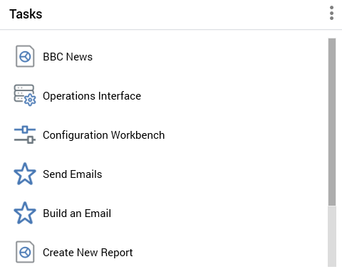
Tasks displayed in the list can be shown as icons:
…or list items:
…depending on the value selected at the Show Tasks As dropdown (displayed above the list, to the right).
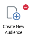
An inline Remove button is shown at each task. Selecting it removes the task from the widget without displaying an “Are You Sure?” dialog.
If required, you can re-order tasks within the list using drag and drop.
Add New Action Task
This button is displayed below the list of tasks. Selecting the button displays the Add New Action Task overlay.
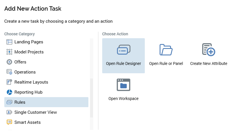
You can add a new task by first selecting a category from the list to the left then, having done so, selecting an action to the right. When you select Add Task, the task is added to the widget’s tasks list. Selecting Cancel removes the Add New Action Task overlay from display.
Add New File Navigation Task
This button is also displayed below the list of tasks. Selecting the button displays the Add New File Navigation Task overlay.
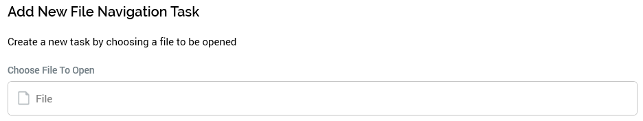
A file chooser allows you to browse for a file with which to configure the task. You cannot choose files that do not support being opened in a designer—for example, attributes. Having chosen a file, you can select the Add Task button to add it to the widget. Selecting Cancel removes the Add New File Navigation Task overlay from display.
Display mode
When a Tasks widget shown in a dashboard, its tasks listed as per its configuration.
You can select a task to undertake the action, or open the file, in question. A context menu is available at file tasks, exposing the following options:
-
View File Information
-
Open Latest Version
-
Open File Location
Tasks can be either shown as icons, as above, or as list items, depending on the widget’s configuration.