

Overview
You can invoke the Audience Designer in the following ways:
-
From the quick access menu’s Audiences menu. The menu exposes the following options:
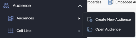
-
From a Tasks or File Type widget. Typically, these might be displayed at your Home Page. For more information on widgets, please see the Dashboard Designer documentation.
-
By double-clicking an Audience file in the File System Dialog, or by highlighting an Audience and selecting OK in the same context.
-
By viewing the latest version of an Audience contextually—for example, from the Audience property within the Audience Snapshot configuration interface.
Note that access to the Audience Designer is controlled via the Audience–Design functional permission. If none of the user groups of which you are a member are associated with this permission, you will not be able to access the Audience Designer.
Audience Designer Basics
Displayed within a separate tab, the Audience Designer consists of a toolbar, properties panel, toolbox, and workspace.
The name of the currently-displayed audience is shown in the tab header.
Toolbar
The following options are available within the Audience Designer toolbar:
-
New: creates a new, empty audience within the workspace.
-
Open an existing Audience: allows you to retrieve an existing audience from storage within the RPI file system and display it for viewing or editing within the workspace.
-
Save the current Audience: saves changes made to an audience that has been saved previously.
-
Save the current Audience as...: allows you to navigate to an RPI file system folder and save an audience.
-
Save the current Audience as a Template: selecting this button, which is only shown when a non-template audience is shown, allows you to save the current audience as a template. For more information on audience templates, please see Audience Templates.
-
Save current Audience Template as File: this button is only available when an audience template is displayed in the Audience Designer. Selecting it displays the “Save Audience Template as new Audience” File System Dialog. Selecting a folder and selecting Save removes the dialog, and saves a new audience based on the current state of the audience template. The new file is shown in the Audience Designer.
-
Remove selected blocks and/or connections: removes the currently-selected blocks and/or connections from the workspace.
-
Properties: allows you to toggle the display of the audience properties panel on and off.
-
Embedded Audience: this toggle button allows you to define that the audience can only be used when embedded in another audience as an audience block. Please see Embedded-only Audiences for further information.
-
Show Audience-level Metadata: displays a summary of metadata values assigned at the audience level in a dialog. Please see Configuring Audience Metadata for further information.
-
Show Audience Placeholders: selecting this button displays the [Audience Name]-Attribute Placeholders dialog. Full details of the Attribute Placeholders dialog can be found in the Framework documentation. You can use the dialog to provide values for any placeholder attributes used in standard or basic selection rules at the audience's filters, suppressions, split and cell list blocks. Note that any test placeholder values provided in the Rule Designer at standard selection rules are ignored and are not presented as default values. When an audience contains a block using a selection rule as per the following:
-
A standard selection rule containing a compare to attribute criterion at which the attribute to which compared is a Placeholder attribute at which Use Sys Variable has been checked OR…
-
…a basic selection rule containing a system variable placeholder criterion. On viewing the Attribute Placeholders dialog, the system variable's value is displayed as default only if exposing system variable values. For more information on system variables, please see the Framework documentation.
-
-
Show the Segment Summary for this Audience: displays a dialog, allowing you to view the metadata assigned to the audience’s segments. Please see Segment Summary for further information.
-
View Insights for this Audience: displays the Insights Window, allowing you to view results pertaining to any audience instances, as well as insights gleaned from viewing a configurable dashboard. For more information, please see the Insights Window section elsewhere in this documentation.
-
Snapshot: allows you to create an audience snapshot based on the audience. Please see Creating an Audience Snapshot for further information.
-
Tests: facilitates the creation of an audience instance to allow you to test the execution of your audience. Also provides access to previously-executed test instances. Please see Testing an Audience for further information.
-
Copy image to Clipboard: This option is available when at least one block is present in the workspace. Selecting it copies the contents of the workspace to the clipboard (even if its full contents are not currently visible).
-
Version number: the version number.
-
Follow/Unfollow File: please see the RPI Framework documentation.
-
File options: please see the RPI Framework documentation.
-
File Metadata: please see the RPI Framework documentation.
-
Linked Page options: please see the RPI Framework documentation.
Start Page
The Audience Designer Start Page is shown upon invocation of Audiences at the quick access menu, and also on selecting Create new Audience at the Audience Designer toolbar.
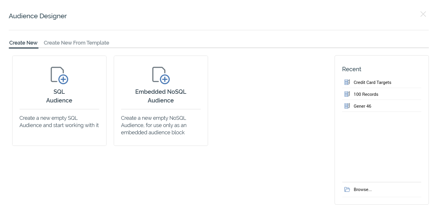
It contains a tabset, which exposes Create New and Create New From Template tabs.
The Create New tab exposes the following:
-
Buttons facilitating creation of the following Audience types (if available):
-
SQL Audience
-
NoSQL Audience
-
Embedded NoSQL Audience
-
The Create New From Template tab lists any audience templates configured at the current RPI tenant. More information on audience templates is provided elsewhere in this documentation. You can search for a template using the field and button provided. If multiple search results are displayed, they can be accessed using the Previous and Next buttons.
In addition, the Start Page also exposes the following:
-
Recent: lists recently-accessed audiences, facilitating the opening of the same.
-
Browse: displays the Open Audience File System Dialog, allowing you to select an audience to open.
A Cancel button is shown at the top of the Start Page. Selecting it removes the Start Page from display, and redisplays the Audience Designer. The Cancel button is only shown on invocation of the Start Page by selecting Create new Audience at the Audience Designer toolbar.
Toolbox
The Audience Designer toolbox contains the following:
Audience Blocks
The section at the top of the Audience Designer toolbox exposes the following:
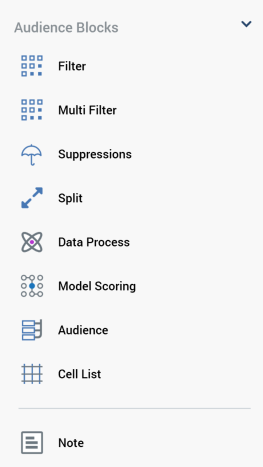
-
Audience Blocks: exposing the following:
-
Filter
-
Multi Filter
-
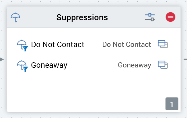
Suppressions
-
Split
-
Data Process
-
Model Scoring
-
Audience
-
Cell List
-
You can drag each block type from the toolbox in order drop it onto the workspace.
-
Data Process Projects: any data process Projects configured at the current RPI tenant that have their Show in toolbox properties set are listed. You can drag a data process project from the toolbox and drop it onto the Audience Designer workspace, creating a data process block with a pre-configured Data process project property.
-
Note
When you drag a block from the toolbox, a label is displayed against the cursor (“Insert new [block type]”).
If you cannot drop the block (for example, due to its being positioned above the toolbox), the label is accompanied by a “no drop” icon:
At the point of dropping the block onto the workspace, a new block of the appropriate type is displayed at the cursor’s current position.
Folder Search
The lower section of the Audience Designer toolbox contains a Folder Search component. For more information, please see the Framework documentation.
The Folder Search is your source for the attributes, selection rules, audiences, model projects and cell lists you will need when building an audience. Having located a file of the required type, you can drag it from the toolbox.
Immediately upon dragging the file onto the workspace, its type’s name is displayed against the cursor. Dropping the following existing files onto the workspace has the following effects:
-
Dropping a selection rule creates a new filter
-
Dropping an audience creates a new audience block
-
Dropping a cell list creates a cell list block
You cannot drop an attribute directly onto the workspace.
You can also drop a selection rule:
-
Onto an existing filter, thereby specifying the records to be targeted by it.
-
Onto a multi filter block, to add a new filter within the same.
-
Onto a split output, to create a new output within the split.
-
Onto a suppressions block, to create a new suppression within the suppressions block.
In addition, you can drop an audience onto an existing audience block, or a cell list onto an existing cell list block.
Audience Validation
Before an audience can be used, it must be valid.
A validation status indicator is displayed to the top right of the Audience Designer, above the workspace. When the audience is valid and contains no validation errors, the validation status indicator is shown as a blue checkmark and the word “Valid”.
Specific validation errors are outlined in the Audience documentation. When one or more validation errors is present, a validation error indicator is shown as a red “x” icon and the words “Not Valid”.
Selecting the indicator lists the validation errors in a dialog:
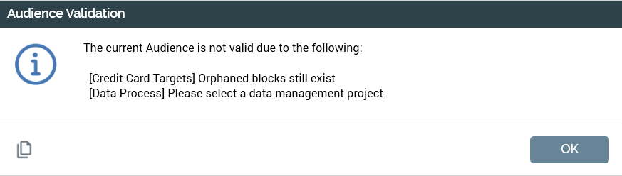
You can use the button at the bottom left of the dialog to copy the validation error details to the clipboard. You can close the dialog using the OK button.
If the determination of an audience’s validation status takes longer than three seconds, dynamic validation is switched off automatically. A button is displayed, and advises of this fact. Selecting the button turns dynamic validation back on.
Workspace
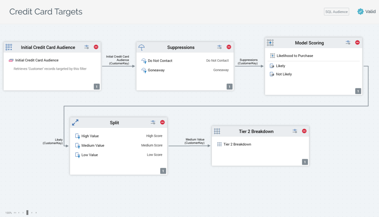
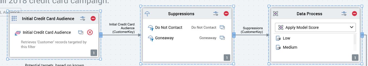
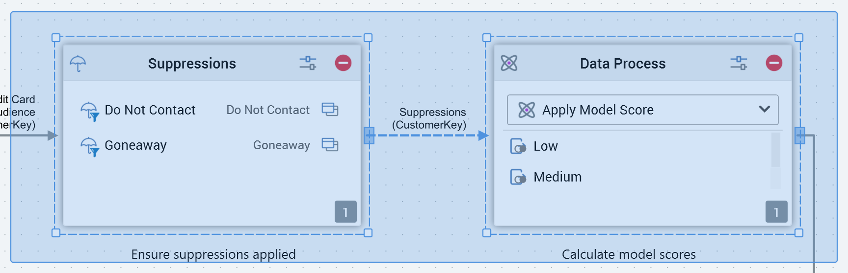
The Audience Designer workspace is the canvas upon which you can design your audiences.
The Audience Designer can only ever display a single audience.
The type of audience (SQL vs. NoSQL) is shown to the top right of the workspace. The workspace is used to display the rules that make up an audience. These rules are represented within the workspace as blocks and connections between blocks. When blocks are moved or resized within the workspace their positions and sizes are snapped to an invisible grid.
A block can be added to the workspace by dragging from the Audience Blocks section in the toolbox.
Blocks are used to restrict records retrieved when an audience instance runs. By default, all records within the table defined by an audience’s resolution level (itself defined by the audience’s audience definition) will be retrieved when an audience instance is executed. Adding blocks to an audience , and connecting those blocks, refines the set of data from the resolution table that will ultimately be retrieved when an instance based upon the audience runs.
All blocks display the following buttons:
-
Configure: selecting this button allows you to configure the block in the Audience Block Builder.
-
Remove: selecting this button removes the block from the audience, without display of an “Are You Sure?” message.
You can select a block in the workspace by selecting upon it. When you highlight a block, it is surrounded by a dashed highlight indicator.
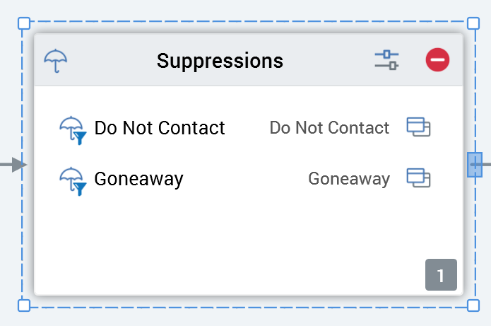
A connection point is shown to the right-hand side of the block as a blue rectangle.
Four resize points are displayed.
You can select more than one block concurrently by holding down the Ctrl key and selecting several blocks in turn.
You can also select multiple blocks by selecting and dragging a “rubberband”.
A block must be completely included within the rubberband to be selected.
If a block is not selected, neither the selected indicator nor the connection point are displayed.
Blocks can be dragged around the workspace. Any connections from or to a block that is moved are also moved appropriately. If multiple blocks are selected, they all move simultaneously.
You can resize a block in the workspace.
Note that a block is constrained to a minimum and a maximum size. If multiple blocks are selected, all are resized simultaneously.
You can zoom the workspace using the slider control displayed to the bottom left. The workspace can be zoomed from 25% to 150% of its standard display size.
Note that you can also use Ctrl-mouse wheel to zoom the designer workspace.
By default, a maximum number of 30 blocks are displayable in workspace concurrently (note that this value may be configured via system configuration setting MaxBlocksDisplayedPerWorkspace). If, by adding a block to the workspace, the maximum number of blocks is exceeded, a warning message is displayed and you are unable to add the block.
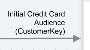
The name of the output from the preceding block that is serving as the current block’s input is displayed above its incoming connector.
In addition, the preceding block’s deduplication level is shown in parentheses below the name of the output.
When you highlight one or more blocks, you can copy them by right-clicking to display a context menu, then selecting Copy. When you do so, an advisory message (“Selected block(s) copied to clipboard”) is shown.
Once blocks have been copied to the clipboard, you can Paste them in the current audience’s workspace, also by using a context menu option. The newly-pasted blocks’ names are the same as the blocks from which they were copied, with an integer appended to ensure uniqueness. Any connections between blocks are also pasted (even if not copied explicitly).
You can also paste copied blocks into another Audience Designer instance.
Note
You can annotate an audience within the Audience Designer by adding a note to the workspace. Simply drag a Note from the Components. Miscellaneous section of the toolbox and drop it where required. The new note is presented in edit mode. You can also add a note by selecting Insert Note—displayed at the context menu shown when right-clicking the workspace.
You can edit an existing note by double-clicking it:
No practicable length limit applies. If the note contains more characters than may currently be displayed, a vertical scrollbar will be shown.
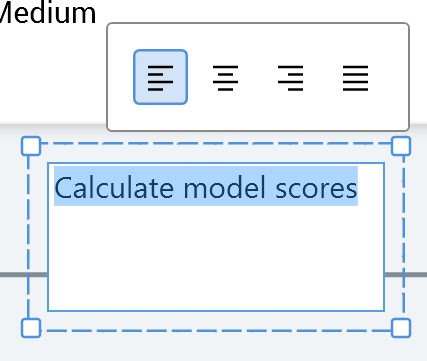
A toolbar shown above the note allows you to control the alignment of the text therein.
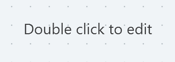
A note in display mode is shown without a border (unless selected, when the standard blue dashed border is displayed). If no text has been added, the default text is shown:
If a note contains more characters than may be displayed within its current size, an ellipsis is appended to the final visible character.
A note is presented in the Foreground (accent) color defined at the Preferences interface.
A context menu is displayed when right-clicking a note. The following options are available:
-
Edit Note
-
Copy
-
Remove