

When a chart widget is shown in dashboard, the following are displayed:
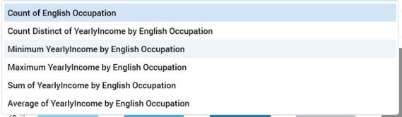
Aggregate(s): if a single aggregate was selected, its name is displayed as a read-only label. If more than one was selected, you can choose the aggregate to view using a dropdown.
-
Chart: the type of chart shown depends on the widget's settings:
-
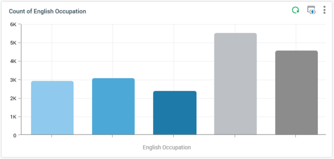
If the widget is wide or entire width, it is always shown as a bar chart.
-
If a Count or Count distinct aggregate is selected, and 7 or fewer values are displayed, the chart is rendered as a pie donut:
-
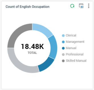
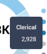
The total count of records displayed in the chart is displayed at its center. On hovering over a pie slice, a tooltip is shown:
Legend is displayed if appropriate:
If another aggregate type or more than 7 values are displayed, the chart is rendered as a bar chart:
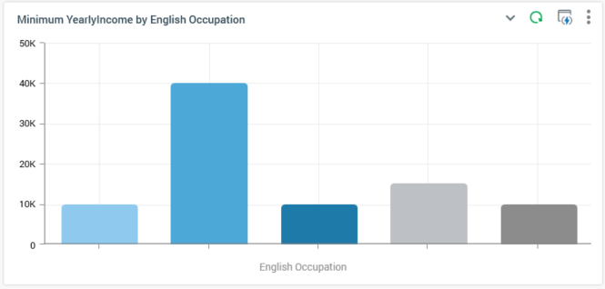
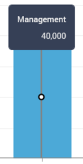
A tooltip is similarly displayed on hovering over a bar:
And legend is shown if appropriate.
If a Heatmap attribute was provided, the chart is rendered accordingly:
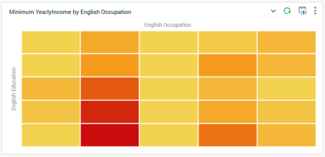
The chart's axes are ordered in ascending alphanumeric order from the top left - right and down. A maximum of 60 values can be displayed at an axis.
If translations have been provided for attribute values, they are rendered within a chart.
On hovering over a cell within the heatmap, a tooltip is shown, displaying:
-
Count of matching records
-
Left axis name and value
-
Top axis name and value
All charts' display reflects the following settings:
-
Filter
-
Order by/Using
-
Chart palette